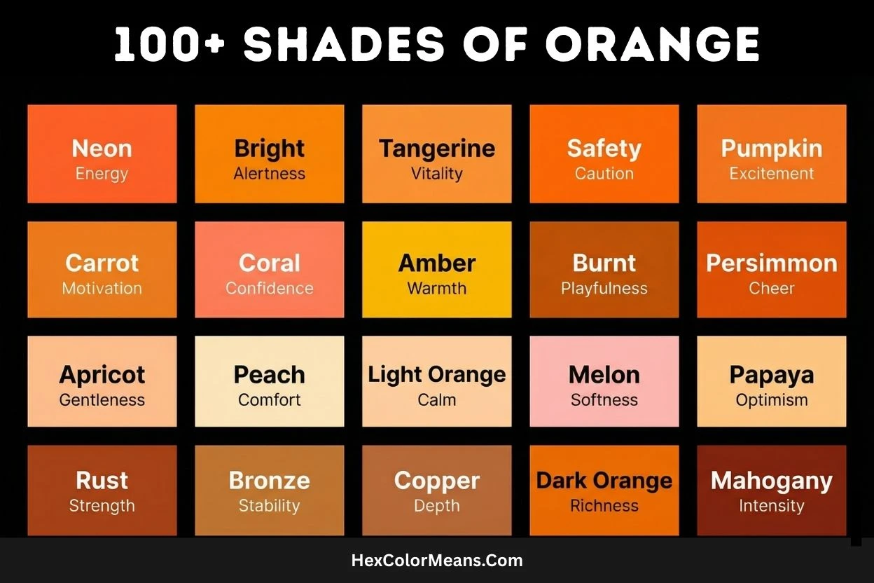
Shades of orange span a bold yet welcoming spectrum. They flow from soft, creamy pastels to vivid citrus tones and deep, earthy hues rooted in nature. Each shade carries its own personality, mood, and purpose.
Orange sits between red and yellow on the color wheel. Because of this position, it blends energy with warmth. The result feels enthusiastic, cheerful, and confident without being overwhelming. Many people associate orange with joy, creativity, sunshine, and movement.
What makes orange special is its natural inspiration. Many well-known shades take their names from fruits, spices, and minerals. Think tangerine, peach, coral, pumpkin, amber, and terra cotta. These names instantly spark emotion and visual clarity.
Some oranges feel playful and bright. Others feel calm and comforting. Deeper tones lean rustic and grounded. This wide range makes orange a favorite across design, branding, interiors, fashion, and digital media.
Popular Orange Shades
Soft & Pale
These light orange shades are often created by mixing orange with white or yellow. They feel gentle, warm, and approachable, making them ideal for calming visuals and subtle accents.
They work well in minimalist interiors, skincare branding, lifestyle blogs, and soft UI designs.
Examples include Apricot, Peach, Papaya Whip, and Bisque.
Bright & Vibrant
These oranges are bold, saturated, and full of energy. They grab attention fast and symbolize enthusiasm, excitement, and confidence.
Designers often use them in advertising, sports graphics, buttons, and warning visuals where visibility matters.
Examples include Tangerine, Safety Orange, Neon Orange, and International Orange.
Deep & Earthy
Darker orange shades lean toward brown or red. They feel natural, grounded, and mature, often reminding us of soil, clay, and autumn landscapes.
These tones suit interior design, fashion, heritage brands, and rustic aesthetics.
Examples include Burnt Orange, Ochre, Rust, Sienna, and Terra Cotta.
Warm & Golden
These oranges carry golden or amber undertones. They appear rich, glowing, and luxurious, often linked with value, warmth, and tradition.
They are popular in premium packaging, festive visuals, and elegant branding.
Examples include Amber, Copper, Pumpkin, and Marigold.
Fruit-Inspired
Named after fruits, these shades feel fresh, lively, and approachable. They bring a sense of youth, flavor, and natural energy.
They are commonly used in food branding, packaging, summer themes, and playful designs.
Examples include Mango, Mandarin, Persimmon, Cantaloupe, and Coral.
Dark Orange
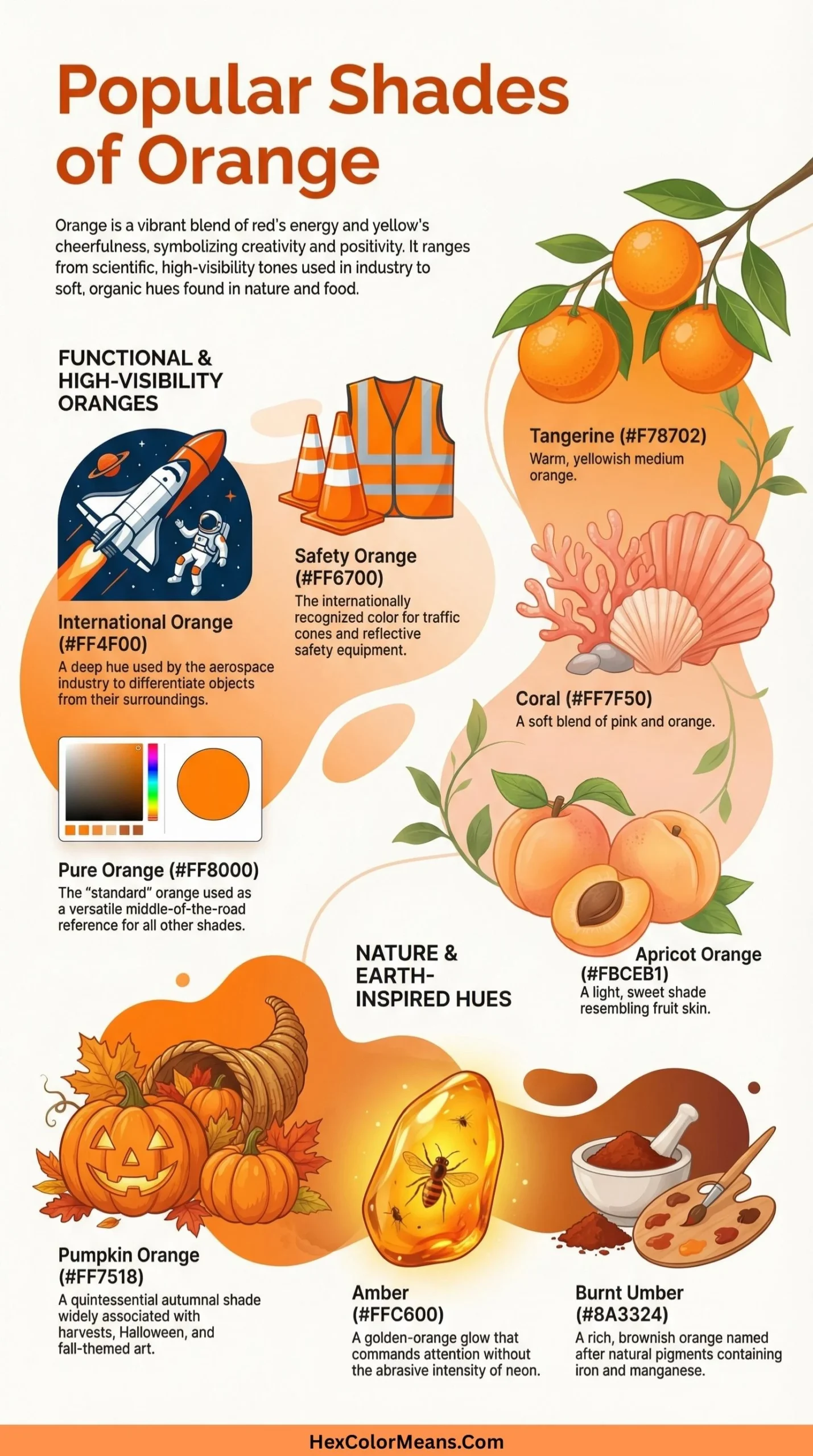
Dark Orange (#FF8C00) is a deeper, more intense shade that leans slightly toward red. This color evokes feelings of autumn, warmth, and urgency. Consequently, it is a popular choice for traffic cones, fall decorations, and impactful call-to-action buttons in digital design.
- HEX #FF8C00
- RGB 255, 140, 0
- CMYK 0, 45, 100, 0
Light Orange
Light Orange (#FFD580) is a pale, softened orange with a significant creaminess. It conveys gentle warmth, friendliness, and approachability. As a result, Light Orange is often used in nursery decor, soft food packaging, and background textures to create a comforting and inviting atmosphere.
- HEX #FFD580
- RGB 255, 213, 128
- CMYK 0, 16, 50, 0
Tangerine
Tangerine (#F28500) is a bright, zesty orange named after the citrus fruit. It is slightly redder and more saturated than pure orange. This shade represents vibrancy, fun, and social activity. Thus, Tangerine is frequently found in sports team logos, summer fashion, and energetic advertising.
- HEX #F28500
- RGB 242, 133, 0
- CMYK 0, 45, 100, 5
Mandarin
Mandarin (#F37A48) is a rich, reddish-orange inspired by the skin of the fruit. It is more muted and sophisticated than neon orange, carrying a warm, autumnal quality. Historically, the name connects to Chinese imperial officials, but the color is now globally tied to the fruit’s juicy sweetness and approachable exoticism. Psychologically, it stimulates appetite and conversation, making it a powerful tool in casual dining branding and social media graphics. Its earthy red undertone also lends itself to bohemian textiles and sunset-inspired art, evoking a sense of communal warmth.
- HEX #F37A48
- RGB 243, 122, 72
- CMYK 0, 50, 70, 5
Pumpkin
Pumpkin (#FF7518) is a quintessential autumn orange, saturated and slightly brownish. It directly references the gourd, embodying harvest, abundance, and seasonal change. This color is central to Halloween iconography and Thanksgiving decor, symbolizing festivity. Beyond holidays, Pumpkin’s hearty warmth is used in home decor and lifestyle branding to create a cozy, welcoming, and nostalgic environment.
- HEX #FF7518
- RGB 255, 117, 24
- CMYK 0, 54, 91, 0
Carrot
Carrot (#ED9121) is a lively, golden-tinged orange with strong yellow undertones. It is named for the root vegetable, associating it with health, vitality, and natural nutrition. This shade is perceived as friendly and energetic, promoting a sense of well-being. Consequently, Carrot is strategically used in health food packaging, children’s products, and educational materials to convey a message of wholesome, accessible energy.
- HEX #ED9121
- RGB 237, 145, 33
- CMYK 0, 39, 86, 7
Burnt Orange
Burnt Orange (#CC5500) is a deep, dark orange with significant brown and red infusion, as if charred by fire. It evokes earthiness, sophistication, and subdued passion. Popular in the 1970s, this color suggests artisan craftsmanship, autumnal landscapes, and intellectual warmth. Therefore, it is favored in university branding, rustic interior design, and artisanal product packaging to convey reliability and depth.
- HEX #CC5500
- RGB 204, 85, 0
- CMYK 0, 58, 100, 20
Amber
Amber (#FFBF00) is a radiant, golden-yellow orange, named after fossilized tree resin. It captures warm, translucent light, symbolizing preservation, ancient wisdom, and enduring energy. Historically prized in jewelry, Amber conveys value and timelessness. It is used in luxury accents, warning lights, and design elements meant to signify caution, warmth, or a precious quality.
- HEX #FFBF00
- RGB 255, 191, 0
- CMYK 0, 25, 100, 0
Apricot
Apricot (#FBCEB1) is a pale, soft orange with strong pink and peach undertones. It is a delicate, pastel shade directly named after the fruit’s flesh, evoking gentleness, innocence, and soft femininity. This color carries a vintage, romantic sensibility, often associated with spring and early summer. Consequently, Apricot is extensively used in wedding stationery, lingerie, and skincare packaging to communicate tenderness, approachability, and a soothing, nurturing quality.
- HEX #FBCEB1
- RGB 251, 206, 177
- CMYK 0, 18, 29, 2
Peach
Peach (#FFE5B4) is an extremely light, creamy orange with a dominant white base and hints of pink. It symbolizes sweetness, warmth, and tranquility, akin to the fruit’s fuzzy skin and soft interior. This color has a calming, nostalgic effect, often linked to Southern hospitality and comfort. Thus, Peach is a staple in nursery designs, dessert branding, and cosmetic products aiming to project a serene, youthful, and friendly image.
- HEX #FFE5B4
- RGB 255, 229, 180
- CMYK 0, 10, 29, 0
Coral Orange
Coral Orange (#FF7F50) is a vibrant, pinkish-orange that draws its name from marine invertebrates. It sits at the crossroads of orange and red, radiating playful energy, sociability, and tropical warmth. This shade is inherently optimistic and engaging, reminiscent of sunsets and reef life. As a result, it is widely employed in resort wear, summer marketing campaigns, and product designs targeting a youthful, dynamic, and cheerful audience.
- HEX #FF7F50
- RGB 255, 127, 80
- CMYK 0, 50, 69, 0
Persimmon
Persimmon (#EC5800) is a strong, vivid orange with a definitive red influence, mirroring the ripe fruit. It is a bold, tangy, and appetizing hue that commands attention. This color suggests exotic flavor, vibrant energy, and a touch of daring. Therefore, Persimmon is effective for creating focal points in design, active sports apparel, and bold digital interfaces where a punch of warm, confident energy is required.
- HEX #EC5800
- RGB 236, 88, 0
- CMYK 0, 63, 100, 7
Papaya
Papaya (#FFEFD5) is an exceptionally light, almost white shade with the faintest whisper of orange and pink. Named for the fruit’s creamy flesh, it evokes purity, softness, and a subtle tropical freshness. This color acts as a warm neutral, providing a gentle backdrop. Consequently, Papaya is ideal for website backgrounds, elegant stationery, and spa interiors where a clean, soft, and inviting ambiance is paramount.
- HEX #FFEFD5
- RGB 255, 239, 213
- CMYK 0, 6, 16, 0
Mango
Mango (#FDBE02) is a lush, tropical orange with a dominant and cheerful yellow base. It captures the vibrant, juicy essence of the fruit, symbolizing summer, exuberance, and sweet reward. This color is inherently energetic and optimistic, often used to evoke feelings of joy and indulgence. As such, Mango is a powerful choice for beverage branding, festival graphics, and children’s toys to communicate fun, spontaneity, and a burst of flavor.
- HEX #FDBE02
- RGB 253, 190, 2
- CMYK 0, 25, 99, 1
Honey Orange
Honey Orange (#F6AE2D) is a warm, golden orange with a rich, amber-like glow. It directly references natural honey, embodying natural sweetness, golden-hour warmth, and artisanal quality. This shade suggests nourishment, comfort, and a touch of rustic luxury. Therefore, it is frequently used in organic product packaging, cozy home decor accents, and branding for natural foods to convey authenticity, richness, and wholesome goodness.
- HEX #F6AE2D
- RGB 246, 174, 45
- CMYK 0, 29, 82, 4
Butterscotch
Butterscotch (#E09540) is a medium, brownish-orange with creamy, caramelized undertones. Named for the confection, it evokes nostalgia, comfort, and indulgent sweetness. This color carries a vintage, homey quality, reminiscent of baked goods and autumn treats. Consequently, Butterscotch is effective in coffee shop interiors, dessert branding, and craft packaging to create a sense of warmth, tradition, and delectable richness.
- HEX #E09540
- RGB 224, 149, 64
- CMYK 0, 33, 71, 12
Saffron
Saffron (#F4C430) is a luminous golden-yellow orange, derived from the precious stigma of the crocus flower. It is a color of high value, spirituality, and illumination across many Eastern cultures. Historically used in royal robes and religious ceremonies, Saffron signifies purity, wisdom, and sacrifice. This makes it a prominent color in religious attire, festive decorations, and luxury design elements where symbolism and opulence are key.
- HEX #F4C430
- RGB 244, 196, 48
- CMYK 0, 20, 80, 4
Ochre
Ochre (#CC7722) is an earthy, brown-orange pigment derived from natural clay. It is one of humanity’s oldest colors, used in prehistoric cave paintings. This color embodies the earth, antiquity, and raw natural beauty. Ochre suggests stability, warmth, and organic connection. Thus, it is fundamental in fine art, terracotta pottery, and earthy, bohemian design schemes to ground a palette with timeless, natural warmth.
- HEX #CC7722
- RGB 204, 119, 34
- CMYK 0, 42, 83, 20
Rust
Rust (#B7410E) is a deep, reddish-brown orange that mimics the color of iron oxide. It evokes decay, weathering, and the relentless passage of time. However, this color has been reclaimed to represent rugged durability, vintage character, and a warm, industrial aesthetic. Consequently, Rust is prominent in industrial design, autumn fashion palettes, and branding for artisan goods to convey authenticity, resilience, and a connection to the past.
- HEX #B7410E
- RGB 183, 65, 14
- CMYK 0, 64, 92, 28
Copper
Copper (#B87333) is a medium, metallic orange-brown named for the elemental metal. It carries a distinctive warm, pinkish glow and suggests conductivity, craftsmanship, and vintage money. This color is associated with electrical wiring, old pennies, and rustic cookware. As a result, Copper is used in technology accents, steampunk design, and home decor to imply warmth, quality, and a touch of retro-futurism.
- HEX #B87333
- RGB 184, 115, 51
- CMYK 0, 38, 72, 28
Bronze
Bronze (#CD7F32) is a darker, more subdued metallic orange with significant brown tones, reminiscent of the tin-copper alloy. It signifies third place, antiquity, and enduring strength. Historically used for tools, weapons, and statues, Bronze implies stability, tradition, and honor. Therefore, it is common in award design, military insignia, and classic architectural accents to communicate a sense of permanence, achievement, and timeless value.
- HEX #CD7F32
- RGB 205, 127, 50
- CMYK 0, 38, 76, 20
Golden Orange
Golden Orange (#FF9F00) is a vibrant, luxurious orange with intense yellow undertones. It blends the energy of orange with the prestige of gold. This shade represents extravagance, success, and radiant joy. Often associated with riches and celebration, Golden Orange is strategically used in premium product packaging, festive decorations, and high-energy marketing to attract attention and suggest premium quality and vibrant prosperity.
- HEX #FF9F00
- RGB 255, 159, 0
- CMYK 0, 38, 100, 0
Cantaloupe
Cantaloupe (#FFA62B) is a soft, warm orange with distinct peachy and salmon undertones. Named for the melon, it embodies sweetness, freshness, and summer refreshment. This color is perceived as friendly, approachable, and subtly nourishing. As such, Cantaloupe is frequently found in health and wellness branding, feminine apparel, and soft interior design to create a soothing, optimistic, and inviting atmosphere.
- HEX #FFA62B
- RGB 255, 166, 43
- CMYK 0, 35, 83, 0
Clay
Clay (#D2691E) is a rich, earthy orange-brown that directly references natural earthenware material. It evokes primal creation, pottery, and a connection to the soil. This color symbolizes warmth, craftsmanship, and organic simplicity. Consequently, Clay is a foundational hue in artisanal branding, Southwestern design, and rustic interiors, providing a grounded, natural, and handcrafted feel that is both sturdy and welcoming.
- HEX #D2691E
- RGB 210, 105, 30
- CMYK 0, 50, 86, 18
Desert Sand
Desert Sand (#EDC9AF) is a very pale, grayish-orange beige that mimics the color of sun-bleached dunes. It acts as a warm, neutral backdrop, suggesting arid landscapes, tranquility, and timelessness. This color provides a sense of calm, spaciousness, and subtle warmth. Therefore, Desert Sand is ideal for minimalist design, spa environments, and apparel where an understated, natural, and sophisticated base is required.
- HEX #EDC9AF
- RGB 237, 201, 175
- CMYK 0, 15, 26, 7
Fire Orange
Fire Orange (#E25822) is a intense, reddish-orange that captures the heart of a flame. It represents extreme heat, danger, and raw, untamed energy. This color is impossible to ignore, triggering immediate visceral reactions. As a result, Fire Orange is critical in emergency services signage, extreme sports branding, and visual effects where communicating power, urgency, and high energy is paramount.
- HEX #E25822
- RGB 226, 88, 34
- CMYK 0, 61, 85, 11
Blaze Orange
Blaze Orange (#FF6700) is a brilliantly vivid, pure spectral orange used for maximum visibility. Also known as Safety Orange, its primary function is to be seen. Developed for high-contrast against natural environments, it signifies caution, alertness, and prevention. Thus, Blaze Orange is legally mandated for hunting gear, traffic safety equipment, and construction site markings to ensure human safety through unmistakable visibility.
- HEX #FF6700
- RGB 255, 103, 0
- CMYK 0, 60, 100, 0
Cadmium Orange
Cadmium Orange (#ED872D) is a strong, opaque orange originally made from cadmium pigment. Prized by artists for its intensity, opacity, and lightfastness, it represents vibrancy in art and design. This color carries an artistic, permanent quality. Consequently, it is a staple on painters’ palettes and is used in graphic design and product design where a bold, pure, and lasting orange statement is needed.
- HEX #ED872D
- RGB 237, 135, 45
- CMYK 0, 43, 81, 7
Neon Orange
Neon Orange (#FF5F1F) is an electric, ultra-saturated orange with a glowing, artificial quality. It mimics the effect of neon lighting and digital screens, symbolizing futurism, nightlife, and extreme attention-grabbing energy. This color is inherently youthful, rebellious, and hyper-modern. As such, it dominates club graphics, gaming peripherals, and futuristic product designs where the goal is to stand out aggressively and signal cutting-edge vibrancy.
- HEX #FF5F1F
- RGB 255, 95, 31
- CMYK 0, 63, 88, 0
Vermilion Orange
Vermilion Orange (#E34234) is a brilliant, scarlet-tinged orange with a historical pedigree. Originally made from powdered cinnabar, it was a precious, toxic pigment used in art and lacquerware. This color signifies classical beauty, importance, and enduring allure. Thus, Vermilion Orange is used in traditional Asian art, ceremonial objects, and luxury accents to convey a sense of heritage, vitality, and rich sophistication.
- HEX #E34234
- RGB 227, 66, 52
- CMYK 0, 71, 77, 11
Terracotta
Terracotta (#E2725B) is a muted, reddish-orange directly named for “baked earth.” It is the color of unglazed pottery, roof tiles, and sun-baked soil. This hue embodies Mediterranean warmth, rustic charm, and handcrafted authenticity. Consequently, Terracotta is a cornerstone of bohemian and rustic interior design, garden pottery, and earthy fashion, providing a warm, organic, and globally-inspired aesthetic.
- HEX #E2725B
- RGB 226, 114, 91
- CMYK 0, 50, 60, 11
Brick Orange
Brick Orange (#CB4154) is a unique, dusky orange with strong pink and red undertones, resembling weathered clay brick. It evokes urban landscapes, industrial history, and structural reliability. This color suggests strength, warmth, and a weathered beauty. Therefore, it is effectively used in architectural visualizations, heritage branding, and autumn palettes to add a layer of textured, historical depth and cozy robustness.
- HEX #CB4154
- RGB 203, 65, 84
- CMYK 0, 68, 59, 20
Chili
Chili (#C21807) is a deep, fiery red-orange that draws its name and heat from the pepper. It sits on the border of red and orange, representing spice, intensity, and passionate flavor. This color stimulates appetite and excitement, conveying a sense of daring. As a result, Chili is powerful in food branding for spicy products, passionate marketing campaigns, and dynamic athletic wear to communicate heat, energy, and boldness.
- HEX #C21807
- RGB 194, 24, 7
- CMYK 0, 88, 96, 24
Cinnamon
Cinnamon (#D2691E) is a warm, spicy brown-orange named for the aromatic bark. It evokes cozy kitchens, autumn spices, and comforting warmth. This color carries culinary and domestic associations, suggesting flavor, tradition, and a welcoming home. Consequently, Cinnamon is extensively used in food packaging, seasonal decor, and cozy apparel like sweaters and blankets to create a sense of nourishing comfort and familiar richness.
- HEX #D2691E
- RGB 210, 105, 30
- CMYK 0, 50, 86, 18
Maple
Maple (#D2691E) is an identical shade to Cinnamon, sharing its hex code, but its name evokes a different natural source: the tree and its syrup. It represents autumnal foliage, sweet harvest, and enduring natural beauty. This color suggests organic sweetness, seasonal change, and North American landscapes. Therefore, Maple is powerfully employed in pancake house branding, rustic furniture stains, and outdoor apparel to convey natural warmth, quality, and earthy comfort.
- HEX #D2691E
- RGB 210, 105, 30
- CMYK 0, 50, 86, 18
Rusty Orange
Rusty Orange (#C46210) is a dulled, brownish medium orange that explicitly references oxidized metal. It embodies weathering, age, and a slow transformation over time. Unlike pure Rust, it retains more orange, suggesting warmth within decay. This color is key for vintage automotive design, historical recreations, and masculine grooming products to achieve a rugged, weathered, and authentically aged aesthetic.
- HEX #C46210
- RGB 196, 98, 16
- CMYK 0, 50, 92, 23
Sun Orange
Sun Orange (#FFB300) is a bright, cheerful golden-orange reminiscent of the sun at high noon. It is the color of pure sunlight and citrus zest, symbolizing optimism, clarity, and vibrant energy. This shade is inherently positive and life-affirming. As such, Sun Orange is a go-to for children’s media, sunny travel branding, and cleaning product packaging to communicate freshness, happiness, and invigorating power.
- HEX #FFB300
- RGB 255, 179, 0
- CMYK 0, 30, 100, 0
Goldenrod Orange
Goldenrod Orange (#DAA520) is a deep, mustardy yellow-orange named for the wildflower. It is a historic, muted gold that feels both natural and valuable. This color suggests late summer meadows, understated wealth, and classic elegance. Consequently, it is used in traditional print design, military accents, and heritage branding to lend a sense of established quality, natural beauty, and timeless dignity.
- HEX #DAA520
- RGB 218, 165, 32
- CMYK 0, 24, 85, 15
Tiger Orange
Tiger Orange (#F96815) is a fierce, bright orange with a bold red undertone, directly inspired by the big cat’s fur. It embodies raw power, wild energy, and predatory confidence. This color is aggressively attention-grabbing and suggests speed and danger. Therefore, Tiger Orange is effectively used in sports team mascots, extreme energy drink branding, and powerful automotive detailing to project an image of untamed strength and dynamic ferocity.
- HEX #F96815
- RGB 249, 104, 21
- CMYK 0, 58, 92, 2
Apricot Orange
Apricot Orange (#F7B267) is a light, soft orange with pronounced peachy tones, sitting between the fruit’s pale flesh and its outer skin. It evokes gentle warmth, approachable sweetness, and soft-focused nostalgia. This color has a calming, edible quality, often associated with watercolor paintings and vintage textiles. As such, it is favored in feminine fashion, dreamy interior design, and artisanal cosmetic packaging to convey softness, creativity, and subtle charm.
- HEX #F7B267
- RGB 247, 178, 103
- CMYK 0, 28, 58, 3
Burnt Sienna
Burnt Sienna (#E97451) is a rich, reddish-brown orange originally derived from a natural earth pigment that is roasted. It is a classic artist’s color, embodying warm shadows, terracotta, and autumnal landscapes. This pigment suggests organic depth, artistic tradition, and rustic warmth. Consequently, Burnt Sienna is fundamental in fine art palettes, Tuscan-inspired design, and craft materials to provide a warm, earthy, and deeply natural tone.
- HEX #E97451
- RGB 233, 116, 81
- CMYK 0, 50, 65, 9
Adobe
Adobe (#A52A2A) is a deep, brownish-red orange named for the sun-dried brick building material. It evokes desert dwellings, Southwestern architecture, and ancient building techniques. This color signifies heat resilience, cultural heritage, and earthy stability. Thus, Adobe is central to Southwestern and Pueblo-style design, landscape architecture, and heritage site branding, creating a palette that feels ancient, protective, and harmoniously blended with the earth.
- HEX #A52A2A
- RGB 165, 42, 42
- CMYK 0, 75, 75, 35
Marigold
Marigold (#EAA221) is a vibrant, golden-yellow orange named for the prolific garden flower. It symbolizes sunshine, celebration (especially in Indian culture), and positive energy. This color is associated with festivals like Dia de los Muertos and Hindu weddings, representing the vibrancy of life and sacred offerings. Therefore, Marigold is used in cultural event design, festive packaging, and garden-themed products to evoke joy, sacredness, and natural brilliance.
- HEX #EAA221
- RGB 234, 162, 33
- CMYK 0, 31, 86, 8
Persimmon Orange
Persimmon Orange (#FF6F00) is a vivid, fully saturated orange that leans decisively toward red, named for the deeply ripe fruit. It represents intense sweetness, vibrant allure, and bold clarity. This color is unapologetically energetic and commands focus. Consequently, it is a powerful tool in graphic design for highlights, athletic wear, and safety applications where maximum visibility combined with a sense of dynamic warmth is critical.
- HEX #FF6F00
- RGB 255, 111, 0
- CMYK 0, 56, 100, 0
Pumpkin Spice
Pumpkin Spice (#FF8243) is a warm, inviting orange with noticeable creamy, cinnamon-infused undertones. It directly evokes the popular autumnal flavor blend, symbolizing cozy comfort, seasonal indulgence, and nostalgic warmth. This color is culturally tied to fall rituals and hygge. As a result, it is extensively used in seasonal marketing, cozy knitwear, and cafe interiors to trigger feelings of comfort, community, and delicious familiarity.
- HEX #FF8243
- RGB 255, 130, 67
- CMYK 0, 49, 74, 0
Nectarine
Nectarine (#FF8656) is a soft, luminous orange with dominant pink and salmon tones, reminiscent of the smooth-skinned fruit. It embodies juicy refreshment, summer ripeness, and a delicate sweetness. This color feels both healthy and decadent, offering a fresher alternative to peach. Thus, Nectarine is effectively used in juice branding, summer fashion, and modern wellness graphics to communicate vitality, gentle energy, and a clean, appetizing appeal.
- HEX #FF8656
- RGB 255, 134, 86
- CMYK 0, 47, 66, 0
Sherbet Orange
Sherbet Orange (#FF9B54) is a bright, creamy, pastel orange that mirrors the frozen dessert. It evokes childhood joy, playful sweetness, and cool refreshment. This color is nostalgic and whimsical, carrying a distinctly retro feel. Therefore, Sherbet Orange is popular in ice cream parlour branding, playful children’s products, and 1950s-inspired design to create a sense of fun, lightheartedness, and sugary delight.
- HEX #FF9B54
- RGB 255, 155, 84
- CMYK 0, 39, 67, 0
Clay Orange
Clay Orange (#D99058) is a muted, medium orange-brown that specifically references wet, workable pottery clay. It signifies potential, craftsmanship, and organic, tactile creation. This color is earthy and humble, yet full of creative possibility. Consequently, it is used in art studio branding, handmade goods packaging, and earthy interior accents to promote a sense of authenticity, handmade quality, and grounded creativity.
- HEX #D99058
- RGB 217, 144, 88
- CMYK 0, 34, 59, 15
Sandstorm
Sandstorm (#ECD540) is a vivid, golden-yellow orange with a dusty, hazy quality. It evokes desert winds, swirling pollen, and intense, dry heat. This color captures movement and atmospheric energy rather than a solid object. It is both warning and phenomenon. As such, Sandstorm is used in adventure gear, exotic travel branding, and graphic designs needing to convey a sense of powerful, natural force and arid, dynamic environments.
- HEX #ECD540
- RGB 236, 213, 64
- CMYK 6, 10, 73, 7
Flame
Flame (#E25822) is a direct synonym for Fire Orange, sharing its hex code. It represents the visible, dancing part of a fire—hot, consuming, and mesmerizing. This color symbolizes transformation, passion, and destructive creativity. It is elemental and urgent. Therefore, Flame is critical in visual storytelling for conflict or energy, motorsports, and alarm systems to instantly communicate high heat, action, and critical attention.
- HEX #E25822
- RGB 226, 88, 34
- CMYK 0, 61, 85, 11
Citrus
Citrus (#FF7A00) is a sharp, zesty, and pure orange leaning slightly toward yellow, encapsulating the essence of fruits like oranges and tangerines. It embodies vitamin C, freshness, and a tangy wake-up call. This color is invigorating and clean, directly linked to health and vitality. Consequently, Citrus is a staple in beverage design, cleaning products, and health supplement packaging to signal effectiveness, natural energy, and a burst of freshness.
- HEX #FF7A00
- RGB 255, 122, 0
- CMYK 0, 52, 100, 0
Golden Papaya
Golden Papaya (#FFB347) is a warm, luminous orange with creamy, tropical undertones, suggesting the ripe interior of the fruit. It represents tropical indulgence, sunny wellness, and soft richness. This color is soothing yet vibrant, evoking exotic vacations and healthy treats. Thus, it is used in resort wear, smoothie bar branding, and spa product lines to create a feeling of luxurious relaxation, natural sweetness, and radiant well-being.
- HEX #FFB347
- RGB 255, 179, 71
- CMYK 0, 30, 72, 0
Molten Orange
Molten Orange (#FF5800) is an intensely bright, red-hot orange that visualizes liquefied metal or lava. It is the color of extreme liquid heat and radiant luminosity. This shade signifies dangerous beauty, manufacturing power, and molten flow. As a result, it is powerfully employed in gaming hardware, extreme sports equipment, and sci-fi aesthetics to convey high performance, cutting-edge technology, and searing energy.
- HEX #FF5800
- RGB 255, 88, 0
- CMYK 0, 65, 100, 0
Traffic Orange
Traffic Orange (#F44611) is a highly saturated, red-leaning orange standardized for maximum visibility in motion. It is engineered for attention, specifically to signal caution, construction, and temporary hazards on roadways. This color cuts through visual clutter and weather conditions. Consequently, it is globally used for road cones, temporary signage, and high-visibility worker apparel, serving a critical role in public safety by providing an unambiguous visual warning.
- HEX #F44611
- RGB 244, 70, 17
- CMYK 0, 71, 93, 4
Blaze
Blaze (#FF5A36) is a vibrant, coral-tinged orange that suggests a vigorous, spreading fire. It is slightly lighter and pinker than “Flame,” evoking rapid heat, contagion, and exciting spread. This color implies trendiness and viral energy. Therefore, Blaze is effective in social media campaign graphics, trendy fashion accessories, and dynamic entertainment branding to communicate something that is catching on quickly and generating widespread excitement.
- HEX #FF5A36
- RGB 255, 90, 54
- CMYK 0, 65, 79, 0
Burnished Orange
Burnished Orange (#A34719) is a deep, dark orange-brown with a subdued, polished metallic sheen implied by its name. It evokes aged leather, polished wood, and antique brass. This color suggests maturity, refined taste, and worn-in luxury. As such, it is a key hue in luxury leather goods branding, traditional library decor, and high-end men’s fashion to convey a sense of heritage, quality, and understated, timeless wealth.
- HEX #A34719
- RGB 163, 71, 25
- CMYK 0, 56, 85, 36
Fawn
Fawn (#E5AA70) is a soft, light brownish-orange named for the coat of a young deer. It embodies natural innocence, gentle warmth, and woodland camouflage. This color is quiet, comforting, and subtly elegant. Consequently, Fawn is a popular neutral in interior design for walls and upholstery, maternity and baby clothing, and natural makeup palettes to create a serene, organic, and softly sophisticated atmosphere.
- HEX #E5AA70
- RGB 229, 170, 112
- CMYK 0, 26, 51, 10
Bronze Orange
Bronze Orange (#B1560F) is a dark, muted orange with strong brown undertones, specifically referencing the alloy in its unpolished, matte state. It signifies antiquity, strength, and earthen durability. This color feels classical and sturdy, less shiny than metallic bronze. Thus, it is used in historical reenactment gear, outdoor equipment, and rustic home hardware to suggest robustness, timeless function, and a connection to the ancient world.
- HEX #B1560F
- RGB 177, 86, 15
- CMYK 0, 51, 92, 31
Autumn Orange
Autumn Orange (#D35400) is a rich, deep orange that captures the essence of the season—think of turning leaves and pumpkin patches. It embodies transition, harvest, and warm decline. This color is nostalgic and grounding, directly linked to seasonal change and abundance. Consequently, it is a cornerstone of fall fashion lines, seasonal food marketing, and cozy home decor, evoking feelings of crisp air, fruitful bounty, and comforting tradition.
- HEX #D35400
- RGB 211, 84, 0
- CMYK 0, 60, 100, 17
Sunburst
Sunburst (#FFC300) is a brilliant, radiant yellow-orange that mimics the explosive rays of the sun breaking over the horizon. It represents sudden illumination, hope, and explosive joy. This color is optimistic and commanding, designed to cut through gloom. Therefore, Sunburst is highly effective in advertising to grab attention, children’s educational media, and celebration graphics to communicate a powerful, positive, and energizing start.
- HEX #FFC300
- RGB 255, 195, 0
- CMYK 0, 24, 100, 0
Amber Glow
Amber Glow (#FFAE42) is a soft, luminous orange with a warm, translucent quality, like light shining through amber resin. It evokes gentle warmth, safety, and a comforting radiance. This color suggests welcoming light and mellow energy, softer than a direct beam. As such, it is used in hospitality branding, ambient lighting design, and packaging for cozy products like tea or blankets to create an inviting, serene, and snug atmosphere.
- HEX #FFAE42
- RGB 255, 174, 66
- CMYK 0, 32, 74, 0
Marmalade
Marmalade (#FF9F1C) is a sticky, vibrant orange named for the citrus preserve. It embodies homemade sweetness, morning brightness, and a tangy kick. This color carries a retro, breakfast-table familiarity and a sense of crafted quality. Consequently, Marmalade is often used in artisanal food packaging, vintage diner aesthetics, and playful kitchenware to convey warmth, zesty flavor, and a touch of nostalgic charm.
- HEX #FF9F1C
- RGB 255, 159, 28
- CMYK 0, 38, 89, 0
Tangelo
Tangelo (#F94D00) is a hybrid-inspired, intense reddish-orange, named for the tangerine-grapefruit cross. It represents bold flavor, juicy acidity, and vibrant hybrid vigor. This color is energetic and slightly exotic. Thus, Tangelo is a dynamic choice for modern fruit juice branding, fitness apparel, and tech startup accents where the goal is to signal innovation, high energy, and a bold, contemporary identity.
- HEX #F94D00
- RGB 249, 77, 0
- CMYK 0, 69, 100, 2
Sorbet
Sorbet (#FFB07C) is a light, creamy, and cool-toned orange with significant pink influence, reminiscent of the frozen dessert. It evokes refreshing sweetness, light indulgence, and a chilled palate cleanser. This color is airy, playful, and sophisticated, less heavy than ice cream. Consequently, Sorbet is popular in summer fashion, beauty product packaging, and upscale cafe graphics to communicate a feeling of cool luxury, gentle refreshment, and modern femininity.
- HEX #FFB07C
- RGB 255, 176, 124
- CMYK 0, 31, 51, 0
Butternut
Butternut (#FF8A33) is a warm, medium orange named for the squash, leaning slightly toward a muted yellow. It embodies organic nourishment, rustic comfort, and autumnal harvest. This color suggests wholesome heartiness and earthy sweetness. Therefore, it is effectively used in natural food brands, cozy home goods, and outdoor fall festival signage to promote a sense of healthy, satisfying, and natural abundance.
- HEX #FF8A33
- RGB 255, 138, 51
- CMYK 0, 46, 80, 0
Amberlight
Amberlight (#FFD27F) is a pale, luminous golden-orange that visualizes the soft glow of an amber lamp or candle. It represents gentle illumination, safety, and a warm, focused calm. This color is soothing and watchful, distinct from harsh light. As such, it is used in nightlight design, wellness app interfaces, and cozy reading nook decor to create an ambiance of peaceful vigilance, comfort, and relaxed attention.
- HEX #FFD27F
- RGB 255, 210, 127
- CMYK 0, 18, 50, 0
Fireball
Fireball (#CE2029) is a searing red-orange that sits on the very edge of the orange spectrum, named for the intense candy and atmospheric phenomenon. It embodies explosive heat, intense spice, and shocking energy. This color is aggressive and exhilarating. Consequently, Fireball is dominant in candy branding for hot flavors, extreme sports logos, and warning graphics to instantly communicate extreme sensation, high danger, or overpowering intensity.
- HEX #CE2029
- RGB 206, 32, 41
- CMYK 0, 84, 80, 19
Lava
Lava (#CF1020) is an even deeper, red-dominant orange that captures the flowing rock of a volcano. It represents primal earth forces, destructive creation, and molten core heat. This color suggests unstoppable flow and raw planetary power. Thus, it is used in geology-themed designs, video game effects for magic or fire, and high-performance automotive accents to convey immense, natural, and awe-inspiring energy.
- HEX #CF1020
- RGB 207, 16, 32
- CMYK 0, 92, 85, 19
Sunset Orange
Sunset Orange (#FD5E53) is a soft, pinkish-orange that captures the serene yet vivid colors of the evening sky. It blends the warmth of the day with the calm of approaching night, symbolizing transition, beauty, and peaceful conclusion. This color evokes romance and reflective moments. Therefore, it is widely used in travel branding for tropical destinations, cosmetic packaging, and wellness products to suggest relaxation, natural beauty, and gentle warmth.
- HEX #FD5E53
- RGB 253, 94, 83
- CMYK 0, 63, 67, 1
Golden Flame
Golden Flame (#FFB000) is a rich, yellow-dominated orange that resembles the hottest, most luminous part of a fire. It represents purifying heat, brilliant energy, and alchemical transformation. This color is less aggressive than red flame, focusing on light and power. Consequently, it is used in premium energy drink logos, spiritual symbolism, and luxury tech detailing to convey a sense of intense, focused, and valuable power.
- HEX #FFB000
- RGB 255, 176, 0
- CMYK 0, 31, 100, 0
Toasted Almond
Toasted Almond (#D2B48C) is a light, grayish brown-orange that mimics the color of the roasted nut. It is a warm, sophisticated neutral that evokes subtle flavor, understated luxury, and natural texture. This color suggests reliability and comfort. As such, it is a foundational hue in interior design for walls and furniture, professional attire, and minimalist packaging to provide a warm, quiet, and elegant backdrop.
- HEX #D2B48C
- RGB 210, 180, 140
- CMYK 0, 14, 33, 18
Amber Spice
Amber Spice (#FF6F31) is a zesty, medium orange with a kick of red, like crushed autumn spices glowing in light. It embodies warm flavor, aromatic complexity, and invigorating warmth. This color is both familiar and exciting, stimulating the senses. Thus, it is effective in gourmet food marketing, seasonal candle packaging, and cozy autumn apparel to communicate rich aroma, comforting heat, and indulgent sensory experience.
- HEX #FF6F31
- RGB 255, 111, 49
- CMYK 0, 56, 81, 0
Canyon
Canyon (#AF6E4D) is a muted, dusty orange-brown inspired by the stratified walls of desert canyons. It represents geological time, erosion, and majestic, arid landscapes. This color suggests patina, history, and natural sculpture. Consequently, it is key in outdoor apparel for desert colors, Southwestern-style decor, and earth-toned art to evoke a sense of ancient stability, weathered beauty, and open-space adventure.
- HEX #AF6E4D
- RGB 175, 110, 77
- CMYK 0, 37, 56, 31
Solar Orange
Solar Orange (#FF9800) is a pure, intense orange that radiates like the visible surface of the sun. It is the color of solar energy, photovoltaic power, and radiant heat. This shade symbolizes renewable power, innovation, and clean, abundant energy. As a result, it is extensively used in technology and energy sector branding, science education materials, and safety gear to represent futuristic power, visibility, and optimistic progress.
- HEX #FF9800
- RGB 255, 152, 0
- CMYK 0, 40, 100, 0
Persimmon Red
Persimmon Red (#FF6347) is a lively, tomato-like orange-red that shares its name with the fruit but leans more toward the red family. It is a classic web color known as “Tomato” in CSS, representing digital vibrancy and friendly boldness. This color is approachable yet energetic, often used for interactive elements. Therefore, it is a staple in early web design, game graphics, and casual dining signage to attract clicks and convey playful, appetizing energy.
- HEX #FF6347
- RGB 255, 99, 71
- CMYK 0, 61, 72, 0
Cider
Cider (#B56727) is a deep, brownish-orange named for the fermented apple drink. It evokes harvest festivals, rustic taverns, and autumnal fermentation. This color suggests traditional craft, warmth, and earthy celebration. Consequently, Cider is prominent in craft brewery branding, fall festival merchandise, and rustic wedding decor to create an atmosphere of hearty tradition, community, and seasonal cheer.
- HEX #B56727
- RGB 181, 103, 39
- CMYK 0, 43, 78, 29
Golden Carrot
Golden Carrot (#ED9121) is identical to the earlier “Carrot” shade, reinforcing its association with health and vitality through a name that emphasizes value. It represents nutrient-rich sustenance, golden-hour growth, and valuable wellness. This color is perceived as both wholesome and precious. Thus, it is strategically used in premium organic branding, nutritional supplement labels, and educational children’s media to symbolize superior, natural nourishment.
- HEX #ED9121
- RGB 237, 145, 33
- CMYK 0, 39, 86, 7
Sunkist
Sunkist (#FFB400) is a vibrant, cheerful orange named after the citrus brand, embodying commercial sunshine, consistent sweetness, and branded vitality. It is a marketing-originated color that signifies consistent quality and mass-market appeal. Therefore, Sunkist is effective in consumer product packaging, promotional materials, and fast-food graphics to communicate reliable flavor, accessible energy, and sunny disposition.
- HEX #FFB400
- RGB 255, 180, 0
- CMYK 0, 29, 100, 0
Ginger
Ginger (#B06500) is a dark, spicy brown-orange named for the root rhizome. It embodies pungent heat, natural remedy, and culinary zest. This color suggests warmth with a bite, earthy potency, and holistic energy. Consequently, Ginger is used in natural health product packaging, Asian cuisine branding, and autumnal home fragrances to communicate a sense of robust, natural vitality, spicy warmth, and grounding flavor.
- HEX #B06500
- RGB 176, 101, 0
- CMYK 0, 43, 100, 31
Harvest Orange
Harvest Orange (#D97D0D) is a robust, golden-brown orange that symbolizes the peak of autumn reaping, bounty, and rewarding labor. It evokes full cornucopias, ripe fields, and Thanksgiving gatherings. This color is celebratory and abundant, representing the culmination of growth. As such, it is central to agricultural fair branding, seasonal food marketing, and rustic decorative elements to promote feelings of plenty, gratitude, and traditional fulfillment.
- HEX #D97D0D
- RGB 217, 125, 13
- CMYK 0, 42, 94, 15
Amber Sand
Amber Sand (#F6C177) is a soft, peachy-orange beige that visualizes sun-warmed desert grains mixed with amber light. It represents warmth held in stillness, peaceful aridity, and soft luminosity. This color is soothing and vast, suggesting tranquil, heat-hazy landscapes. Therefore, it is ideal for spa environments, minimalist ceramic glazes, and neutral fashion bases to create a serene, clean, and naturally warm aesthetic.
- HEX #F6C177
- RGB 246, 193, 119
- CMYK 0, 22, 52, 4
Tiger Lily
Tiger Lily (#E15D44) is a distinctive orange with strong, dusty pink undertones, named for the spotted flower. It embodies exotic beauty, bold patterning, and elegant wildness. This color is feminine yet fierce, carrying a garden-grown drama. Consequently, it is favored in floral design, statement fashion pieces, and creative interior accents to add a sophisticated, vibrant, and naturally artistic pop of warm color.
- HEX #E15D44
- RGB 225, 93, 68
- CMYK 0, 59, 70, 12
Pumpkin Cream
Pumpkin Cream (#FFB07C) is identical to “Sorbet,” but its name shifts the association from a chilled dessert to a warm, spicy latte or soup. It represents creamy indulgence, comforting flavor, and soft warmth. This color suggests cozy cafes and homemade comfort food. Thus, it is used in coffee shop branding, lounge-wear, and soft home textiles to evoke a sense of soothing, creamy, and enveloping comfort.
- HEX #FFB07C
- RGB 255, 176, 124
- CMYK 0, 31, 51, 0
Golden Apricot
Golden Apricot (#FBC02D) is a bright, sunny yellow-orange that emphasizes the golden, sun-kissed side of the fruit. It radiates optimistic energy, creative inspiration, and cheerful abundance. This color is inherently positive and uplifting, linked to sunshine and ideas. Consequently, it is powerful in educational materials for children, creative software icons, and summer advertising campaigns to stimulate minds, evoke happiness, and project a bright, friendly image.
- HEX #FBC02D
- RGB 251, 192, 45
- CMYK 0, 23, 82, 2
Firestorm
Firestorm (#FF4500) is a blazing, pure spectral orange-red known as “Vermilion” in web colors. It represents uncontainable conflagration, rapid spread, and dramatic intensity. This color is chaotic and all-consuming, suggesting wildfire or urban blaze. As such, it is used in disaster awareness graphics, intense action-game visuals, and emergency vehicle highlights to communicate overwhelming, fast-moving, and dangerous power.
- HEX #FF4500
- RGB 255, 69, 0
- CMYK 0, 73, 100, 0
Spiced Orange
Spiced Orange (#D35400) is identical to “Autumn Orange,” but its name directly references the blend of cinnamon, clove, and nutmeg. It embodies warming aromatics, festive baking, and sensory richness. This color evokes holiday gatherings and mulled drinks. Therefore, it is essential in holiday season packaging, candle making, and rustic kitchenware design to trigger associations of festive warmth, familiar spice, and nostalgic celebration.
- HEX #D35400
- RGB 211, 84, 0
- CMYK 0, 60, 100, 17
Autumn Leaf
Autumn Leaf (#C86533) is a muted, rusty orange-brown that captures the specific hue of a drying oak or maple leaf. It symbolizes natural transition, gentle decay, and the beautiful melancholy of fall. This color is earthy and poetic, representing the cycle of life. Consequently, it is a key color in nature photography themes, outdoor apparel, and poetic literature covers to convey change, maturity, and natural elegance.
- HEX #C86533
- RGB 200, 101, 51
- CMYK 0, 50, 75, 22
Honey Glow
Honey Glow (#F9A602) is a rich, golden orange that mimics the color of honey catching the light. It represents liquid sunlight, natural sweetness, and radiant health. This color suggests nourishment from within and a healthy vibrance. Thus, it is effectively used in beauty product branding for “glow,” natural syrup packaging, and wellness retreat marketing to communicate a concept of inner warmth, natural luxury, and luminous well-being.
- HEX #F9A602
- RGB 249, 166, 2
- CMYK 0, 33, 99, 2
Solar Flare
Solar Flare (#FF6E00) is an intense, pure orange that captures the violent, magnetic eruptions on the sun’s surface. It represents astronomical power, electromagnetic bursts, and cosmic-scale energy. This color is scientific and phenomenal, suggesting immense forces beyond Earth. Consequently, it is used in astronomy-related media, sci-fi special effects, and cutting-edge tech product launches to signify extreme power, innovation, and otherworldly intensity.
- HEX #FF6E00
- RGB 255, 110, 0
- CMYK 0, 57, 100, 0
Copper Glow
Copper Glow (#C47A2C) is a warm, medium orange-brown with a subtle metallic sheen, like polished copper under low light. It embodies refined warmth, artisanal metalwork, and a mellow radiance. This color suggests handcrafted quality and timeless elegance. As such, it is favored in high-end hardware fixtures, bespoke jewelry design, and warm, inviting interior lighting schemes to create an atmosphere of crafted luxury and cozy sophistication.
- HEX #C47A2C
- RGB 196, 122, 44
- CMYK 0, 38, 78, 23
Peach Orange
Peach Orange (#FFCC99) is an extremely light, pastel orange with a dominant creamy white base, also known as “Peach Puff” in web colors. It embodies softness, innocence, and gentle sweetness. This color is soothing and nostalgic, often associated with simplicity and youth. Therefore, it is widely used in nursery decor, vintage-style websites, and packaging for gentle skincare products to convey tenderness, purity, and a calming effect.
- HEX #FFCC99
- RGB 255, 204, 153
- CMYK 0, 20, 40, 0
Saffron Gold
Saffron Gold (#FBB917) is a bright, luminous yellow-orange that highlights the precious, golden aspect of the spice threads. It represents luxury, auspiciousness, and illuminated wisdom. This color is sacred and celebratory in many cultures. Consequently, it is central to festival decor in India, luxury packaging, and religious art to denote divinity, prosperity, and the highest, most joyful forms of celebration.
- HEX #FBB917
- RGB 251, 185, 23
- CMYK 0, 26, 91, 2
Burnt Copper
Burnt Copper (#8A3324) is a very dark, reddish-brown orange that results from the extreme oxidation of copper, creating a verdigris-like depth. It evokes ancient patina, archaeological finds, and weathered sculpture. This color suggests great age and historical discovery. Thus, it is used in museum exhibit design, historical fiction book covers, and antique restoration to impart a sense of uncovered history, deep time, and authentic decay.
- HEX #8A3324
- RGB 138, 51, 36
- CMYK 0, 63, 74, 46
Papaya Whip
Papaya Whip (#FFEFD5) is identical to the earlier “Papaya” shade, a pale, creamy orange-white named for the frothy fruit smoothie. It embodies light refreshment, tropical breakfasts, and airy softness. This color is clean and comforting, with a slight edible quality. Consequently, it is a popular CSS color name used in web design for subtle backgrounds, minimalist lifestyle branding, and spa menus to evoke a sense of clean, natural, and gentle luxury.
- HEX #FFEFD5
- RGB 255, 239, 213
- CMYK 0, 6, 16, 0
Golden Nectar
Golden Nectar (#FFAA1D) is a rich, luminous orange that visualizes sweet, flowing sustenance like honey or ambrosia. It represents divine sustenance, concentrated sweetness, and life-giving liquid gold. This color suggests mythical richness and natural abundance. Therefore, it is effectively used in premium juice or mead branding, fantasy game art, and gourmet sauce labels to convey a sense of precious, flavorful, and almost magical richness.
- HEX #FFAA1D
- RGB 255, 170, 29
- CMYK 0, 33, 89, 0
Sunset Gold
Sunset Gold (#FDCB58) is a soft, buttery yellow-orange that captures the last, gentle golden rays of the sun. It embodies tranquil conclusion, mellow warmth, and romantic light. This color is nostalgic and peaceful, suggesting the end of a perfect day. As such, it is used in wedding stationery, luxury hotel branding, and cosmetic highlights to create an ambiance of serene beauty, gentle glamour, and warm reflection.
- HEX #FDCB58
- RGB 253, 203, 88
- CMYK 0, 20, 65, 1
Citrus Peel
Citrus Peel (#FF851B) is a vibrant, zesty orange that mimics the outer rind of an orange or tangerine. It embodies tangy bitterness, essential oils, and fresh aroma. This color is energizing and natural, representing the protective, flavorful skin of the fruit. Consequently, it is used in cleaning product marketing (for citrus-based cleaners), natural cosmetic packaging, and fresh produce logos to communicate potent, natural, and effective freshness.
- HEX #FF851B
- RGB 255, 133, 27
- CMYK 0, 48, 89, 0
Toasted Orange
Toasted Orange (#D97706) is a dark, brownish-orange that resembles the caramelized edges of baked goods or roasted squash. It represents careful application of heat, savory transformation, and comforting depth of flavor. This color suggests artisanal cooking and cozy kitchens. Thus, it is prominent in bakery branding, coffee shop interiors, and artisan craft branding to evoke a sense of skilled craftsmanship, warm richness, and homemade quality.
- HEX #D97706
- RGB 217, 119, 6
- CMYK 0, 45, 97, 15
Amber Blaze
Amber Blaze (#FF7E00) is a vivid, traffic-stopping orange that combines the urgency of blaze orange with the luminous quality of amber. It represents high-visibility warning with a sense of glowing heat. This color is impossible to ignore, engineered for maximum daytime detection. Consequently, it is used in advanced safety equipment, hunter’s caps, and high-risk construction signage where the highest level of alertness and visibility in natural environments is legally or practically required.
- HEX #FF7E00
- RGB 255, 126, 0
- CMYK 0, 51, 100, 0
Firelight
Firelight (#F08000) is a warm, medium orange that mimics the steady, dancing light of a campfire or hearth. It embodies communal warmth, storytelling, and primal safety. This color suggests gathering, tradition, and the center of the home. Therefore, it is used in outdoor brand logos, rustic cabin decor, and packaging for fireplace products to create an atmosphere of authentic, nostalgic, and welcoming warmth.
- HEX #F08000
- RGB 240, 128, 0
- CMYK 0, 47, 100, 6
Dusty Orange
Dusty Orange (#E27D60) is a muted, grayish orange with a softened, weathered appearance. It evokes faded desert florals, vintage advertisements, and sun-bleached terracotta. This color has a retro, melancholic charm, suggesting memories and gentle aging. As such, it is popular in vintage fashion, shabby-chic interior design, and historical film grading to impart a sense of faded beauty, timelessness, and soft warmth.
- HEX #E27D60
- RGB 226, 125, 96
- CMYK 0, 45, 58, 11
Warm Sand
Warm Sand (#F4A460) is a soft, peachy brown-orange named for sun-heated beach sand, also a web color called “Sandy Brown”. It represents relaxation, vacation, and natural, granular warmth. This color is casual and comforting, directly linked to leisure and the seaside. Consequently, it is a staple in resort wear, beach town business branding, and neutral summer palettes to evoke effortless relaxation, sunny days, and earthy comfort.
- HEX #F4A460
- RGB 244, 164, 96
- CMYK 0, 33, 61, 4
Solar Peach
Solar Peach (#FFB6A3) is an extremely light, pink-dominated orange that visualizes peach under brilliant sunlight. It embodies luminous softness, radiant health, and ethereal warmth. This color has a delicate, airy quality, suggesting glow from within. Thus, it is used in cosmetic marketing for “lit-from-within” skin, dreamy wedding themes, and children’s book illustrations to communicate innocence, radiant beauty, and soft fantasy.
- HEX #FFB6A3
- RGB 255, 182, 163
- CMYK 0, 29, 36, 0
Rustic Orange
Rustic Orange (#C45508) is a deep, earthy orange-brown that evokes unrefined, natural materials and rural life. It embodies hand-hewn wood, tanned leather, and the simple, sturdy warmth of country living. This color suggests authenticity, durability, and a back-to-basics aesthetic. Consequently, it is foundational in lodging and park branding, artisanal furniture stains, and outdoor adventure gear to communicate rugged reliability, natural charm, and grounded simplicity.
- HEX #C45508
- RGB 196, 85, 8
- CMYK 0, 57, 96, 23
Golden Sunrise
Golden Sunrise (#FFCC33) is a bright, cheerful yellow-orange that captures the first brilliant moments of dawn. It represents new beginnings, hopeful energy, and the promise of a fresh day. This color is inherently optimistic and awakening. Therefore, it is powerfully used in breakfast product marketing, morning service branding, and inspirational media to evoke feelings of positivity, start-up energy, and vibrant renewal.
- HEX #FFCC33
- RGB 255, 204, 51
- CMYK 0, 20, 80, 0
Tropical Orange
Tropical Orange (#FF9E2C) is a lush, saturated orange that embodies the essence of equatorial vitality—think ripe mangoes and vivid sunsets. It symbolizes exotic escape, festive energy, and fruity abundance. This color is uninhibited and joyous, directly linked to vacation and celebration. As such, it dominates tourist destination advertising, summer cocktail menus, and carnival costumes to project an image of lively, warm, and unforgettable fun.
- HEX #FF9E2C
- RGB 255, 158, 44
- CMYK 0, 38, 83, 0
Apricot Glow
Apricot Glow (#FDB777) is a soft, luminous orange with a creamy, radiant quality, like the fruit illuminated from within. It represents inner warmth, gentle health, and a soft-focus radiance. This color suggests natural beauty and subtle vitality. Consequently, it is a favorite in makeup for highlighting, serene interior design schemes, and packaging for self-care products to create a feeling of nurtured well-being, soft elegance, and comforting light.
- HEX #FDB777
- RGB 253, 183, 119
- CMYK 0, 28, 53, 1
Desert Orange
Desert Orange (#ED8A51) is a warm, sandy orange that reflects the colors of canyon rocks and arid blooms. It captures the beauty of harsh landscapes, resilient life, and vast, open warmth. This color is both fierce and beautiful, suggesting adaptation and stark scenery. Thus, it is used in adventure tourism branding, earth-toned ceramics, and outdoor apparel to convey a sense of natural adventure, sun-baked earth, and rugged inspiration.
- HEX #ED8A51
- RGB 237, 138, 81
- CMYK 0, 42, 66, 7
Molten Copper
Molten Copper (#B87333) is identical to the earlier “Copper” shade, but its name specifically references the metal in its liquid, flowing state. It represents industrial fabrication, liquid heat, and the process of creation. This color embodies manufacturing power and transformative liquid fire. Therefore, it is used in heavy industry branding, steampunk aesthetics, and special effects for magic or machinery to signify raw, forged power and gleaming, hot fabrication.
- HEX #B87333
- RGB 184, 115, 51
- CMYK 0, 38, 72, 28