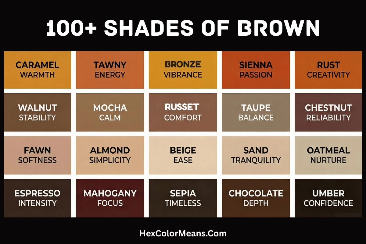
Shades of brown color stretch across one of the most grounded and versatile ranges in the color spectrum.
From soft, sandy neutrals that feel calm and natural to deep, near-black browns that feel rich and dramatic, brown carries more variety than most people expect. It does not sit in one emotional lane. It adapts.
Brown is usually formed by mixing complementary colors like blue and orange, or by blending all three primary colors together. This gives it a complex, layered nature.
Because of that, different shades of brown can completely change the mood of a space, design, or product. Some feel warm and comforting. Others feel bold, earthy, or even luxurious.
Light & Neutral Brown Shades
These shades feel soft, natural, and visually relaxing. Often created by mixing brown with white or yellow, they include beige, tan, fawn, and khaki.
These tones work as neutral foundations in home decor, fashion, and minimal design because they never overpower. They quietly support everything around them.
Light browns bring a sense of openness and simplicity. They are widely used in interiors, lifestyle branding, and websites that aim for warmth without visual noise.
Medium & Warm Brown Shades
Warm browns sit at the emotional core of the color family. Caramel, cinnamon, chestnut, and similar tones carry golden, red, or orange undertones.
These shades feel inviting, cozy, and emotionally rich. They are common in coffee brands, food packaging, furniture, and natural-themed designs.
Warm browns create connection. They feel familiar, reliable, and deeply human.
Deep & Dark Brown Shades
Dark browns move closer to black, creating a sense of depth, strength, and seriousness. Chocolate, espresso, mahogany, and walnut fall into this range.
These tones feel heavy, stable, and authoritative. Designers often use dark browns in luxury branding, formal interiors, and premium packaging where trust and sophistication matter more than brightness.
Metallic & Earth-Toned Browns
Some browns carry metallic or mineral qualities. Copper leans orange and energetic, while bronze feels darker with subtle green or gold undertones.
These shades bridge the gap between natural earth and refined metal. They are popular in product design, jewelry, architectural elements, and modern interiors where texture and visual richness play a bigger role than pure color alone.
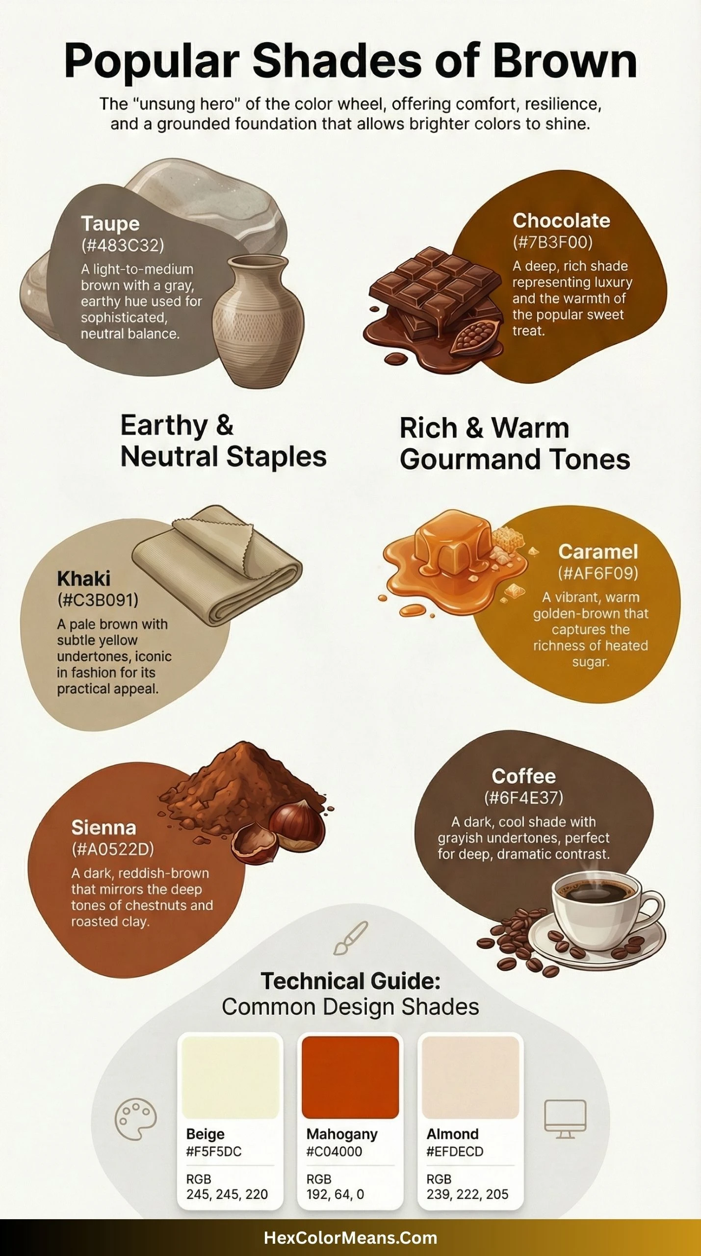
Saddle Brown
Saddle Brown (#8B4513) is a deep, rich reddish-brown. Its name is taken from the traditional color of dyed leather used in horseback riding gear. The color embodies a sense of rugged craftsmanship and the American West. This shade feels earthy and grounded, yet remarkably warm. Historically, its creation was linked to the development of aniline dyes in the 19th century. Saddle Brown represents stability, simplicity, and an appreciation for the natural world. Consequently, it is a staple for outdoor brands, leather goods marketing, and rustic home decor.
- HEX #8B4513
- RGB 139, 69, 19
- CMYK 0, 50, 86, 45
Sienna
Sienna (#A0522D) is a medium, earthy brown with strong red undertones. Its name comes from the Italian city of Siena, where the pigment has been mined since the Renaissance. It was a crucial color for old masters like Caravaggio. Sienna is the color of raw, unburnt earth and represents authenticity and natural beauty. It evokes a sense of history and timelessness. Therefore, Sienna is frequently used in historical restorations, pottery glazes, and cosmetic lines focused on natural ingredients.
- HEX #A0522D
- RGB 160, 82, 45
- CMYK 0, 49, 72, 37
Chocolate
Chocolate (#7B3F00) is a very dark, warm brown that directly mimics the color of pure cocoa. This color is intensely associated with indulgence, comfort, and sweetness. It is rich and inviting, often triggering a subconscious craving. The use of “chocolate” as a color name became popular in the 20th century with the rise of consumerism and food branding. Chocolate represents luxury and simple pleasures. It is a top choice for confectionery packaging, dessert shop interiors, and cozy, warm-toned branding.
- HEX #7B3F00
- RGB 123, 63, 0
- CMYK 0, 49, 100, 52
Peru
Peru (#CD853F) is a medium, golden-tan brown. Interestingly, the color is named after the Peru nut tree, not the country directly. It is a warm, sun-kissed shade that falls between tan and copper. Peru embodies a sense of adventure and organic warmth. It lacks the red intensity of Sienna but retains a rich, golden glow. This makes Peru perfect for representing harvest seasons, woodwork, and Southwestern aesthetics in design.
- HEX #CD853F
- RGB 205, 133, 63
- CMYK 0, 35, 69, 20
Burlywood
Burlywood (#DEB887) is a light, muted brown with a subtle pinkish-beige tone. Its name perfectly describes the look of weathered, aged wood that has been bleached by the sun. It is a soft, approachable neutral that feels casual and natural. Burlywood lacks the starkness of pure beige, giving it a warmer, more textured appearance. It is widely used in background design, paper textures, and rustic interiors to create a sense of gentle warmth and relaxed elegance.
- HEX #DEB887
- RGB 222, 184, 135
- CMYK 0, 17, 39, 13
Tan
Tan (#D2B48C) is a pale, greyish-brown that resembles the color of tanned leather or sun-bleached skin. Its name comes from the process of tanning animal hides. This color is the quintessential neutral backdrop, often used to represent simplicity and organic material. It feels soft, warm, and incredibly versatile. Tan is neither too bold nor too bland, making it a foundational color in fashion basics. Therefore, it is extensively used in interior design for walls, linen marketing, and sustainable clothing lines.
- HEX #D2B48C
- RGB 210, 180, 140
- CMYK 0, 14, 33, 18
Rosy Brown
Rosy Brown (#BC8F8F) is a muted, dusty pinkish-brown. It is essentially a brown tone softened with a significant amount of grey and a touch of rose. This color evokes sentimentality, gentleness, and quiet comfort. It has a vintage quality, often associated with faded photographs and antique fabrics. Rosy Brown represents understated femininity and warmth without intensity. It is a popular choice for shabby chic decor, cosmetic packaging for mature lines, and calming bedroom color schemes.
- HEX #BC8F8F
- RGB 188, 143, 143
- CMYK 0, 24, 24, 26
Sandy Brown
Sandy Brown (#F4A460) is a light, warm brown that vividly captures the color of beach sand at midday. It is a bright, cheerful earth tone with strong orange-yellow undertones. This color radiates warmth, casual energy, and the carefree spirit of summer. It feels dry yet inviting, like sun-baked shores. Sandy Brown is often used in travel and tourism marketing, particularly for beach resorts. It also works well in children’s products and ice cream branding to convey a sense of fun and sweetness.
- HEX #F4A460
- RGB 244, 164, 96
- CMYK 0, 33, 61, 4
Golden Brown
Golden Brown (#996515) is a deep, rich brown saturated with a distinct golden-yellow hue. It strikes a perfect balance between the earthiness of brown and the opulence of gold. This color represents quality, harvest, and accumulated wealth. It has a warmer, more optimistic feel than cooler browns. Golden Brown is frequently associated with autumn, ripe grains, and high-quality wood finishes. It is a powerful color for bakeries, honey producers, and brands that want to project a sense of premium value and natural richness.
- HEX #996515
- RGB 153, 101, 21
- CMYK 0, 34, 86, 40
Mocha
Mocha (#6F4E37) is a medium-dark, rich brown with subtle red or purple undertones. As the name suggests, it is inspired by the color of a coffee drink mixed with chocolate. This shade is the epitome of sophisticated comfort and urban warmth. It is less rustic than other browns, leaning more towards a chic, cosmopolitan feel. Mocha represents a refined taste for life’s simple luxuries. It is a dominant color in the beauty industry for hair color and makeup, as well as in cafe branding and cozy knitwear.
- HEX #6F4E37
- RGB 111, 78, 55
- CMYK 0, 30, 50, 56
Coffee
Coffee (#6F4E37) is a deep, sophisticated brown that directly mimics the color of freshly brewed black coffee. It is almost identical to Mocha in appearance but carries a slightly more bitter, earthy connotation rather than a sweet one. This color is universally associated with morning rituals, awakening, and simple daily pleasures. It grounds a space or design, providing a sense of stability and reliability. Coffee represents the working person’s luxury, the aroma of a cafe, and the comfort of routine. Therefore, it is extensively used in coffee shop branding, breakfast product packaging, and interior design for spaces meant to feel cozy and focused.
- HEX #6F4E37
- RGB 111, 78, 55
- CMYK 0, 30, 50, 56
Espresso
Espresso (#4B3832) is an extremely dark, rich brown with cool, almost black undertones. It is named after the concentrated coffee beverage and represents the deepest, most intense end of the brown spectrum. This color feels sophisticated, dense, and powerful. Unlike lighter browns that feel earthy and organic, Espresso leans into urbanity and sleekness. It absorbs light, creating a sense of depth and mystery. Espresso is a favorite in modern furniture design, luxury automotive interiors, and high-end packaging, where it conveys premium quality, seriousness, and understated elegance.
- HEX #4B3832
- RGB 75, 56, 50
- CMYK 0, 25, 33, 71
Chestnut
Chestnut (#954535) is a medium, vivid reddish-brown that captures the glossy, polished look of a ripe chestnut. It is significantly more red than other browns, giving it a fiery, energetic quality. This color is associated with autumn, vitality, and warm-blooded life. Historically, it was a common color for horse coats and leather goods. Chestnut represents a flash of warmth against the cold, a touch of the dramatic in nature. Consequently, it is a popular choice for fall fashion collections, hair color dyes, and branding for products that want to project passion and natural energy.
- HEX #954535
- RGB 149, 69, 53
- CMYK 0, 54, 64, 42
Walnut
Walnut (#773F1A) is a warm, medium-dark brown that mirrors the rich color of walnut wood and its edible shell. It is a deeply organic shade, sitting comfortably between the red of mahogany and the yellow of oak. This color evokes craftsmanship, durability, and timeless beauty. Walnut has been prized for centuries in furniture making, and its color name carries that legacy of quality. It feels solid, reliable, and handsomely classic. Walnut is ideal for luxury furniture catalogs, wooden flooring advertisements, and any brand that wants to communicate artisanal skill and long-lasting value.
- HEX #773F1A
- RGB 119, 63, 26
- CMYK 0, 47, 78, 53
Cocoa
Cocoa (#875F42) is a warm, medium brown with a balanced blend of red and yellow undertones. It represents the color of raw cocoa beans before they are processed into the dark powder we know. This shade is the essence of comfort food and natural sweetness. It is softer and milkier than dark chocolate browns, making it more approachable and gentle. Cocoa embodies nurturing, homeliness, and a connection to the earth’s bounty. It is frequently used in dessert shop branding, cozy blanket marketing, and natural food packaging to create an immediate sense of warmth and indulgent safety.
- HEX #875F42
- RGB 135, 95, 66
- CMYK 0, 30, 51, 47
Mahogany
Mahogany (#4A0100) is an exceptionally deep, dark brown that is virtually indistinguishable from black until light hits its intense red undertones. It is named after the tropical hardwood prized for its rich color and fine grain. This color reeks of old money, antiquity, and dramatic luxury. Unlike the organic feel of Walnut, Mahogany feels manufactured, polished, and stately. It represents power, formality, and high status. Historically, it adorned the interiors of banks and executive offices. Therefore, Mahogany is used in luxury branding, high-end furniture, and formal wear to project an image of unwavering authority and timeless elegance.
- HEX #4A0100
- RGB 74, 1, 0
- CMYK 0, 99, 100, 71
Umber
Umber (#635147) is a cool, muted grey-brown that sits exactly in the middle of the brown and grey spectrums. It is named after the natural earth pigment containing manganese and iron oxide. This color is the embodiment of neutrality and geological stability. It lacks the warmth of most browns, giving it a serious, almost somber quality. Umber represents raw earth, primer, and the foundation upon which other colors are built. It is widely used as a base coat in painting and in industrial design for equipment that needs to feel sturdy, reliable, and utterly without pretense.
- HEX #635147
- RGB 99, 81, 71
- CMYK 0, 18, 28, 61
Raw Umber
Raw Umber (#826644) is a medium, greenish-brown earth tone that serves as the unheated version of Burnt Umber. It has a distinct, olive-tinged quality that sets it apart from other browns. This color feels primordial, damp, and untouched by fire. It represents the color of clay straight from the earth, rich with organic matter. Raw Umber has been used as a pigment since prehistoric times, found in cave paintings. It evokes a sense of ancient history and raw naturalism. Artists and designers use it to create muted, natural palettes that feel grounded in the literal earth.
- HEX #826644
- RGB 130, 102, 68
- CMYK 0, 22, 48, 49
Burnt Umber
Burnt Umber (#8A3324) is a rich, warm reddish-brown created by heating Raw Umber pigment. This process dehydrates the iron oxides, deepening the color and bringing out intense red undertones. It is the color of scorched earth, autumn leaves, and fired clay. Burnt Umber represents transformation through heat, the change from raw to finished. It is a standard color in every artist’s paint set, used for shadows and skin tones. This color conveys warmth, intensity, and a sense of alchemical change. It is perfect for branding that wants to evoke traditional craftsmanship, pottery, or the heat of the forge.
- HEX #8A3324
- RGB 138, 51, 36
- CMYK 0, 63, 74, 46
Sepia
Sepia (#704214) is a dark, muted brownish-grey with a distinct cool, almost purple undertone. Its name comes from the cuttlefish, Sepia, whose ink was originally used to make this pigment. This color is inextricably linked to nostalgia, history, and the photographic past. It is the color of aged photographs, antique manuscripts, and old maps. Sepia represents memory, the passage of time, and a romanticized view of history. It evokes a sense of permanence and fading glory. Therefore, Sepia filters are ubiquitous in digital media to create a vintage feel, and it is used extensively in historical publishing and heritage branding.
- HEX #704214
- RGB 112, 66, 20
- CMYK 0, 41, 82, 56
Bronze
Bronze (#CD7F32) is a metallic, golden-brown that mimics the appearance of the aged metal alloy. It sits at the intersection of brown and gold, carrying the warmth of copper and the prestige of gold. This color is the universal symbol for third place, achievement, and honorable mention. Historically, it represents the Bronze Age, a pivotal era of human advancement. Bronze embodies durability, artistic casting, and a weathered beauty that improves with age. It is widely used in awards, sculpture marketing, and vintage design to convey a sense of earned recognition and classical artistry.
- HEX #CD7F32
- RGB 205, 127, 50
- CMYK 0, 38, 76, 20
Copper
Copper (#B87333) is a bright, reddish-brown metallic shade that captures the gleam of the raw metal. It is significantly more orange and pink than Bronze, giving it a lively, energetic quality. This color is associated with conductivity, craftsmanship, and vitality. Copper represents the glow of fire, the shine of a newly minted penny, and the warmth of cooking pots. It is believed to have healing and conductive properties. Consequently, Copper is a favorite in kitchenware branding, electrical product design, and wellness marketing, where it projects warmth, utility, and natural energy.
- HEX #B87333
- RGB 184, 115, 51
- CMYK 0, 38, 72, 28
Rust
Rust (#B7410E) is a vivid, orange-reddish brown that directly mimics the color of oxidized iron. It is the most aggressive and fiery of all browns, leaning so far into red and orange that it almost leaves the brown family. This color represents decay, age, and the inevitable passage of time. Paradoxically, it also evokes the industrial revolution, the red dust of Mars, and the raw power of corrosion. Rust embodies a raw, untamed beauty found in abandonment. It is used in industrial design, autumn color palettes, and grunge aesthetics to convey raw texture, age, and a weather-beaten authenticity.
- HEX #B7410E
- RGB 183, 65, 14
- CMYK 0, 64, 92, 28
Cinnamon
Cinnamon (#7B3F00) is a warm, medium-dark brown with distinct red-orange undertones, identical in value to Chocolate but with a spicier perception. It is named after the aromatic spice derived from tree bark. This color evokes warmth, sweetness, and exotic spice. It smells as good as it looks, triggering sensory memories of baking and holidays. Cinnamon represents comfort with an edge of foreign intrigue. Historically, it was a rare and valuable commodity. Therefore, Cinnamon is a powerful choice for autumn-themed marketing, candle branding, and any product that wants to convey cozy warmth with a hint of the exotic.
- HEX #7B3F00
- RGB 123, 63, 0
- CMYK 0, 49, 100, 52
Caramel
Caramel (#AF6F09) is a rich, golden-brown that captures the color of melted sugar cooked to perfection. It is lighter and more yellow than Toffee, with a glossy, molten quality. This color is the embodiment of indulgence, stickiness, and sweet satisfaction. It represents the transformation of simple ingredients into something decadent. Caramel feels warm, soft, and liquid, even in solid form. It triggers immediate cravings and associations with dessert. Consequently, Caramel is extensively used in confectionery packaging, ice cream marketing, and beauty products for hair and skin where a sweet, warm glow is desired.
- HEX #AF6F09
- RGB 175, 111, 9
- CMYK 0, 37, 95, 31
Toffee
Toffee (#755139) is a medium-dark, warm brown with a balanced blend of red and yellow undertones. Unlike the molten quality of Caramel, Toffee represents the hardened, set version of sugar confection. This color feels chewy, dense, and substantial. It embodies the comfort of British confectionery and the richness of butter and sugar combined. Toffee is less sweet-looking than Caramel, carrying a more sophisticated, earthy warmth. It represents stability and simple pleasures. Therefore, Toffee is frequently used in cozy knitwear, autumnal decor, and gourmet snack branding to convey hearty warmth and rustic quality.
- HEX #755139
- RGB 117, 81, 57
- CMYK 0, 31, 51, 54
Taupe
Taupe (#483C32) is a dark, cool grey-brown that sits exactly on the boundary between brown and grey. Its name comes from the French word for mole, reflecting its subterranean, neutral character. This color is the ultimate chameleon, appearing brown in some lights and grey in others. Taupe represents sophistication, urbanity, and understated elegance. It lacks the rustic warmth of earth tones, making it a favorite in modern minimalist design. Taupe is extensively used in fashion fundamentals, luxury apartment paints, and high-end corporate interiors where a sense of quiet refinement and timeless neutrality is required.
- HEX #483C32
- RGB 72, 60, 50
- CMYK 0, 17, 31, 72
Mink
Mink (#5B504F) is a soft, warm greyish-brown that mimics the luxurious fur of the mink animal. It is slightly warmer than Taupe, with subtle purple-red undertones that give it a plush, tactile quality. This color evokes softness, warmth, and understated luxury. It feels like something you want to touch, like high-end fabric or a cozy blanket. Mink represents a quiet, comfortable wealth that doesn’t need to shout. It is a dominant color in the fashion industry for coats and accessories, as well as in interior design for creating serene, luxurious living spaces that feel inviting rather than ostentatious.
- HEX #5B504F
- RGB 91, 80, 79
- CMYK 0, 12, 13, 64
Hazel
Hazel (#8E7618) is an unusual, olive-tinged brown that captures the complex color of hazel eyes. It is a brown deeply infused with green and gold, making it one of the most dynamic shades in the brown family. This color represents mystery, changeability, and the blending of earth and plant life. It evokes the dappled light of a forest, the color of moss on bark, and the flecks in a curious eye. Hazel embodies versatility and hidden depths. It is a striking choice for eyewear branding, natural cosmetics, and any design that wants to capture a sense of intriguing complexity and organic fusion.
- HEX #8E7618
- RGB 142, 118, 24
- CMYK 0, 17, 83, 44
Beaver
Beaver (#9F8170) is a medium, warm greyish-brown that takes its name from the color of the North American rodent’s fur. It is a practical, utilitarian brown that lacks the glamour of Mink or the mystery of Taupe. This color represents industriousness, construction, and natural adaptation. It is the color of dams, lodges, and durable pelts. Beaver feels honest, hardworking, and unpretentious. It embodies the spirit of craftsmanship and building. Consequently, Beaver is often used in outdoor workwear, construction branding, and natural building materials to convey a sense of reliable labor and earnest functionality.
- HEX #9F8170
- RGB 159, 129, 112
- CMYK 0, 19, 30, 38
Fawn
Fawn (#E5AA70) is a light, soft yellowish-brown that mirrors the color of a young deer’s coat. It is one of the gentlest, most delicate shades in the brown family, carrying a distinct warmth without any heaviness. This color represents innocence, vulnerability, and new life. It feels tender, approachable, and quietly optimistic. Fawn has been a popular color in fashion for decades, particularly in spring collections and children’s wear. It embodies a soft, nurturing warmth that doesn’t overwhelm. Therefore, Fawn is extensively used in baby product branding, spring decor, and soft furnishings to create an atmosphere of gentle comfort and youthful tenderness.
- HEX #E5AA70
- RGB 229, 170, 112
- CMYK 0, 26, 51, 10
Latte
Latte (#C19A6B) is a medium-light, creamy brown that captures the perfect blend of coffee and steamed milk. It is warmer and milkier than Tan, with a smooth, velvety quality. This color represents the morning ritual, the cafe experience, and the comfort of a warm drink in your hands. Latte feels sophisticated yet approachable, urban yet cozy. It embodies the modern coffeehouse culture that has spread across the world. This shade is a favorite in cafe branding, cozy interior design, and fashion basics where a warm, neutral tone is needed to create an inviting, relaxed atmosphere.
- HEX #C19A6B
- RGB 193, 154, 107
- CMYK 0, 20, 45, 24
Maple
Maple (#C04000) is a vivid, intense reddish-orange brown that captures the color of maple wood and its famous syrup. It is one of the brightest, most energetic browns, leaning heavily into orange and red tones. This color represents autumn in full blaze, the tapping of trees, and the sweetness of natural sap. Maple feels alive, vibrant, and full of energy. It demands attention without being as aggressive as Rust. Maple embodies the peak of fall foliage and the warmth of a sugar shack. Consequently, it is a powerful choice for autumn marketing, Canadian branding, and any product that wants to convey natural sweetness with energetic warmth.
- HEX #C04000
- RGB 192, 64, 0
- CMYK 0, 67, 100, 25
Brandy
Brandy (#87413F) is a medium, dusty reddish-brown with distinct purple-pink undertones. Unlike most browns that lean orange or yellow, Brandy has a cool, vinous quality. It is named after the distilled wine, and it carries that association of celebration, warmth from within, and aged sophistication. This color feels like a cozy fire in a dark room, like the glow of a snifter held in your hand. Brandy represents refinement, relaxation, and the good life. It is a unique brown that works beautifully in wine branding, evening wear, and sophisticated interiors where a touch of warmth with cool complexity is desired.
- HEX #87413F
- RGB 135, 65, 63
- CMYK 0, 52, 53, 47
Bistre
Bistre (#3D2B1F) is a very dark, cool greyish-brown that resembles wood stain or old ink. Its name comes from the pigment made from beechwood soot, used by artists in the Renaissance. This color is the essence of shadow, age, and old master drawings. It feels ancient, serious, and deeply grounded. Bistre lacks any warmth or brightness, sitting firmly in the realm of the subdued and the historical. It represents the base layer, the underdrawing, the foundation of a masterpiece. Therefore, Bistre is used in archival design, historical reproductions, and any project that wants to evoke a sense of serious age and artistic tradition.
- HEX #3D2B1F
- RGB 61, 43, 31
- CMYK 0, 30, 49, 76
Otter Brown
Otter Brown (#654321) is a medium-dark, rich brown that captures the sleek, water-resistant coat of the river otter. It is a pure, unadulterated brown with minimal red or yellow undertones, making it feel almost archetypal. This color represents playfulness, adaptability, and sleek naturalism. It feels wet and smooth, like an animal slipping through water. Otter Brown embodies the spirit of wilderness and the joy of natural creatures. It is neither too warm nor too cool, striking a perfect balance. Consequently, this shade is ideal for wildlife branding, outdoor gear, and any design that wants to convey a sense of natural agility and earthy authenticity.
- HEX #654321
- RGB 101, 67, 33
- CMYK 0, 34, 67, 60
Tawny
Tawny (#CD5700) is a vivid, orange-brown that sits at the brightest end of the brown spectrum. It is the color of lion’s manes, autumn grasses, and the feathers of certain owls. This color radiates wild energy, savanna heat, and predatory grace. Tawny is significantly more orange than brown, giving it a burning, sun-drenched quality. It represents the peak of summer, the dry season, and the wild beauty of nature at its most intense. Tawny is a commanding color that cannot be ignored. It is frequently used in sports branding, wildlife conservation logos, and any project that needs to project fierce warmth and natural power.
- HEX #CD5700
- RGB 205, 87, 0
- CMYK 0, 58, 100, 20
Pecan
Pecan (#5E3A1A) is a medium-dark, warm brown with distinct golden undertones that mirror the color of the pecan nut’s shell. It is a sweet, approachable brown that feels both rustic and refined. This color represents the American South, harvest time, and the rich flavor of pecan pie. Pecan feels warm, nutty, and naturally comforting. It lacks the intensity of darker browns, making it more versatile for everyday use. Pecan embodies the warmth of a kitchen during baking and the simplicity of natural foods. Therefore, it is a popular choice for bakery branding, wooden furniture, and cozy autumn decor.
- HEX #5E3A1A
- RGB 94, 58, 26
- CMYK 0, 38, 72, 63
Driftwood
Driftwood (#836953) is a medium, weathered grey-brown that captures the appearance of wood bleached by sun and sea. It is significantly cooler and greyer than most wood tones, with a distinct saline, eroded quality. This color represents journeys, endurance, and the meeting of land and sea. It feels light, dry, and porous, like wood that has spent years floating in the ocean. Driftwood embodies the beauty of decay and the patience of natural forces. It evokes beachcombing walks and coastal serenity. This shade is extensively used in coastal interior design, beach resort branding, and natural spa products to convey a sense of weathered peace and tranquil isolation.
- HEX #836953
- RGB 131, 105, 83
- CMYK 0, 20, 37, 49
Cork
Cork (#8D6E63) is a medium, warm pinkish-brown that mimics the natural bark of the cork oak tree. It has a distinctive soft, spongy quality that feels tactile and organic. This color represents sustainability, harvest without harm, and natural texture. Cork is unique among browns for its association with wine preservation and eco-friendly materials. It feels warm, breathable, and gently textured. Cork embodies the Mediterranean landscape and the careful craft of harvesting bark without killing the tree. Consequently, it is a perfect choice for wine branding, sustainable product marketing, and natural flooring advertisements where a sense of organic responsibility and warm texture is essential.
- HEX #8D6E63
- RGB 141, 110, 99
- CMYK 0, 22, 30, 45
Sandstone
Sandstone (#786D5F) is a medium, muted grey-brown that captures the color of sedimentary rock formations. It is a geological brown, built from layers of sand compressed over millennia. This color represents stability, ancient history, and architectural permanence. It feels dry, granular, and solid underfoot. Sandstone is the color of cliff dwellings, desert canyons, and timeless monuments. It embodies the patient work of nature and the durability of stone. Unlike organic browns, Sandstone feels inert and unchanging. Therefore, it is extensively used in architectural marketing, natural stone products, and desert-inspired design palettes to convey eternal stability and earthy permanence.
- HEX #786D5F
- RGB 120, 109, 95
- CMYK 0, 9, 21, 53
Mushroom
Mushroom (#BDACA3) is a light, soft greyish-brown with distinct pink-beige undertones. It is named after the underside of a common mushroom cap, capturing its delicate, fleshy quality. This color represents subtlety, growth in darkness, and organic softness. Mushroom feels damp, cool, and quietly alive. It is a neutral that carries warmth without ever being bold. Mushroom embodies the forest floor, the quiet decay that breeds new life, and the gentle palette of fungi. This shade is a favorite in minimalist interiors, spa environments, and natural skincare packaging where a sense of gentle calm and understated organic beauty is desired.
- HEX #BDACA3
- RGB 189, 172, 163
- CMYK 0, 9, 14, 26
Khaki Brown
Khaki Brown (#C3B091) is a light, warm greyish-brown that sits between traditional khaki and true brown. It is the color of utilitarian fabric, dusty plains, and military practicality. This color represents functionality, endurance, and understated readiness. The name khaki comes from the Urdu word for dusty, and this shade carries that association of arid landscapes and practical clothing. Khaki Brown feels dry, comfortable, and unpretentious. It embodies the spirit of exploration and the practicality of clothing designed for harsh environments. Consequently, it is extensively used in outdoor apparel, safari-themed branding, and military-inspired fashion where rugged utility and earthy neutrality are paramount.
- HEX #C3B091
- RGB 195, 176, 145
- CMYK 0, 10, 26, 24
Clay Brown
Clay Brown (#B66A50) is a medium, warm reddish-brown that captures the color of natural earthen clay after firing. It is significantly more orange and red than other earth tones, giving it a fired, baked quality. This color represents pottery, the kiln, and transformation through heat. Clay Brown feels like something shaped by human hands, then hardened by fire. It embodies the ancient craft of ceramics and the warmth of terracotta pots. This shade is neither fully raw earth nor finished product—it sits in the beautiful middle ground. Clay Brown is ideal for pottery studios, terracotta product marketing, and Southwestern interior design where a sense of artisanal warmth and earthy craft is essential.
- HEX #B66A50
- RGB 182, 106, 80
- CMYK 0, 42, 56, 29
Leather Brown
Leather Brown (#5D4037) is a medium-dark, rich reddish-brown that captures the appearance of aged, oiled leather. It carries the patina of use, the softness of breaking in, and the durability of tanned hide. This color represents craftsmanship, journeys, and objects that improve with age. Leather Brown feels like a well-worn jacket, a favorite saddle, or an antique book binding. It embodies the relationship between human hands and natural materials. Unlike raw wood tones, Leather Brown has a manufactured quality—it has been worked, treated, and polished. Therefore, it is extensively used in luxury goods marketing, furniture branding, and automotive interiors to convey timeless quality and earned sophistication.
- HEX #5D4037
- RGB 93, 64, 55
- CMYK 0, 31, 41, 64
Earth Brown
Earth Brown (#5C4033) is a deep, warm brown that captures the essence of freshly turned soil. It is the most fundamental, primordial brown in the entire spectrum—the color of dirt itself. This color represents fertility, growth, and the very basis of life. It feels damp, rich, and full of potential. Earth Brown is the color of gardens after rain, of fields ready for planting, of the ground beneath our feet. It embodies humility and grounding. There is nothing manufactured or refined about this shade. Consequently, Earth Brown is a powerful choice for gardening brands, organic farming marketing, and environmental organizations where a direct connection to the living soil must be communicated.
- HEX #5C4033
- RGB 92, 64, 51
- CMYK 0, 30, 45, 64
Coyote Brown
Coyote Brown (#81613C) is a medium, greyish-tan brown named after the color of the coyote’s fur coat. It is a camouflage brown, designed by nature to blend into arid landscapes. This color represents adaptability, survival, and wild cunning. It feels dry, dusty, and perfectly suited to desert environments. Coyote Brown was adopted by military forces around the world as an effective camouflage color for arid operations. It embodies the intersection of natural evolution and human tactical design. This shade is neither flashy nor dull—it is precisely calibrated to disappear. Therefore, Coyote Brown is extensively used in military gear, outdoor equipment, and tactical apparel where blending in and functional neutrality are essential.
- HEX #81613C
- RGB 129, 97, 60
- CMYK 0, 25, 53, 49
Antique Bronze
Antique Bronze (#665D1E) is a dark, olive-tinged brown with a distinct metallic greenish-gold undertone. It captures the appearance of ancient bronze artifacts weathered by centuries. This color represents age, archaeology, and the patina of time. It feels like something dug from an ancient tomb, covered in the greenish-brown corrosion of millennia. Antique Bronze embodies the romance of history and the beauty of decay. Unlike shiny modern metals, this shade has depth and mystery. It whispers of forgotten civilizations and buried treasures. Antique Bronze is a favorite in historical reproductions, artifact packaging, and luxury branding that wants to evoke a sense of ancient provenance and timeless value.
- HEX #665D1E
- RGB 102, 93, 30
- CMYK 0, 9, 71, 60
Wood Brown
Wood Brown (#C19A6B) is a medium, warm golden-brown that captures the appearance of freshly cut timber. It is identical in value to Latte but carries a more arboreal, forested connotation. This color represents lumber, carpentry, and the beauty of trees. It feels like a workbench, a wooden floor, or a hand-carved bowl. Wood Brown embodies the grain, the knots, and the natural variation of timber. It is neither the dark of walnut nor the pale of pine—it sits in the comfortable middle of wood tones. This shade is extensively used in construction marketing, furniture catalogs, and woodworking brands where the natural beauty of wood must be celebrated.
- HEX #C19A6B
- RGB 193, 154, 107
- CMYK 0, 20, 45, 24
Bark
Bark (#5F4B32) is a medium-dark, rough brown that captures the textured appearance of tree bark. It is a rugged, vertical brown that feels like the exterior of an ancient oak or pine. This color represents protection, age, and the outer layer of life. It feels rough to the touch, deeply ridged, and resilient against weather. Bark embodies the boundary between the living tree inside and the harsh world outside. It is the color of forests in winter, of old growth, of survival. Unlike smoother browns, Bark has texture built into its very perception. Therefore, it is ideal for rustic cabin branding, forestry services, and any design that wants to project a sense of rough durability and natural resilience.
- HEX #5F4B32
- RGB 95, 75, 50
- CMYK 0, 21, 47, 63
Dirt Brown
Dirt Brown (#7A5C58) is a medium, cool reddish-brown that captures the color of common garden soil. Unlike Earth Brown, which feels rich and fertile, Dirt Brown is more utilitarian and everyday. This color represents the ordinary ground, the path we walk on, the mud after rain. It feels common, humble, and utterly unpretentious. Dirt Brown has no aspirations to luxury or beauty—it simply is what it is. This shade embodies the democratic nature of earth, the soil that belongs to everyone and no one. Consequently, Dirt Brown is used in landscaping branding, workwear, and any project that needs to communicate grounded reality without romanticizing the natural world.
- HEX #7A5C58
- RGB 122, 92, 88
- CMYK 0, 25, 28, 52
Soil Brown
Soil Brown (#6A4E42) is a medium-dark, warm brown that sits between Earth Brown and Dirt Brown in richness. It represents the topsoil layer, the living skin of the earth where seeds germinate and roots spread. This color feels crumbly, aerated, and full of organic matter. Soil Brown embodies the complex ecosystem beneath our feet—the worms, the fungi, the decay that feeds new growth. It is darker than Dirt Brown, suggesting higher organic content and greater fertility. Soil Brown is the color of productive farmland, of gardens that yield abundantly. It is extensively used in agricultural branding, composting products, and environmental education materials where the living soil must be represented accurately.
- HEX #6A4E42
- RGB 106, 78, 66
- CMYK 0, 26, 38, 58
Desert Brown
Desert Brown (#EDC9AF) is a very light, warm sandy brown that captures the color of sun-baked desert landscapes at midday. It is one of the palest, most luminous shades in the brown family, reflecting harsh sunlight rather than absorbing it. This color represents aridity, vast spaces, and the beauty of emptiness. It feels dry, warm, and endlessly expansive. Desert Brown embodies the dunes of the Sahara, the baked clay of the American Southwest, and the quiet of places where water is scarce. Unlike darker browns, this shade feels light and airy. Therefore, Desert Brown is ideal for desert resort branding, summer fashion collections, and any design that wants to evoke the peaceful vastness of arid landscapes.
- HEX #EDC9AF
- RGB 237, 201, 175
- CMYK 0, 15, 26, 7
Camel
Camel (#C19A6B) is a medium, warm golden-brown that captures the color of camel hair and the animal’s coat. It is identical in value to Latte and Wood Brown but carries a distinct animal, nomadic connotation. This color represents desert travel, endurance, and luxurious warmth. Camel hair has been prized for centuries for its softness and insulating properties. This shade embodies the romance of caravans crossing dunes, of Bedouin tents, of slow travel through harsh landscapes. Camel is a perennial favorite in fashion for coats and accessories, representing understated luxury and timeless style. It is neither flashy nor dull—it is perfectly balanced for enduring appeal.
- HEX #C19A6B
- RGB 193, 154, 107
- CMYK 0, 20, 45, 24
Ginger
Ginger (#B06500) is a vivid, orange-brown that captures the color of fresh ginger root and the spice derived from it. It is one of the brightest, spiciest browns, leaning heavily into orange and gold tones. This color represents warmth, zest, and pungent energy. Ginger feels hot, not just in temperature but in personality—it has bite and character. This shade embodies the fiery nature of the root, its use in cuisine and traditional medicine, and its association with vitality. Ginger is impossible to ignore, demanding attention with its warm intensity. Consequently, it is a powerful choice for spicy food branding, fall collections, and any product that wants to convey energetic warmth and distinctive character.
- HEX #B06500
- RGB 176, 101, 0
- CMYK 0, 43, 100, 31
Adobe
Adobe (#BD6C48) is a medium, warm reddish-brown that captures the color of sun-dried clay bricks used in Southwestern architecture. It is a structural brown, representing buildings made from the earth itself. This color feels solid, thermal, and deeply connected to the landscape. Adobe embodies the ancient building traditions of the American Southwest and Mexico, where homes are crafted from the very ground beneath them. It represents shelter, tradition, and harmony with environment. Unlike manufactured building materials, Adobe feels organic and alive. This shade is extensively used in Southwestern decor, desert architecture marketing, and any design that wants to evoke the warmth of earthen construction and the beauty of traditional building methods.
- HEX #BD6C48
- RGB 189, 108, 72
- CMYK 0, 43, 62, 26
Acorn
Acorn (#7E3817) is a deep, rich reddish-brown that captures the color of the oak nut’s cap and shell. It is a small, concentrated brown, representing the potential of a mighty tree contained in a tiny package. This color feels hard, smooth, and naturally polished. Acorn embodies potential, growth, and the cycle of forests. It is the color of squirrel hoards, autumn gatherings, and the promise of future oaks. This shade is darker and more red than many nut browns, giving it a sense of density and strength. Acorn is ideal for woodland branding, autumn decor, and natural product packaging where the power of potential and the beauty of small things must be celebrated.
- HEX #7E3817
- RGB 126, 56, 23
- CMYK 0, 56, 82, 51
Brindle
Brindle (#82776B) is a medium, muted grey-brown that captures the streaked, striped appearance of certain animal coats. It is named after the tiger-striped pattern found in dogs, cattle, and other animals. This color represents natural patterns, camouflage, and individual markings. Brindle feels textured even in solid form, suggesting the complexity of striped fur. It embodies the unique beauty of animal coats, where no two patterns are exactly alike. This shade is cooler and greyer than most browns, giving it a sophisticated, understated quality. Brindle is a favorite in pet product branding, natural textiles, and any design that wants to evoke the unique beauty of animal markings and natural patterns.
- HEX #82776B
- RGB 130, 119, 107
- CMYK 0, 8, 18, 49
Hickory
Hickory (#371D10) is a very dark, warm brown that captures the color of hickory wood and smoked meat. It is one of the darkest, smokiest browns, approaching black in its intensity. This color represents smoking, curing, and preservation through fire. Hickory feels like barbecue pits, smokehouses, and the deep flavor of wood-smoked food. It embodies the American tradition of slow-cooking meat over hardwood fires. This shade is rich, dense, and full of umami—it tastes as much as it appears. Hickory is extensively used in barbecue restaurant branding, smoked food packaging, and rustic kitchen design where the deep flavor of smoke and the tradition of wood-fired cooking must be communicated.
- HEX #371D10
- RGB 55, 29, 16
- CMYK 0, 47, 71, 78
Coffee Bean
Coffee Bean (#3B2F2F) is an extremely dark, cool brown that captures the color of unroasted or dark roasted coffee beans. It is almost black, with just enough brown to distinguish it from true black. This color represents the origin of coffee, the bean itself before grinding and brewing. Coffee Bean feels dense, hard, and full of potential energy. It embodies the global coffee trade, the farms where coffee grows, and the roasters who transform green beans into aromatic brown ones. Unlike brewed coffee colors, this shade is dry and solid. Coffee Bean is a powerful choice for coffee roastery branding, bean packaging, and any design that wants to emphasize the raw material behind the morning cup.
- HEX #3B2F2F
- RGB 59, 47, 47
- CMYK 0, 20, 20, 77
Café Noir
Café Noir (#4B3621) is a very dark, warm brown that captures the color of black coffee in its purest form. The name is French for “black coffee,” and this shade represents the essence of coffee without milk or sugar. This color feels strong, bitter, and uncompromising. It embodies the robust flavor of dark roast, the caffeine kick, and the simplicity of coffee served black. Café Noir is darker than Mocha or Coffee, approaching the depth of Espresso but with warmer undertones. It represents sophistication without sweetness, strength without apology. Consequently, this shade is extensively used in upscale coffee branding, espresso machine marketing, and any design that wants to convey the pure, unadulterated power of black coffee.
- HEX #4B3621
- RGB 75, 54, 33
- CMYK 0, 28, 56, 71
Tobacco
Tobacco (#6F4E37) is a medium-dark, warm brown that captures the color of cured tobacco leaves. It is identical in value to Mocha and Coffee but carries a distinct earthy, smoky connotation. This color represents aging, curing, and slow transformation. Tobacco leaves change from green to brown through careful drying and fermentation, and this shade embodies that patient process. It feels dry, slightly rough, and deeply traditional. Tobacco has been a cash crop for centuries, shaping economies and cultures. This brown evokes the American South, Cuban cigar rollers, and the ritual of smoking. It is used in cigar packaging, whiskey branding, and rustic decor where a sense of aged tradition and earthy masculinity is desired.
- HEX #6F4E37
- RGB 111, 78, 55
- CMYK 0, 30, 50, 56
Truffle
Truffle (#46382B) is a very dark, warm brown that captures the color of the prized underground fungus. It is a fungal brown, representing the mysterious, earthy flavor of truffles that grow hidden beneath the soil. This color feels rich, umami, and deeply savory. Truffles are among the most expensive foods in the world, and this shade carries that association of luxury and rarity. It embodies the forest floor, the partnership between fungi and tree roots, and the patient work of truffle-hunting pigs and dogs. Truffle is darker and more complex than simple earth tones, suggesting hidden depths and acquired tastes. It is ideal for gourmet food branding, luxury restaurant marketing, and any design that wants to evoke underground mystery and culinary sophistication.
- HEX #46382B
- RGB 70, 56, 43
- CMYK 0, 20, 39, 73
Nutmeg
Nutmeg (#814A2B) is a medium, warm reddish-brown that captures the color of the ground spice and the seed it comes from. It is a spice brown, carrying the warmth of holiday baking and exotic trade routes. This color represents flavor, aroma, and culinary warmth. Nutmeg feels like pumpkin pie, eggnog, and mulled wine—it is the taste of autumn and winter celebrations. This shade is brighter and more red than Cinnamon, with a distinct warmth that feels almost glowing. Nutmeg embodies the age of exploration, when nutmeg was worth more than gold and drove empires to seek the Spice Islands. It is extensively used in holiday packaging, spice branding, and cozy kitchen designs where warm flavor and festive tradition must be communicated.
- HEX #814A2B
- RGB 129, 74, 43
- CMYK 0, 43, 67, 49
Brown Sugar
Brown Sugar (#AF6E4D) is a medium, warm golden-brown that captures the color of unrefined sugar with its molasses content. It is a sweet brown, softer and more approachable than the sharpness of white sugar. This color represents baking, comfort, and natural sweetness. Brown Sugar feels moist, clumpy, and full of rich flavor. It embodies the warmth of chocolate chip cookies fresh from the oven, the stickiness of cinnamon rolls, and the depth of flavor that molasses provides. This shade is lighter and more golden than Molasses, suggesting the sugar crystals rather than the pure syrup. Brown Sugar is a favorite in dessert branding, bakery marketing, and any design that wants to evoke sweet comfort and homemade warmth.
- HEX #AF6E4D
- RGB 175, 110, 77
- CMYK 0, 37, 56, 31
Molasses
Molasses (#3B2F2F) is an extremely dark, warm brown that captures the color of thick, viscous sugar syrup. It is identical in value to Coffee Bean but carries a distinctly sweet, sticky connotation. This color represents density, slowness, and concentrated sweetness. Molasses feels thick enough to coat a spoon, heavy in the jar, and slowly pouring. It embodies the byproduct of sugar refining that became a staple of colonial trade and traditional baking. This shade is darker than Brown Sugar, suggesting the pure syrup rather than crystallized sugar. Molasses evokes gingerbread, baked beans, and the slow, rich sweetness of old-fashioned desserts. It is extensively used in traditional baking branding, rum packaging, and rustic kitchen designs where deep sweetness and colonial tradition must be communicated.
- HEX #3B2F2F
- RGB 59, 47, 47
- CMYK 0, 20, 20, 77
Coconut Husk
Coconut Husk (#5A3E36) is a medium-dark, warm reddish-brown that captures the color of the fibrous outer covering of coconuts. It is a tropical brown, representing the rough, hairy shell that protects the white flesh and water inside. This color feels fibrous, rough, and naturally textured. Coconut Husk embodies the palm-fringed beaches of the tropics, the raw material for ropes and mats, and the protective layer of the coconut itself. It is warmer and more red than simple earth tones, suggesting the specific environment of tropical islands. This shade evokes the feel of coarse fibers in your hands, the rustle of palm fronds, and the promise of the sweet water inside. It is ideal for tropical product branding, natural fiber marketing, and island-inspired design where rough texture and tropical authenticity are essential.
- HEX #5A3E36
- RGB 90, 62, 54
- CMYK 0, 31, 40, 65
Almond Brown
Almond Brown (#8B6F47) is a medium, warm golden-brown that captures the color of almonds with their skins on. It is a nut brown, representing the wholesome goodness of tree nuts and their rich, buttery flavor. This color feels crunchy, nutritious, and naturally wholesome. Almond Brown embodies orchards in bloom, the harvest of nuts, and the healthy fat that makes almonds a superfood. It is lighter and more golden than Pecan or Walnut, suggesting the specific color of the almond’s thin brown skin. This shade evokes granola, healthy snacks, and the simple pleasure of raw nuts. It is extensively used in health food branding, nut packaging, and natural cosmetics where wholesome nutrition and natural goodness must be communicated.
- HEX #8B6F47
- RGB 139, 111, 71
- CMYK 0, 20, 49, 45
Hazelnut
Hazelnut (#B08B57) is a medium, warm golden-brown that captures the color of hazelnuts and the popular coffee flavor named after them. It is a sweet nut brown, softer and creamier than the raw nut itself. This color represents spreadable sweetness, European confectionery, and the comfort of Nutella. Hazelnut feels smooth, buttery, and indulgent. It embodies the orchards of Italy and Turkey, the praline in chocolates, and the beloved flavor combination of hazelnut and chocolate. This shade is lighter and more golden than many nut browns, suggesting the roasted, ground nut rather than the raw kernel. Hazelnut is a favorite in coffeehouse branding, chocolate marketing, and any design that wants to evoke sweet indulgence with a touch of European sophistication.
- HEX #B08B57
- RGB 176, 139, 87
- CMYK 0, 21, 51, 31
Pine Cone
Pine Cone (#6A4B3C) is a medium-dark, warm brown that captures the color of pine cones fallen from evergreen trees. It is a forest brown, representing the seed-bearing structures of conifers and the woodland floor where they accumulate. This color feels scaly, woody, and naturally patterned. Pine Cone embodies the texture of overlapping scales, the resinous scent of pine, and the promise of new trees contained within. It is darker and more red than simple wood tones, suggesting the specific color of pine cones after they have dried and opened. This shade evokes walks through evergreen forests, the crackle of pine needles underfoot, and the quiet beauty of woodland details. It is ideal for forest branding, natural decor, and any design that wants to evoke the quiet depth of evergreen woodlands.
- HEX #6A4B3C
- RGB 106, 75, 60
- CMYK 0, 29, 43, 58
Oxblood Brown
Oxblood Brown (#4A0404) is an exceptionally deep, dark reddish-brown that captures the color of aged, dried blood. The name comes from the deep red-brown shade of treated oxhide leather. This color represents gravity, antiquity, and profound depth. It is one of the most intense, serious browns in existence, almost black but with smoldering red undertones that glow when hit by light. Oxblood Brown feels heavy, substantial, and deeply historical. It has been a favorite color for leather goods, academic robes, and traditional libraries for centuries. This shade embodies the patina of age, the richness of old leather bindings, and the somber elegance of Victorian interiors. Consequently, it is extensively used in luxury leather branding, traditional publishing, and sophisticated interiors where serious elegance and timeless depth are required.
- HEX #4A0404
- RGB 74, 4, 4
- CMYK 0, 95, 95, 71
Smoked Brown
Smoked Brown (#3E2723) is a very dark, cool greyish-brown that captures the color of wood and meat after exposure to smoke. It is a preserved brown, representing transformation through fire and time. This color feels hazy, obscured, and deeply aromatic. Smoked Brown embodies the ancient human practice of preserving food with smoke, the flavor of bacon and smoked fish, and the atmospheric quality of a smoke-filled room. It is cooler and greyer than most dark browns, suggesting the veil of smoke that hangs in the air. This shade evokes rustic smokehouses, campfire evenings, and the primal connection between fire and food. Smoked Brown is ideal for barbecue branding, whiskey packaging, and rustic interior design where smoky depth and primitive authenticity must be communicated.
- HEX #3E2723
- RGB 62, 39, 35
- CMYK 0, 37, 44, 76
Vintage Brown
Vintage Brown (#8B5A2B) is a medium, warm golden-brown that captures the color of aged paper, antique furniture, and sepia-toned photographs. It is a nostalgic brown, representing the passage of time and the beauty of age. This color feels weathered, treasured, and historically rich. Vintage Brown embodies the yellowing of newspaper clippings, the patina of old wooden dressers, and the warm glow of gaslight-era interiors. It is lighter and more golden than Sepia, suggesting the actual color of aged paper rather than photographic tones. This shade evokes antique shops, inherited furniture, and the romance of previous centuries. It is extensively used in vintage branding, historical reproductions, and nostalgic packaging where aged beauty and timeless appeal must be conveyed.
- HEX #8B5A2B
- RGB 139, 90, 43
- CMYK 0, 35, 69, 45
Bourbon
Bourbon (#6F4E37) is a medium-dark, warm amber-brown that captures the color of aged Kentucky straight bourbon whiskey. It is identical in value to Mocha, Coffee, and Tobacco but carries a distinct alcoholic, barrel-aged connotation. This color represents craft distillation, oak aging, and American spirit. Bourbon feels warm, smooth, and slightly intoxicating. It embodies the amber liquid swirling in a glass, the charred oak barrels where it ages, and the rich vanilla and caramel notes it develops over years. This shade is specifically American, tied to the history of Kentucky and the craftsmanship of small-batch distilling. Bourbon is a powerful choice for whiskey branding, cocktail lounge design, and any product that wants to evoke smooth warmth and craft authenticity.
- HEX #6F4E37
- RGB 111, 78, 55
- CMYK 0, 30, 50, 56
Cedar
Cedar (#5E3023) is a medium-dark, warm reddish-brown that captures the color of cedar wood, prized for its aromatic properties and resistance to decay. It is a fragrant brown, representing the distinct scent and durability of cedar trees. This color feels aromatic, resilient, and naturally preservative. Cedar embodies hope chests, closet linings, and the wood that repels moths and rot. It is warmer and more red than many wood tones, suggesting the specific hue of Western Red Cedar used in construction and storage. This shade evokes the forests of the Pacific Northwest, the scent of pencil shavings, and the security of items stored in cedar chests. Cedar is ideal for woodworking branding, aromatic product marketing, and rustic cabin design where natural fragrance and durable beauty must be communicated.
- HEX #5E3023
- RGB 94, 48, 35
- CMYK 0, 49, 63, 63
Oak
Oak (#806517) is a medium, warm olive-brown that captures the color of oak wood and its famous golden-tan hue. It is a structural brown, representing the strength and durability of the mighty oak tree. This color feels sturdy, reliable, and timelessly classic. Oak embodies the hardwood used for shipbuilding, furniture, and flooring for centuries. It is more golden and slightly greener than other wood tones, suggesting the specific color of white oak and red oak in their natural state. This shade evokes English forests, sturdy dining tables, and the grain of hardwood floors. Oak is extensively used in furniture marketing, flooring advertising, and traditional interior design where reliable strength and classic beauty must be conveyed.
- HEX #806517
- RGB 128, 101, 23
- CMYK 0, 21, 82, 50
Teak
Teak (#7A5C58) is a medium, warm greyish-brown that captures the color of teak wood, prized for its water resistance and golden-brown hue. It is identical in value to Dirt Brown but carries a distinct nautical, outdoor connotation. This color represents marine craftsmanship, outdoor furniture, and tropical luxury. Teak feels smooth, oily, and naturally resistant to water and rot. It embodies the decks of luxury yachts, the chairs on tropical resort patios, and the durability required for outdoor living. This shade is warmer and more golden than many grey-browns, suggesting the specific color of aged teak that has weathered to a silvery patina. Teak is a favorite in marine supply branding, outdoor furniture marketing, and tropical resort design where water resistance and outdoor elegance are essential.
- HEX #7A5C58
- RGB 122, 92, 88
- CMYK 0, 25, 28, 52
Wheat Brown
Wheat Brown (#C9AE5D) is a light, warm golden-brown that captures the color of ripe wheat fields ready for harvest. It is one of the brightest, most golden shades in the brown family, leaning heavily into yellow tones. This color represents abundance, harvest, and sustenance. Wheat Brown feels like endless fields under a summer sun, the grain that becomes our daily bread, and the cycle of planting and reaping. It embodies agricultural tradition and the fundamental human relationship with cereal crops. This shade is lighter and more yellow than Tan or Camel, suggesting the specific color of ripe wheat stalks. It is extensively used in baking branding, agricultural marketing, and harvest-themed decor where golden abundance and agricultural richness must be communicated.
- HEX #C9AE5D
- RGB 201, 174, 93
- CMYK 0, 13, 54, 21
Macchiato
Macchiato (#7A4A3E) is a medium, warm reddish-brown that captures the color of espresso marked with a small amount of steamed milk. The name means “stained” or “marked” in Italian, referring to milk staining the coffee. This color represents coffeehouse culture, Italian tradition, and perfect balance. Macchiato feels smooth, warm, and carefully crafted. It embodies the moment when dark espresso meets white milk, creating a distinct layered beverage. This shade is lighter than pure espresso but darker than latte, suggesting the specific ratio of coffee to milk in a macchiato. It evokes the barista’s craft, the morning coffee ritual, and the sophistication of Italian coffee culture. Macchiato is ideal for coffee shop branding, cafe interior design, and any product that wants to evoke artisanal coffee with Italian elegance.
- HEX #7A4A3E
- RGB 122, 74, 62
- CMYK 0, 39, 49, 52
Burnt Coffee
Burnt Coffee (#3A2C2A) is an extremely dark, warm brown that captures the color of coffee beans roasted past their prime to a dark, almost carbonized state. It is a scorched brown, representing the edge between perfect roast and complete carbonization. This color feels intense, slightly bitter, and deeply roasted. Burnt Coffee embodies the dark roasts favored in espresso blends, the smoky notes of French roast, and the thin line between rich and burnt. It is darker than standard coffee browns, suggesting beans that have been pushed to their limit. This shade evokes the roaster’s art, the boldest coffee flavors, and the intensity required for perfect espresso. Burnt Coffee is a powerful choice for dark roast branding, espresso machine marketing, and any design that wants to convey maximum intensity and bold flavor.
- HEX #3A2C2A
- RGB 58, 44, 42
- CMYK 0, 24, 28, 77
Spice Brown
Spice Brown (#6A2E1F) is a medium-dark, intense reddish-brown that captures the color of dried spices like paprika, cayenne, and chili powder. It is one of the hottest, most fiery browns, leaning heavily into red and orange tones. This color represents heat, flavor, and culinary adventure. Spice Brown embodies the global spice trade, the warmth of ethnic cuisine, and the kick of chili peppers. It feels hot to the tongue, aromatic in the kitchen, and vibrantly alive. This shade is more red than Cinnamon or Nutmeg, suggesting the specific color of ground red spices. It evokes bustling spice markets, simmering pots of curry, and the bold flavors of world cuisine. Spice Brown is extensively used in hot sauce branding, ethnic food marketing, and any design that wants to convey culinary heat and flavorful intensity.
- HEX #6A2E1F
- RGB 106, 46, 31
- CMYK 0, 57, 71, 58
Chocolate Truffle
Chocolate Truffle (#4E342E) is a very dark, warm brown that captures the color of the luxurious French confection. It is a decadent brown, representing the pinnacle of chocolate indulgence. This color feels velvety, smooth, and sinfully rich. Chocolate Truffle embodies the ganache center, the cocoa powder dusting, and the hand-rolled craftsmanship of artisanal chocolates. It is darker than Milk Chocolate, suggesting the higher cocoa content of dark chocolate truffles. This shade evokes upscale chocolatiers, Valentine’s Day boxes, and the moment of biting through a delicate shell into a soft center. Chocolate Truffle is a favorite in luxury confectionery branding, high-end dessert marketing, and romantic packaging where ultimate indulgence and decadent richness must be communicated.
- HEX #4E342E
- RGB 78, 52, 46
- CMYK 0, 33, 41, 69
Dark Cocoa
Dark Cocoa (#35281E) is an extremely dark, warm brown that captures the color of high-percentage dark chocolate and unsweetened cocoa powder. It is one of the darkest, purest chocolate browns, approaching black but maintaining distinct warmth. This color represents antioxidants, bitter sweetness, and sophisticated palates. Dark Cocoa embodies the trend toward high-cocoa-content chocolate, the health benefits of dark chocolate, and the complex flavor notes of single-origin beans. It is darker than Milk Chocolate or Chocolate Truffle, suggesting the intensity of 70% and above cocoa content. This shade evokes artisanal chocolate bars, health-conscious indulgence, and the complex bitterness that sophisticated chocolate lovers crave. Dark Cocoa is ideal for dark chocolate branding, health-focused confectionery, and any design that wants to convey intense purity and sophisticated bitterness.
- HEX #35281E
- RGB 53, 40, 30
- CMYK 0, 25, 43, 79
Milk Chocolate
Milk Chocolate (#7B3F00) is a medium-dark, warm brown that captures the color of classic milk chocolate bars. It is identical in value to Chocolate and Cinnamon but carries a distinct creamy, sweet connotation. This color represents childhood treats, comfort candy, and universal appeal. Milk Chocolate embodies the candy bars of youth, the chocolate Easter bunnies, and the familiar taste that pleases almost everyone. It is lighter and warmer than Dark Cocoa, suggesting the addition of milk and sugar that defines milk chocolate. This shade evokes trick-or-treat hauls, chocolate chip cookies, and the simple pleasure of a chocolate bar. Milk Chocolate is extensively used in confectionery branding, children’s product marketing, and nostalgic packaging where sweet comfort and universal appeal must be communicated.
- HEX #7B3F00
- RGB 123, 63, 0
- CMYK 0, 49, 100, 52
Light Mocha
Light Mocha (#B38B6D) is a medium-light, warm brown that captures the color of coffee with a generous amount of milk. It is a creamy brown, softer and more approachable than darker coffee tones. This color represents gentle warmth, morning comfort, and relaxed cafe culture. Light Mocha embodies the first sip of a milky coffee, the cozy atmosphere of neighborhood coffee shops, and the gentle start to a day. It is lighter than Mocha or Latte, suggesting a higher ratio of milk to coffee. This shade evokes weekend brunches, comfortable armchairs, and the simple pleasure of a warm drink. Light Mocha is a favorite in coffee shop branding, cozy interior design, and any product that wants to convey gentle warmth and relaxed comfort.
- HEX #B38B6D
- RGB 179, 139, 109
- CMYK 0, 22, 39, 30
Deep Bronze
Deep Bronze (#804A00) is a medium-dark, rich golden-brown that captures the color of bronze metal with deep, aged patina. It is a metallic brown, representing the intersection of earth and metal, of natural ore and human craftsmanship. This color feels heavy, valuable, and anciently wrought. Deep Bronze embodies the Bronze Age, the casting of statues and weapons, and the warm glow of well-preserved artifacts. It is darker and richer than standard Bronze, suggesting metal that has developed depth through age and handling. This shade evokes archaeological treasures, Olympic medals, and the warm luster of historical metalwork. Deep Bronze is extensively used in award manufacturing, heritage branding, and luxury packaging where ancient value and metallic warmth must be communicated.
- HEX #804A00
- RGB 128, 74, 0
- CMYK 0, 42, 100, 50
Antique Brown
Antique Brown (#8B5A2B) is a medium, warm golden-brown that captures the color of aged furniture, vintage photographs, and historical documents. It is identical in value to Vintage Brown but carries an even stronger sense of genuine age and historical authenticity. This color represents provenance, inheritance, and the beauty of wear. Antique Brown embodies the patina of a table passed down through generations, the yellowed pages of a family Bible, and the warm glow of oil paintings darkened by time. It feels genuinely old rather than artificially distressed. This shade evokes estate sales, museum collections, and the privilege of owning something with history. Antique Brown is a favorite in antique store branding, restoration marketing, and heritage packaging where genuine age and historical authenticity are essential.
- HEX #8B5A2B
- RGB 139, 90, 43
- CMYK 0, 35, 69, 45
Rustic Brown
Rustic Brown (#593E1A) is a medium-dark, warm earthy brown that captures the color of rough-hewn timber and country simplicity. It is a rural brown, representing the charm of countryside living and traditional building methods. This color feels rough, honest, and unpretentious. Rustic Brown embodies log cabins, barn wood, and the simple life away from cities. It is warmer and more golden than many earthy browns, suggesting the specific color of wood used in rural construction. This shade evokes crackling fireplaces, handmade furniture, and the peace of country mornings. Rustic Brown is extensively used in cabin rental marketing, country decor branding, and outdoor equipment advertising where rural simplicity and honest craftsmanship must be conveyed.
- HEX #593E1A
- RGB 89, 62, 26
- CMYK 0, 30, 71, 65
Parchment Brown
Parchment Brown (#E6CBA8) is a very light, warm creamy brown that captures the color of ancient writing material made from animal skin. It is one of the palest, most delicate browns, almost beige but with distinct warmth. This color represents writing, history, and recorded knowledge. Parchment Brown embodies medieval manuscripts, illuminated texts, and the documents that preserved human knowledge through the ages. It is lighter and creamier than standard paper tones, suggesting the specific color of treated animal skin used before paper became common. This shade evokes monastery scriptoriums, ancient libraries, and the weight of historical documents. Parchment Brown is a favorite in historical publishing, calligraphy supplies, and any design that wants to evoke ancient knowledge and written tradition.
- HEX #E6CBA8
- RGB 230, 203, 168
- CMYK 0, 12, 27, 10
Weathered Wood
Weathered Wood (#7E6A52) is a medium, muted grey-brown that captures the color of wood exposed to years of sun, rain, and wind. It is a aged timber brown, representing the beauty of natural decay and the passage of time. This color feels dry, cracked, and patiently worn. Weathered Wood embodies beach boardwalks, abandoned barns, and fence posts that have stood for decades. It is greyer and cooler than fresh wood tones, suggesting the bleaching effect of sun and the washing effect of rain. This shade evokes coastal cottages, rustic retreats, and the quiet beauty of things left to weather naturally. Weathered Wood is extensively used in coastal interior design, rustic home branding, and natural building materials where aged beauty and natural weathering must be communicated.
- HEX #7E6A52
- RGB 126, 106, 82
- CMYK 0, 16, 35, 51
Ash Brown
Ash Brown (#5A5047) is a medium, cool grey-brown that captures the color of wood ash after a fire has completely burned out. It is a residual brown, representing what remains after combustion—the mineral content that fire cannot destroy. This color feels cool, powdery, and utterly still. Ash Brown embodies the aftermath of fire, the gray remains of campfires, and the quiet of a landscape after a burn. It is cooler and greyer than most browns, suggesting the complete absence of organic matter. This shade evokes volcanic landscapes, fireplace clean-out, and the cycle of destruction and renewal through fire. Ash Brown is a favorite in minimalist design, industrial interiors, and any project that wants to convey cool stillness and elemental reduction.
- HEX #5A5047
- RGB 90, 80, 71
- CMYK 0, 11, 21, 65
Shadow Brown
Shadow Brown (#3C2F2F) is a very dark, cool grey-brown that captures the color of deep shadows in forests and dimly lit rooms. It is a recessive brown, representing the places where light does not reach. This color feels mysterious, protected, and deeply quiet. Shadow Brown embodies the space beneath trees, the corners of old rooms, and the transition between light and dark. It is cooler and greyer than many dark browns, suggesting the absence of warmth that characterizes true shadow. This shade evokes twilight forests, intimate dining rooms, and the peaceful darkness before sleep. Shadow Brown is extensively used in moody interior design, atmospheric branding, and any project that wants to convey quiet mystery and peaceful depth.
- HEX #3C2F2F
- RGB 60, 47, 47
- CMYK 0, 22, 22, 76
Burnt Sienna
Burnt Sienna (#E97451) is a medium-light, vivid reddish-brown that captures the color of heated sienna pigment. It is created by heating raw sienna, which dehydrates the iron oxides and deepens the color dramatically. This color represents heat, transformation, and earthy warmth. Burnt Sienna is one of the brightest, most energetic earth tones, with a fiery quality that commands attention. It embodies the kiln, the sunset, and the most intense autumn leaves. This shade has been used by artists since the Renaissance for its warmth and transparency. Burnt Sienna evokes Italian landscapes, terracotta pottery, and the glow of a dying fire. It is a powerful choice for art supply branding, sunset-themed designs, and any project that wants to convey earthy heat and artistic tradition.
- HEX #E97451
- RGB 233, 116, 81
- CMYK 0, 50, 65, 9
Copper Penny
Copper Penny (#AD6F69) is a medium, muted reddish-brown that captures the color of an aged, tarnished copper coin. It is a weathered metallic brown, representing the beauty of oxidation on formerly bright metal. This color feels familiar, circulated, and democratically valuable. Copper Penny embodies the pocket change of everyday life, the worn coins passed from hand to hand, and the warm glow of copper left to age naturally. It is softer and pinker than bright Copper, suggesting the specific patina of well-handled pennies. This shade evokes childhood piggy banks, vintage cash registers, and the humble beauty of small currency. Copper Penny is a favorite in vintage branding, nostalgic packaging, and any design that wants to evoke everyday value and worn familiarity.
- HEX #AD6F69
- RGB 173, 111, 105
- CMYK 0, 36, 39, 32
Cognac
Cognac (#9A463D) is a medium, rich reddish-brown that captures the color of aged French brandy. It is a spirited brown, representing the amber liquid aged in oak barrels and the sophistication of French luxury. This color feels smooth, warm, and distinctly upscale. Cognac embodies the swirling of brandy in a snifter, the leather of a club chair, and the cigar smoke of a private lounge. It is more red and transparent than whiskey browns, suggesting the specific color of high-quality Cognac aged for decades. This shade evokes French luxury, gentlemen’s clubs, and the pinnacle of distilled spirits. Cognac is extensively used in spirits branding, luxury leather goods, and sophisticated interior design where aged elegance and French luxury must be communicated.
- HEX #9A463D
- RGB 154, 70, 61
- CMYK 0, 55, 60, 40
Brass Brown
Brass Brown (#B5A642) is a medium, warm olive-golden brown that captures the color of aged brass metal. It is a metallic brown with distinct greenish-gold undertones, representing the unique patina of brass alloys. This color feels ornamental, musical, and traditionally decorative. Brass Brown embodies vintage musical instruments, antique doorknobs, and the warm glow of polished brass fixtures. It is more golden and greener than copper or bronze tones, suggesting the specific zinc-copper alloy that creates brass. This shade evokes marching bands, nautical instruments, and the warm hospitality of brass-fitted pubs. Brass Brown is a favorite in musical instrument marketing, traditional decor, and heritage branding where ornamental warmth and traditional craftsmanship must be conveyed.
- HEX #B5A642
- RGB 181, 166, 66
- CMYK 0, 8, 64, 29
Old Leather
Old Leather (#654321) is a medium-dark, warm brown that captures the color of well-worn, aged leather goods. It is identical in value to Otter Brown but carries a distinct manufactured, well-used connotation. This color represents patina, character, and objects that improve with age. Old Leather embodies a favorite wallet passed down for years, a vintage baseball glove, or an heirloom belt softened by decades of use. It feels supple, creased, and deeply personal. This shade is warmer and richer than new leather, suggesting the oils from human hands and the slow transformation of material through use. Old Leather evokes antique shops, inherited accessories, and the unique relationship between owner and object. It is extensively used in leather goods marketing, vintage fashion, and heritage branding where earned patina and personal history must be communicated.
- HEX #654321
- RGB 101, 67, 33
- CMYK 0, 34, 67, 60
Harvest Brown
Harvest Brown (#7C4A1E) is a medium-dark, warm golden-brown that captures the color of autumn’s bounty—the ripe grains, pumpkins, and dried corn of harvest season. It is a seasonal brown, representing the culmination of a year’s labor in the fields. This color feels abundant, grateful, and rich with yield. Harvest Brown embodies Thanksgiving tables, cornucopias, and the satisfaction of gathering what has been sown. It is warmer and more golden than many earth tones, suggesting the specific colors of autumn at its peak. This shade evokes hayrides, harvest festivals, and the golden light of late October afternoons. Harvest Brown is a favorite in fall marketing, agricultural branding, and seasonal decor where autumn abundance and grateful harvest must be conveyed.
- HEX #7C4A1E
- RGB 124, 74, 30
- CMYK 0, 40, 76, 51
Café Latte
Café Latte (#C6A47E) is a light, warm creamy brown that captures the color of espresso with a significant amount of steamed milk. It is a milky brown, softer and more approachable than darker coffee tones. This color represents morning rituals, cafe comfort, and Italian coffee culture. Café Latte embodies the large, milky coffee served in cafes across Europe, the comforting warmth of a morning cup, and the relaxed pace of cafe conversation. It is lighter than Latte or Light Mocha, suggesting the specific ratio of one part coffee to three parts milk that defines a latte. This shade evokes weekend brunches, coffee shop windows, and the simple pleasure of a warm drink. Café Latte is extensively used in coffeehouse branding, breakfast marketing, and cozy interior design where milky warmth and cafe comfort must be communicated.
- HEX #C6A47E
- RGB 198, 164, 126
- CMYK 0, 17, 36, 22
Warm Taupe
Warm Taupe (#6E5849) is a medium, warm grey-brown that balances the neutrality of taupe with the comfort of brown. It is a bridge color, sitting precisely between cool grey and warm brown. This color represents sophisticated neutrality, urban warmth, and timeless design. Warm Taupe embodies the perfect background—neither too cold nor too warm, neither too bold nor too bland. It is the color of high-end apartment walls, luxury hotel lobbies, and designer fashion basics. This shade is warmer than standard taupe but maintains its sophisticated neutrality. Warm Taupe evokes minimalist elegance, Scandinavian design, and the quiet luxury of perfectly chosen neutrals. It is a favorite in interior design, high-end fashion, and luxury branding where sophisticated neutrality and timeless elegance must be conveyed.
- HEX #6E5849
- RGB 110, 88, 73
- CMYK 0, 20, 34, 57
Dune Brown
Dune Brown (#C2B280) is a light, warm sandy brown that captures the color of desert sand dunes at golden hour. It is one of the lightest, most luminous browns, reflecting the warm light of low sun on sand. This color represents desert beauty, wind-sculpted landscapes, and peaceful vastness. Dune Brown embodies the rolling hills of sand in the Sahara, the quiet of empty deserts, and the play of light on wind-rippled surfaces. It is lighter and more golden than Desert Brown or Sandstone, suggesting the specific color of sand illuminated by golden light. This shade evokes desert adventures, peaceful solitude, and the ancient beauty of arid landscapes. Dune Brown is extensively used in travel marketing, desert resort branding, and peaceful interior design where golden serenity and desert beauty must be communicated.
- HEX #C2B280
- RGB 194, 178, 128
- CMYK 0, 8, 34, 24
Pueblo Brown
Pueblo Brown (#7E4A35) is a medium, warm reddish-brown that captures the color of adobe buildings in the American Southwest. It is a structural brown, representing the ancient building traditions of Pueblo peoples and Spanish colonists. This color feels earthy, ancient, and deeply connected to place. Pueblo Brown embodies the multi-story dwellings of Taos, the missions of New Mexico, and the timeless architecture of the desert Southwest. It is warmer and more red than Adobe, suggesting the specific color of sun-dried clay bricks in the high desert light. This shade evokes Native American heritage, Spanish colonial history, and the profound beauty of buildings made from the earth itself. Pueblo Brown is a favorite in Southwestern design, heritage tourism marketing, and any project that wants to evoke ancient tradition and desert architecture.
- HEX #7E4A35
- RGB 126, 74, 53
- CMYK 0, 41, 58, 51
Tiramisu
Tiramisu (#6F4B3E) is a medium-dark, warm brown that captures the color of the beloved Italian dessert. It is a dessert brown, representing the layers of coffee-soaked ladyfingers and cocoa-dusted mascarpone. This color feels indulgent, layered, and distinctly Italian. Tiramisu embodies the perfect bite of the dessert—the bitterness of coffee, the sweetness of cream, and the richness of cocoa. It is warmer and more complex than simple coffee browns, suggesting the multiple layers that make up the dessert. This shade evokes Italian restaurants, celebratory dinners, and the pure pleasure of a well-made dessert. Tiramisu is extensively used in restaurant branding, dessert marketing, and Italian food packaging where layered indulgence and Italian comfort must be communicated.
- HEX #6F4B3E
- RGB 111, 75, 62
- CMYK 0, 32, 44, 56
Raisin Brown
Raisin Brown (#4F3A3C) is a very dark, cool purple-brown that captures the color of dried grapes. It is a fruit brown, representing the concentrated sweetness of raisins and the purple undertones of their skin. This color feels chewy, sweet, and intensely fruity. Raisin Brown embodies the wrinkled texture of dried fruit, the concentrated flavor of grapes in winter, and the natural sweetness that needs no added sugar. It is cooler and more purple than most browns, suggesting the specific anthocyanin pigments in grape skins. This shade evokes holiday fruitcakes, oatmeal cookies, and the simple pleasure of a handful of raisins. Raisin Brown is a favorite in baking marketing, natural snack branding, and any design that wants to evoke fruited sweetness and concentrated flavor.
- HEX #4F3A3C
- RGB 79, 58, 60
- CMYK 0, 27, 24, 69
Cappuccino
Cappuccino (#9C7A5C) is a medium, warm brown that captures the color of the classic Italian coffee drink with its equal parts espresso, steamed milk, and foam. It is a balanced brown, representing the perfect harmony of coffee and milk. This color feels smooth, frothy, and quintessentially Italian. Cappuccino embodies the morning coffee ritual in Italy, the skill of the barista, and the comfort of a perfectly made drink. It is lighter than Mocha but darker than Latte, suggesting the specific one-to-one-to-one ratio that defines a true cappuccino. This shade evokes Italian cafes, morning routines, and the simple pleasure of a well-crafted coffee. Cappuccino is extensively used in coffeehouse branding, Italian restaurant marketing, and cozy interior design where balanced warmth and Italian tradition must be conveyed.
- HEX #9C7A5C
- RGB 156, 122, 92
- CMYK 0, 22, 41, 39
Maple Syrup
Maple Syrup (#BB6C2F) is a medium, warm amber-brown that captures the color of pure maple syrup pouring from a jug. It is a liquid brown, representing the sweet sap of maple trees boiled down to golden perfection. This color feels sticky, sweet, and distinctly North American. Maple Syrup embodies the sugar shacks of Vermont and Quebec, the tradition of tapping trees in early spring, and the irreplaceable flavor of real maple syrup on pancakes. It is more golden and translucent than Caramel, suggesting the specific color of Grade A maple syrup. This shade evokes snowy mornings, pancake breakfasts, and the pure taste of the forest transformed into sweetness. Maple Syrup is a favorite in breakfast marketing, Canadian branding, and any design that wants to evoke pure sweetness and North American tradition.
- HEX #BB6C2F
- RGB 187, 108, 47
- CMYK 0, 42, 75, 27
Cocoa Powder
Cocoa Powder (#5C3A21) is a medium-dark, warm brown that captures the color of unsweetened cocoa powder used in baking. It is a dry brown, representing the raw ingredient before it becomes dessert. This color feels powdery, bitter, and full of potential. Cocoa Powder embodies the dusty cocoa sitting in tins, the essential ingredient for brownies and cakes, and the bitter base that sugar transforms into sweetness. It is lighter than Dark Cocoa but darker than Milk Chocolate, suggesting the specific color of natural cocoa powder. This shade evokes baking projects, messy kitchens, and the anticipation of sweets to come. Cocoa Powder is extensively used in baking supply branding, chocolate marketing, and kitchen design where baking potential and dry richness must be communicated.
- HEX #5C3A21
- RGB 92, 58, 33
- CMYK 0, 37, 64, 64
Bitter Chocolate
Bitter Chocolate (#2E1B14) is an extremely dark, warm brown that captures the color of 90% and above dark chocolate. It is one of the darkest browns possible, barely distinguishable from black but with profound warmth. This color represents maximum cocoa content, acquired taste, and serious chocolate appreciation. Bitter Chocolate embodies the intense, unsweetened end of the chocolate spectrum, the complex notes of single-origin bars, and the palate of true connoisseurs. It is darker than Dark Cocoa, suggesting the specific color of chocolate with minimal sugar and maximum cocoa solids. This shade evokes sophisticated dessert menus, health-conscious indulgence, and the complex pleasure of truly bitter chocolate. Bitter Chocolate is a favorite in high-end confectionery branding, health-focused marketing, and any design that wants to convey intense purity and sophisticated bitterness.
- HEX #2E1B14
- RGB 46, 27, 20
- CMYK 0, 41, 57, 82
Dark Sand
Dark Sand (#A38F6C) is a medium, warm greyish-brown that captures the color of wet sand on a beach. It is a coastal brown, representing the line where ocean meets land and waves darken the shore. This color feels damp, compact, and freshly washed. Dark Sand embodies beach walks at low tide, sandcastles built near the water, and the distinctive color of sand saturated with seawater. It is darker and greyer than standard sand tones, suggesting the specific color of sand when wet. This shade evokes coastal mornings, the smell of salt air, and the simple pleasure of walking barefoot on a damp beach. Dark Sand is extensively used in coastal branding, beach resort marketing, and serene interior design where damp tranquility and coastal calm must be conveyed.
- HEX #A38F6C
- RGB 163, 143, 108
- CMYK 0, 12, 34, 36
Stone Brown
Stone Brown (#7D7461) is a medium, muted grey-brown that captures the color of natural stone and rock formations. It is a geological brown, representing the ancient, unchanging nature of the earth’s crust. This color feels solid, permanent, and utterly reliable. Stone Brown embodies mountain faces, river rocks, and the foundations of the earth itself. It is cooler and greyer than many browns, suggesting the mineral composition of stone rather than the organic nature of soil or wood. This shade evokes hiking trails, rock walls, and the profound stability of the natural world. Stone Brown is a favorite in architectural marketing, landscaping branding, and any design that wants to convey geological permanence and solid reliability.
- HEX #7D7461
- RGB 125, 116, 97
- CMYK 0, 7, 22, 51