Shades of pink color stretch across one of the most expressive ranges in the color spectrum. From whisper soft pastels that feel airy and calm to intense, electric hues that demand attention, pink never stays in one mood for long. It shifts. It evolves.
Pink sits close to red on the color wheel, yet it carries a gentler emotional pull. It blends warmth with sensitivity, passion with calm. Because of this balance, different shades of pink can completely change the mood of a space, design, or outfit. Some feel soothing and light. Others feel confident and electrifying.
Soft & Pale Pink Shades
These shades feel light, airy, and emotionally gentle. Often created by blending pink with white, they carry a sense of innocence, calm, and comfort. Baby pink, cherry blossom, and cotton candy fall into this category.
They work beautifully in wellness spaces, romantic designs, minimal interiors, and soft digital interfaces. Their strength lies in subtlety rather than attention seeking.
Muted & Earthy Pink Shades
Muted pinks feel grounded and mature. They often include gray, beige, or brown undertones, which makes them feel natural and timeless. Dusty rose, salmon, and mauve belong here.
These shades create emotional depth without feeling heavy. Designers often use them in fashion, interior design, and branding where warmth and sophistication need to coexist.
Vibrant & Bold Pink Shades
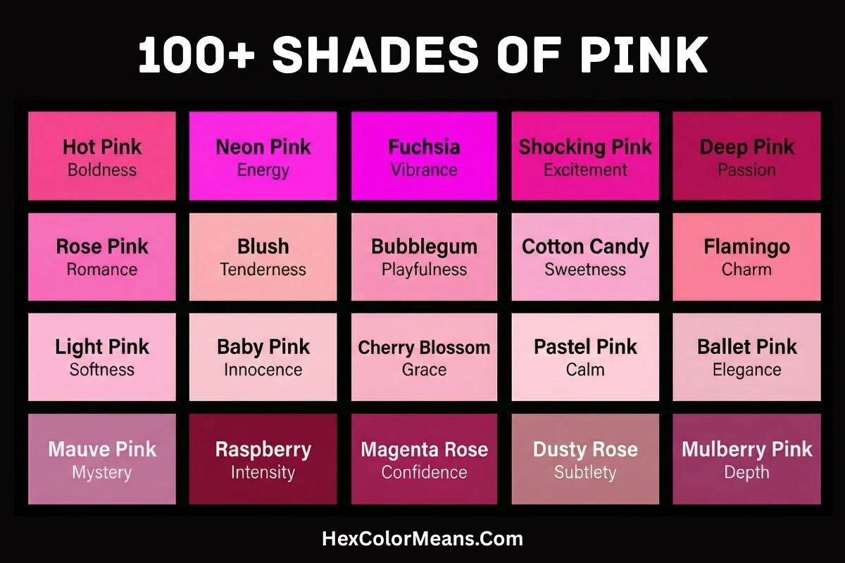
These pinks are loud, energetic, and impossible to ignore. High saturation gives them confidence and presence. Fuchsia, hot pink, magenta, and neon pink define this group.
They symbolize creativity, self expression, and modern energy. These shades work best in statement designs, pop culture visuals, youth branding, and bold fashion where impact matters.
Deep & Dark Pink Shades
Dark pinks lean toward red or purple, giving them intensity and emotional richness. Mulberry, wine, and amaranth feel dramatic, elegant, and powerful. They often represent passion, mystery, and depth.
These tones are popular in luxury branding, evening wear, and moody interior palettes where emotion and sophistication lead the design.
Light Pink
Light Pink (#FFB6C1) is a softer, paler version of the primary pink, leaning slightly toward peach. It is frequently associated with sweetness, gentleness, and innocence. Historically, it has been a staple in baby clothing and Valentine’s Day cards. Light Pink is considered calming and non-threatening. Consequently, it is a popular choice for soap packaging, confectionery, and romance novel covers.
- HEX #FFB6C1
- RGB 255, 182, 193
- CMYK 0, 29, 24, 0
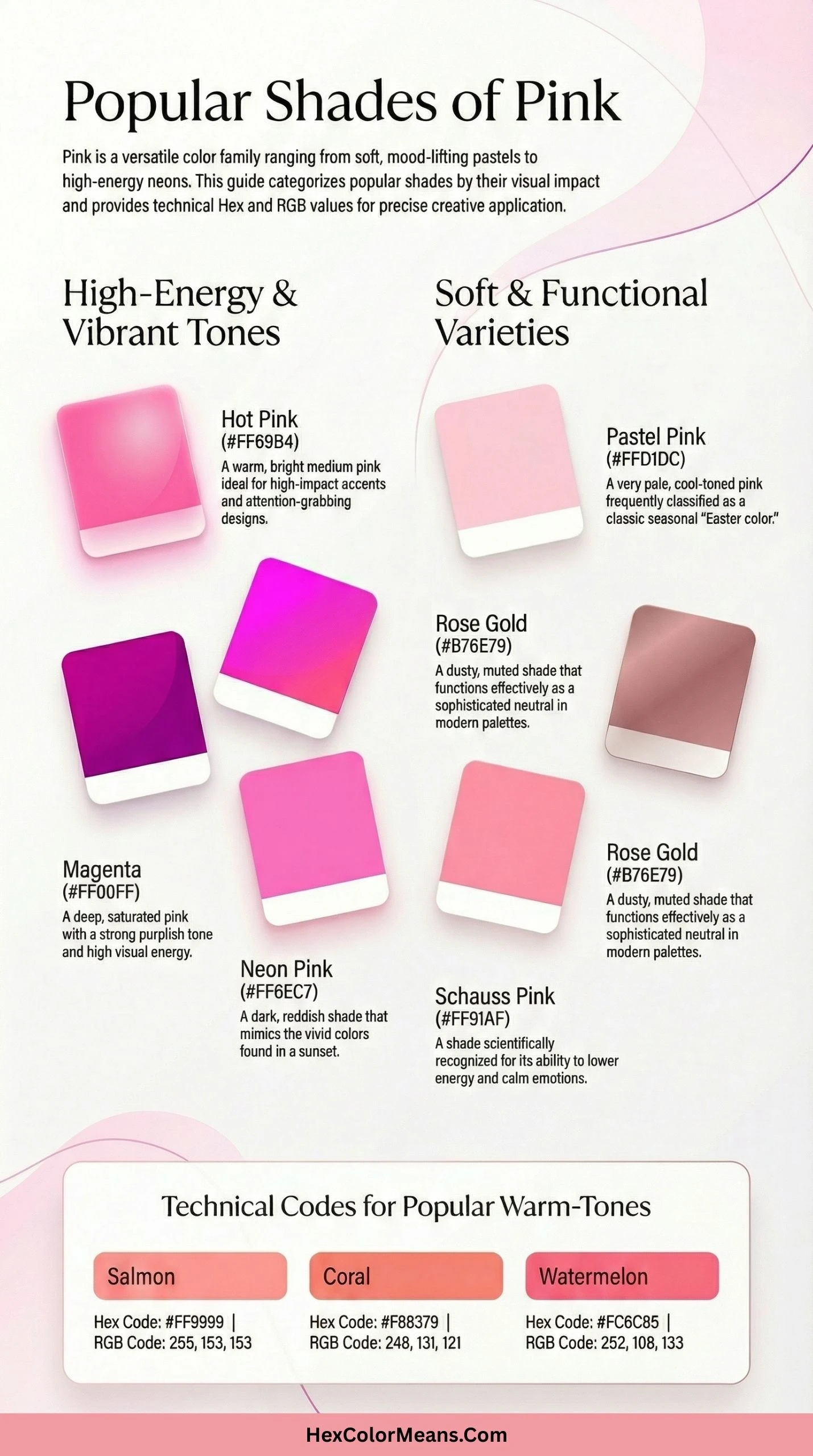
Hot Pink
Hot Pink (#FF69B4) is a bold, saturated pink with a slight purple undertone that gives it an electric energy. It emerged as a cultural force during the 1960s and 70s, closely tied to pop art and rock-and-roll. This color represents rebellion, confidence, and sexual liberation. It is impossible to ignore. Therefore, it is often used in music festival branding, cosmetics for younger demographics, and punk fashion.
- HEX #FF69B4
- RGB 255, 105, 180
- CMYK 0, 59, 29, 0
Deep Pink
Deep Pink (#FF1493) is an intensely saturated pink that is much darker and more powerful than its pastel counterparts. It sits very close to pure red on the color wheel, retaining that aggressive warmth. Deep Pink signifies high energy, excitement, and drama. It commands attention immediately. Its primary uses are in sportswear, gaming peripherals, and warning signage where a friendly but urgent tone is needed.
- HEX #FF1493
- RGB 255, 20, 147
- CMYK 0, 92, 42, 0
Pale Pink
Pale Pink (#FADADD) is a delicate, almost neutral tint that contains just a whisper of red. It is often associated with fragility, quietness, and the antique. Historically, it was a favorite in Georgian and Victorian-era interior design for bedrooms. Pale Pink feels timeless and subdued. Consequently, it is widely used in wedding stationery, heritage brands, and minimalist fashion to suggest understated elegance.
- HEX #FADADD
- RGB 250, 218, 221
- CMYK 0, 13, 12, 2
Baby Pink
Baby Pink (#F4C2C2) is a soft, warm-toned pastel with a gentle orange undertone that distinguishes it from cooler pinks. It was explicitly named and marketed for infant girls in the post-World War II baby boom era. Before the 1940s, the assignment of pink to girls was not standardized. Today, it universally signifies tenderness, vulnerability, and new beginnings. It evokes the softness of a newborn’s skin. Consequently, its primary use remains in newborn photography, maternity products, and children’s furniture.
- HEX #F4C2C2
- RGB 244, 194, 194
- CMYK 0, 21, 21, 4
Blush Pink
Blush Pink (#DE5D83) mimics the natural flush of healthy human cheeks, giving it an inherent organic warmth. It gained prominence in cosmetics during the 1950s as a “natural look” became fashionable. Blush Pink represents modesty, vitality, and subtle flirtation. It is intimate without being overtly sexual. Therefore, it is a cornerstone of the bridal industry, lingerie design, and high-end skincare packaging where a healthy, natural glow is the goal.
- HEX #DE5D83
- RGB 222, 93, 131
- CMYK 0, 58, 41, 13
Cotton Candy Pink
Cotton Candy Pink (#FFBCD9) is an airy, ethereal pink that evokes the spun sugar confection it is named after. It is associated with nostalgia, carnivals, and childhood delight. This specific shade became iconic through its use in American fairground aesthetics and vintage toy packaging. It represents ephemeral pleasure and sweetness. Its primary applications are in candy branding, children’s party supplies, and fantasy-themed illustrations to create a whimsical atmosphere.
- HEX #FFBCD9
- RGB 255, 188, 217
- CMYK 0, 26, 15, 0
Rose Pink
Rose Pink (#FF66CC) captures the vivid hue of blooming rose petals with a slight fluorescent quality. Unlike softer rose shades, this version leans heavily into magenta territory, giving it a tropical vibrancy. It rose to popularity in 1950s fashion design and again in 1980s Memphis design movements. Rose Pink signifies flamboyance, artificial beauty, and joy. It is frequently used in beauty product lines aimed at Gen Z, tropical resort branding, and artificial flower arrangements.
- HEX #FF66CC
- RGB 255, 102, 204
- CMYK 0, 60, 20, 0
Dusty Rose
Dusty Rose (#C08081) is a muted, grayed-down pink that carries the sophistication of age. It evokes antique textiles, faded floral wallpaper, and Victorian mourning jewelry. This shade gained massive traction in the 2010s minimalist and boho design movements. Dusty Rose represents melancholy, nostalgia, and understated elegance. Unlike bright pinks, it does not shout. Consequently, it is a favorite for high-end fashion, wedding color palettes, and luxury packaging aiming for a vintage feel.
- HEX #C08081
- RGB 192, 128, 129
- CMYK 0, 33, 33, 25
Salmon Pink
Salmon Pink (#FF91A4) is a pink-orange hybrid named after the flesh of the salmon fish, though it is often lighter and more vibrant. This color became prominent in mid-century kitchen appliances and bathroom tiles during the 1950s. Salmon Pink represents health, vibrancy, and tropical warmth. It has a appetizing quality. Therefore, it is widely used in seafood restaurant branding, tropical print designs, and activewear where energy and freshness are key selling points.
- HEX #FF91A4
- RGB 255, 145, 164
- CMYK 0, 43, 36, 0
Coral Pink
Coral Pink (#F88379) sits at the intersection of pink and orange, mimicking the color of precious marine coral. It was immensely popular in Art Deco jewelry and 1930s fashion illustrations. This color symbolizes excitement, desire, and tropical adventure. It is warmer than salmon but less orange than true coral. Its modern uses are dominant in summer cosmetics, tropical destination branding, and children’s swimwear where a playful, energetic vibe is essential.
- HEX #F88379
- RGB 248, 131, 121
- CMYK 0, 47, 51, 3
Flamingo Pink
Flamingo Pink (#FC8EAC) captures the striking plumage of the flamingo, which actually gets its color from its diet of brine shrimp. This shade is inherently exotic and tropical. It became a symbol of kitsch Americana through the popularity of plastic lawn flamingos in the 1950s. Flamingo Pink represents whimsy, standing out, and fun. Consequently, it is used in theme park merchandise, poolside accessories, and tropical resort logos to convey a lighthearted, vacation-ready atmosphere.
- HEX #FC8EAC
- RGB 252, 142, 172
- CMYK 0, 44, 32, 1
Carnation Pink
Carnation Pink (#FFA6C9) is a clear, fresh pink named after the common carnation flower, which has been cultivated for over 2,000 years. In the language of flowers, carnations often symbolize fascination and a woman’s love. This specific shade is lighter than cerise but more saturated than baby pink. Carnation Pink evokes springtime, freshness, and affection. It is a staple in floral design, perfume packaging, and mother-daughter matching outfit collections for its universally appealing, gentle vibrancy.
- HEX #FFA6C9
- RGB 255, 166, 201
- CMYK 0, 35, 21, 0
Bubblegum Pink
Bubblegum Pink (#FFC1CC) is a cheerful, slightly cool pink that directly references the iconic color of bubblegum, specifically the “Double Bubble” variety. This color is a 20th-century invention, created alongside commercial chewing gum. It represents childhood, cheekiness, and casual fun. It is not serious or romantic. Therefore, it is heavily utilized in confectionery branding, teen magazines, and slime and toy manufacturing to attract young consumers seeking playful, sweet experiences.
- HEX #FFC1CC
- RGB 255, 193, 204
- CMYK 0, 24, 20, 0
Cherry Blossom Pink
Cherry Blossom Pink (#FFB7C5) is a delicate, fleeting pink that mirrors the sakura blooms of Japan. In Japanese culture, it holds profound significance as a symbol of the ephemeral nature of life and beauty. The annual cherry blossom viewing tradition, hanami, centers on this color. Cherry Blossom Pink represents rebirth, optimism, and mortality. It is a dominant color in Japanese tourism branding, spring fashion collections, and teaware designs aimed at evoking mindfulness and natural beauty.
- HEX #FFB7C5
- RGB 255, 183, 197
- CMYK 0, 28, 23, 0
Strawberry Pink
Strawberry Pink (#FC5A8D) is a juicy, vibrant pink that takes its cue from the interior flesh of a ripe strawberry. It is significantly warmer and more red-based than raspberry shades. This color became associated with American diner aesthetics and fruit-themed desserts of the 1950s. Strawberry Pink signifies sweetness, ripeness, and indulgence. Consequently, it is extensively used in ice cream packaging, fruit juice branding, and summertime advertising where appetite appeal is paramount.
- HEX #FC5A8D
- RGB 252, 90, 141
- CMYK 0, 64, 44, 1
Watermelon Pink
Watermelon Pink (#FC6C85) captures the juicy, bright interior of a watermelon, distinct from its green rind. This color is inherently refreshing and summery. It became a symbol of American summer picnics and pool parties in the mid-20th century. Watermelon Pink represents refreshment, casual joy, and youthful energy. Unlike deeper reds, it maintains a lightness. Its primary uses are in summertime apparel, tropical drink branding, and children’s outdoor toys to evoke a sense of seasonal fun and hydration.
- HEX #FC6C85
- RGB 252, 108, 133
- CMYK 0, 57, 47, 1
Rose Quartz Pink
Rose Quartz Pink (#F7CAC9) is an incredibly soft, almost powdery pink named after the rose quartz gemstone, which has been used for centuries in carvings and jewelry. The stone is believed to carry healing energies and promote unconditional love. This color, specifically, was named one of the Pantone Colors of the Year in 2016, representing gender fluidity and calm. Rose Quartz Pink signifies compassion, soothing, and peace. Consequently, it is widely used in spa branding, meditation apps, and intimate apparel to create a serene, loving atmosphere.
- HEX #F7CAC9
- RGB 247, 202, 201
- CMYK 0, 18, 19, 3
Tea Rose Pink
Tea Rose Pink (#F4C2C2) is a warm, slightly dusty pink named after the old garden rose variety that has a distinct tea fragrance. These roses were prized in Victorian England for their scent and delicate colors. Tea Rose Pink carries a sense of formality, romance, and old-world charm. It is less vibrant than a modern hybrid tea rose. Therefore, it is frequently chosen for vintage-inspired wedding decor, herbal product packaging, and period film costume design to evoke a bygone era of elegance and gentility.
- HEX #F4C2C2
- RGB 244, 194, 194
- CMYK 0, 20, 20, 4
Peony Pink
Peony Pink (#E8AEB7) reflects the lush, full-bodied blooms of the peony flower, a symbol of prosperity, honor, and romance in Chinese culture for over 1,500 years. This shade is slightly more mauve than baby pink, giving it depth. Peony Pink represents abundance, beauty, and bashfulness. It has a luxurious, petal-like softness. Consequently, it is a dominant color in luxury floral arrangements, bridesmaid dress collections, and high-end skincare branding where a rich, blooming quality is desired.
- HEX #E8AEB7
- RGB 232, 174, 183
- CMYK 0, 25, 21, 9
Ballet Pink
Ballet Pink (#F2C1D1) is an ethereal, cool-toned pink associated with the traditional color of ballet slippers and tutus. It is intrinsically linked to the world of dance, grace, and discipline. This shade gained cultural cachet through Degas’s paintings of dancers in the late 19th century. Ballet Pink signifies delicacy, aspiration, and artistic purity. It is never loud or demanding. Therefore, it is extensively used in dancewear manufacturing, performing arts center branding, and girls’ formal wear to suggest elegance and poise.
- HEX #F2C1D1
- RGB 242, 193, 209
- CMYK 0, 20, 14, 5
Thulian Pink
Thulian Pink (#DE6FA1), also known as “Congo Pink,” is a unique, slightly dusky medium pink with a subtle violet undertone. The name “Thulian” is an archaic term referring to a mythical northern land, giving the color an exotic and academic air. It was a popular shade in Victorian wallpaper and textile design. Thulian Pink represents mystery, sophistication, and non-conformity. It is pink for intellectuals. Consequently, it appears in university heraldry, literary fiction book covers, and boutique interior design where a distinctive, thoughtful atmosphere is required.
- HEX #DE6FA1
- RGB 222, 111, 161
- CMYK 0, 50, 27, 13
Persian Pink
Persian Pink (#F77FBE) is a vibrant, slightly purplish pink that traces its roots to traditional Persian textiles and dyes. The color is part of a family of Persian colors documented in 19th-century British natural history texts describing exotic Eastern goods. Persian Pink represents luxury, spice, and ancient artistry. It is richer and more exotic than standard pinks. Its modern uses include Middle Eastern tourism branding, orientalist fashion collections, and premium chocolate packaging seeking a touch of historical opulence.
- HEX #F77FBE
- RGB 247, 127, 190
- CMYK 0, 49, 23, 3
Cerise Pink
Cerise Pink (#EC3B83) is a deep, vivid reddish-pink named after the French word for “cherry.” It is significantly darker and more saturated than standard pink, approaching true red. Cerise has been a staple in French high fashion and couture since the 19th century. This color symbolizes dramatic flair, confidence, and sensuality. It makes a bold statement. Therefore, it is frequently used in evening gowns, lipstick manufacturing, and theatrical stage makeup where intense color payoff and visibility are crucial.
- HEX #EC3B83
- RGB 236, 59, 131
- CMYK 0, 75, 44, 7
Magenta Pink
Magenta Pink (#FF00FF) is the purest, most electric expression of pink, existing as a primary color in the subtractive CMYK system. It was named after the 1859 Battle of Magenta, coinciding with the discovery of the first synthetic aniline dye of this color. This revolutionized the textile industry. Magenta Pink represents artificiality, revolution, and maximum vibrancy. It is unapologetically synthetic. Consequently, it is essential in process printing, digital screen displays, and psychedelic art where absolute, eye-searing intensity is required.
- HEX #FF00FF
- RGB 255, 0, 255
- CMYK 0, 100, 0, 0
Fuchsia Pink
Fuchsia Pink (#FF77FF) is a slightly softer, less saturated cousin of pure magenta, named after the fuchsia flower, which was discovered in the Caribbean in the late 17th century. The plant was named after German botanist Leonhart Fuchs. This color represents playfulness, tropical exuberance, and bold femininity. It is vibrant but not as aggressive as magenta. Its uses are widespread in tropical print fabrics, children’s toys, and energy drink branding to convey a sense of wild, vibrant energy.
- HEX #FF77FF
- RGB 255, 119, 255
- CMYK 0, 53, 0, 0
Raspberry Pink
Raspberry Pink (#E30B5D) is a deep, cool-toned pink that mimics the rich color of ripe raspberries. It is much bluer and darker than strawberry pink. This shade has been a favorite in autumn fashion palettes and jewelry design for decades. Raspberry Pink represents richness, depth, and tart sweetness. It has a complexity that simple pinks lack. Therefore, it is extensively used in gourmet food branding, fall makeup collections, and luxury velvet textiles where a sense of depth and opulence is desired.
- HEX #E30B5D
- RGB 227, 11, 93
- CMYK 0, 95, 59, 11
Berry Pink
Berry Pink (#C84C6D) is a muted, slightly grayed pink that evokes mixed berry compotes and preserves. It sits between raspberry and rose, with a distinct earthy quality. This color is associated with harvest, preservation, and rustic charm. It became popular in country-style kitchens and farmhouse decor in the late 20th century. Berry Pink represents homeliness, sweetness, and tradition. Its primary uses are in jam and preserve labels, fall wedding themes, and cozy knitwear where a warm, inviting, and natural aesthetic is paramount.
- HEX #C84C6D
- RGB 200, 76, 109
- CMYK 0, 62, 45, 22
Mulberry Pink
Mulberry Pink (#C54B8C) is a sophisticated, purple-leaning pink named after the mulberry fruit and the color of its staining juice. It has a historical richness, being used in ancient textiles for dyeing. This shade is darker and more mysterious than berry pink. Mulberry Pink signifies intrigue, wealth, and creative flair. It is often associated with artistic temperaments. Consequently, it is a popular choice for artist branding, wine labels (specifically dessert wines), and velvet upholstery in eclectic interior design schemes.
- HEX #C54B8C
- RGB 197, 75, 140
- CMYK 0, 62, 29, 23
Orchid Pink
Orchid Pink (#DA70D6) captures the exotic, complex hues of orchid flowers, which have fascinated botanists and collectors for centuries. Orchids symbolize rare beauty, strength, and luxury in Victorian flower language. This shade is a balanced mix of pink and purple, creating a harmonious warmth. Orchid Pink represents creativity, refinement, and the unconventional. It is often used in beauty packaging for anti-aging products, spiritual and wellness branding, and artificial flower manufacturing to suggest exotic beauty and delicate strength.
- HEX #DA70D6
- RGB 218, 112, 214
- CMYK 0, 49, 2, 15
Mauve Pink
Mauve Pink (#E0B0FF) is a pale, soft purple-pink that sits on the boundary between the two color families. The original mauve was the first synthetic aniline dye, accidentally discovered by William Perkin in 1856, sparking a worldwide fashion craze. Mauve Pink represents innovation, gentility, and twilight. It carries a historical weight of scientific breakthrough. Consequently, it is used in heritage branding, lavender-scented products, and twilight-themed event decor to evoke a sense of historical romance and gentle transition.
- HEX #E0B0FF
- RGB 224, 176, 255
- CMYK 12, 31, 0, 0
Lavender Pink
Lavender Pink (#FBAED2) is a light, airy blend of pink and lavender tones, evoking the color of certain heather blooms. It has a soothing, medicinal quality reminiscent of lavender sachets used in Victorian linen closets. This shade represents calm, purity, and gentle affection. It lacks the passionate intensity of redder pinks. Therefore, it is a frequent choice for baby girl nurseries, aromatherapy branding, and soft-focus photography filters where a peaceful, dreamy atmosphere is the goal.
- HEX #FBAED2
- RGB 251, 174, 210
- CMYK 0, 31, 16, 2
Lilac Pink
Lilac Pink (#C8A2C8) is a muted, dusty pink-purple that closely mirrors the color of common lilac blossoms. In many cultures, lilacs are associated with first love and springtime renewal. This specific shade has a faded, vintage quality that suggests memories and nostalgia. Lilac Pink represents sentimentality, grace, and youthful innocence. It is a staple in shabby chic decor, vintage reproduction fabrics, and mother’s Day card designs where a tender, nostalgic, and gently romantic message is required.
- HEX #C8A2C8
- RGB 200, 162, 200
- CMYK 0, 19, 0, 22
Shell Pink
Shell Pink (#FDDDE6) is an extremely pale, warm pink that mimics the delicate inner lining of certain seashells, particularly conch shells. It has been prized in seashell jewelry and cameos since ancient times. This color is almost translucent in its lightness. Shell Pink represents fragility, the ocean’s secrets, and natural beauty. It is the color of skin beneath a shell. Consequently, it is widely used in pearl jewelry marketing, beach resort spas, and bridal lingerie to evoke a sense of intimate, natural, and precious delicacy.
- HEX #FDDDE6
- RGB 253, 221, 230
- CMYK 0, 13, 9, 1
Seashell Pink
Seashell Pink (#FFF5EE) is a warm, almost off-white pink that derives its name from the interior of certain mollusk shells. It is one of the original X11 web colors, established in the 1980s. This color is essentially a tint of pink so light it borders on neutral. Seashell Pink represents purity, warmth, and organic origins. It is often used as a background color in web design and print. Its primary applications include wedding invitation backgrounds, minimalist interior wall paints, and organic skincare packaging where a clean, warm, and unobtrusive base is needed.
- HEX #FFF5EE
- RGB 255, 245, 238
- CMYK 0, 4, 7, 0
Powder Pink
Powder Pink (#FFB2D0) is a light, soft pink with a subtle blue undertone, reminiscent of facial powder and cosmetic compacts from the 1920s and 1930s. It is inherently tied to the world of beauty and artifice. This shade is airy and light, like a dusting of powder. Powder Pink represents cosmetic beauty, delicacy, and vintage glamour. It is frequently used in vintage reproduction cosmetics packaging, ballet costume trims, and confectionery sugar dusting imagery where a soft, fine, and pretty texture is suggested.
- HEX #FFB2D0
- RGB 255, 178, 208
- CMYK 0, 30, 18, 0
Millennial Pink
Millennial Pink (#F3CFC6) is a specific shade of dusty, peachy pink that became the defining color of the 2010s. It was dubbed “Millennial Pink” because it was ubiquitously marketed to and embraced by the Millennial generation. It is intentionally gender-neutral, nostalgic, and non-threatening. Millennial Pink represented a rejection of hyper-feminine bright pinks. Consequently, it was used everywhere from Apple products and Acne Studios branding to hipster cafes and political campaign logos, signaling a modern, savvy, and inclusive aesthetic.
- HEX #F3CFC6
- RGB 243, 207, 198
- CMYK 0, 15, 18, 5
Nude Pink
Nude Pink (#E3BC9A) is a pink-beige hybrid designed to approximate the color of Caucasian skin, hence the controversial name “nude.” It has been a staple in lingerie and hosiery manufacturing for nearly a century to create “invisible” undergarments. This shade represents the body, subtlety, and foundation. In recent years, the concept of “nude” has been challenged and expanded. Its primary use remains in sheer hosiery, shapewear, and cosmetics foundations, though it now represents a single skin tone within a broader spectrum.
- HEX #E3BC9A
- RGB 227, 188, 154
- CMYK 0, 17, 32, 11
Antique Rose Pink
Antique Rose Pink (#C08081) is a muted, brownish-pink that replicates the faded color of roses in a centuries-old painting or dried flower arrangement. It is deeply associated with Victiana, heritage, and the passage of time. This color is the opposite of modern, bright florals. Antique Rose Pink represents memory, romance of the past, and decay. It is a favorite for shabby chic furniture, historical society branding, and heirloom rose packaging where a sense of age, value, and timeless beauty is essential.
- HEX #C08081
- RGB 192, 128, 129
- CMYK 0, 33, 33, 25
Old Rose Pink
Old Rose Pink (#C48793) is similar to antique rose but slightly more purple and less brown, mimicking the color of old garden roses pressed in books. It has a literary quality, evoking Victorian poetry and pressed flowers. This shade represents sentiment, nostalgia, and gentle decay. It is romantic but not fresh. Consequently, it is used extensively in vintage-inspired stationery, period drama set design, and heritage textile reproductions where an authentic, aged, and romantic color palette is required.
- HEX #C48793
- RGB 196, 135, 147
- CMYK 0, 31, 25, 23
Quartz Pink
Quartz Pink (#EDA6C4) is a soft, medium-light pink with a distinct translucence, much like the rose quartz crystal. Crystals have seen a resurgence in popularity with the modern wellness movement. Quartz Pink represents healing, clarity, and emotional balance. It is believed to carry the metaphysical properties of the stone. Therefore, it is a dominant color in crystal healing marketing, yoga apparel, and meditation app branding to evoke a sense of calm, openness, and spiritual well-being.
- HEX #EDA6C4
- RGB 237, 166, 196
- CMYK 0, 30, 17, 7
Soft Pink
Soft Pink (#F2A2B1) is a gentle, medium-light pink that is neither too pastel nor too saturated. It is the archetypal “feminine” pink in many modern contexts. This color emerged as a standard in mass-market apparel and toy manufacturing in the late 20th century. Soft Pink represents gentleness, approachability, and universal appeal. It offends no one. Consequently, it is used in healthcare branding for women’s centers, children’s vitamin packaging, and general gift wrap where a soft, universally pleasant, and inoffensive pink is needed.
- HEX #F2A2B1
- RGB 242, 162, 177
- CMYK 0, 33, 27, 5
Muted Pink
Muted Pink (#D8A7B1) is a deliberately desaturated pink, created by adding gray or its complement to soften the intensity. It is a key color in Scandinavian interior design, which prizes dämpade (damped) colors. Muted Pink represents sophistication, calm, and modernity. It is pink for adults who find bright pink childish. Its primary uses are in modern home decor, fashion basics, and corporate branding that wants to use pink but appear serious, restrained, and tasteful rather than playful.
- HEX #D8A7B1
- RGB 216, 167, 177
- CMYK 0, 23, 18, 15
Dusky Pink
Dusky Pink (#CC7A8B) is a darker, more shadowed pink that suggests twilight or the fading of light. It carries a sense of melancholy, intimacy, and end-of-day calm. This shade has been popular in autumn and winter fashion palettes for decades. Dusky Pink is more grounded than airy pinks. It represents maturity, depth, and quiet emotion. It is frequently used in dramatic evening wear, bedroom accent walls, and romance novel covers with a serious or tragic tone, rather than a lighthearted one.
- HEX #CC7A8B
- RGB 204, 122, 139
- CMYK 0, 40, 32, 20
Warm Pink
Warm Pink (#FF9E9E) is a pink that leans heavily toward the peach and salmon family, with a strong yellow-orange undertone. It captures the color of skin flushed with warmth, embarrassment, or exertion. This shade is inherently human and organic. Warm Pink represents health, vitality, and approachability. It is friendly and energetic. Consequently, it is used in fitness apparel, health food branding, and children’s book illustrations where a warm, active, and cheerful human presence is implied.
- HEX #FF9E9E
- RGB 255, 158, 158
- CMYK 0, 38, 38, 0
Cool Pink
Cool Pink (#FF77AA) is a pink with a distinct blue or violet undertone, making it appear crisper and more reserved than warm pinks. It is often associated with ice cream flavors like raspberry or bubblegum. Cool Pink represents refreshment, crispness, and modernity. It feels clean and sharp. Its primary applications are in tech accessories marketed toward women, cosmetics for cool skin tones, and frozen dessert branding where a clean, refreshing, and distinctly cool impression is desired.
- HEX #FF77AA
- RGB 255, 119, 170
- CMYK 0, 53, 33, 0
Neon Pink
Neon Pink (#FF1DCE) is an ultra-bright, fluorescent pink that appears to glow, even in daylight. It relies on optical physics where the color reflects more light than it receives. Neon colors exploded in popularity during the 1980s, driven by club culture and sportswear. Neon Pink represents artificial energy, warning, and radical visibility. It is impossible to ignore. Therefore, it is used for high-visibility sportswear, rave culture fashion, and youth-oriented energy drink cans to grab attention and convey maximum excitement.
- HEX #FF1DCE
- RGB 255, 29, 206
- CMYK 0, 89, 19, 0
Electric Pink
Electric Pink (#F62681) is a vibrant, shocking pink that carries the intensity of an electrical charge. It is slightly deeper than neon pink, with a stronger magenta base. This color is associated with cyberpunk aesthetics, digital culture, and synthetic life. Electric Pink represents futurism, shock, and digital-native energy. It feels electronic, not natural. Its uses are dominant in gaming peripheral lighting, sci-fi movie posters, and social media branding aimed at Gen Z, where a cutting-edge, high-voltage identity is crucial.
- HEX #F62681
- RGB 246, 38, 129
- CMYK 0, 85, 48, 4
Bright Pink
Bright Pink (#FF007F) is a pure, saturated pink that sits exactly midway between red and magenta on the color wheel. It is the color of pure pigment, often used as a standard for “pink” in printing. Bright Pink represents boldness, feminine power, and fun. It is confident and unapologetic. Consequently, it is a staple in pop star merchandise, cosmetics for young adults, and sporting goods where a strong, energetic, and distinctly feminine identity is needed without the aggression of red.
- HEX #FF007F
- RGB 255, 0, 127
- CMYK 0, 100, 50, 0
Dark Pink
Dark Pink (#E75480) is a deep, rich pink that retains its pink identity while approaching the depth of red. It is often used as a more feminine alternative to burgundy. This shade became popular in 1940s and 50s Hollywood glamour. Dark Pink represents sophistication, passion, and maturity. It is pink for grown-ups. Its primary uses are in luxury cosmetics, evening gowns, and valentine’s Day packaging aimed at adults, conveying a sense of serious romance and depth rather than playful flirtation.
- HEX #E75480
- RGB 231, 84, 128
- CMYK 0, 64, 45, 9
Medium Pink
Medium Pink (#EEA9B8) is a balanced, mid-tone pink that sits perfectly between light and dark, pale and saturated. It is often considered the baseline “normal” pink in color theory. This shade lacks extreme personality, making it incredibly versatile. Medium Pink represents balance, sweetness, and reliability. It is friendly without being cloying. Consequently, it is widely used in general gift wrap, mass-market greeting cards, and children’s apparel where a pleasant, recognizable, and inoffensive pink is required for broad consumer appeal.
- HEX #EEA9B8
- RGB 238, 169, 184
- CMYK 0, 29, 23, 7
Pastel Pink
Pastel Pink (#FFD1DC) is a very light, soft pink created by mixing a large amount of white with pure pink. It is the definitive color of Easter, spring, and new beginnings. Pastel aesthetics became dominant in the 1950s with the popularization of pastel appliances and automobiles. This color represents gentleness, hope, and innocence. It has a powdered sugar quality. Its uses are ubiquitous in spring fashion, baby shower decor, and confectionery for holidays, evoking a sense of softness, renewal, and sweet simplicity.
- HEX #FFD1DC
- RGB 255, 209, 220
- CMYK 0, 18, 14, 0
Cream Pink
Cream Pink (#F6C1CC) is a warm, milky pink that blends pink with a generous amount of cream or yellow. It evokes dairy products, custards, and rich desserts. This shade has been a favorite in French patisserie branding and ice cream parlor decor. Cream Pink represents indulgence, comfort, and richness. It is sweet but substantial. Therefore, it is extensively used in dessert packaging, cozy knitwear, and bedroom textiles to create a warm, comforting, and slightly decadent atmosphere.
- HEX #F6C1CC
- RGB 246, 193, 204
- CMYK 0, 22, 17, 4
Rosewood Pink
Rosewood Pink (#65000B) is an extremely dark, brownish-red that barely registers as pink, more akin to deep mahogany or dried blood. It is named after the dense, dark rosewood timber. This color carries immense weight, gravity, and seriousness. It represents maturity, depth, and earthiness. It is the opposite of frivolous. Its primary uses are in luxury furniture stains, academic regalia, and high-end leather goods where a sense of age, value, seriousness, and understated richness is paramount.
- HEX #65000B
- RGB 101, 0, 11
- CMYK 0, 100, 89, 60
Desert Pink
Desert Pink (#EDC9AF) is a warm, sandy, terracotta-tinged pink that mirrors the colors of arid landscapes at sunset. It is inherently linked to Southwestern US aesthetics, Pueblo architecture, and desert flora. This shade represents earthiness, warmth, and natural endurance. Desert Pink feels sun-baked and ancient. It is the color of eroded rock and canyon walls. Consequently, Desert Pink is extensively used in southwestern home decor, desert resort branding, and natural skincare packaging to evoke a sense of rugged, sun-drenched, and organic warmth. Desert Pink offers a grounded alternative to cooler, more urban pinks. The subtle orange undertone of Desert Pink makes it exceptionally versatile in boho-chic design schemes.
- HEX #EDC9AF
- RGB 237, 201, 175
- CMYK 0, 15, 26, 7
Pink Lemonade
Pink Lemonade (#EFDADA) is an ultra-light, barely-there pink with a cool, refreshing quality, named after the tinted summer beverage. It is associated with nostalgic American summers, country fairs, and childhood refreshment. This color is almost white, with just a blush of pink. Pink Lemonade represents refreshment, whimsy, and innocent fun. Pink Lemonade evokes the memory of standing in line at a carnival on a hot day. Therefore, Pink Lemonade is a popular choice for summertime beverage branding, children’s party supplies, and vintage-inspired kitchenware where a light, refreshing, and nostalgic touch is desired. Pink Lemonade is subtle enough to serve as a neutral backdrop while retaining its cheerful identity.
- HEX #EFDADA
- RGB 239, 218, 218
- CMYK 0, 9, 9, 6
Valentine Pink
Valentine Pink (#E5546F) is a vibrant, heartfelt red-pink named for the holiday of romance. It captures the color of passionate love, red roses, and heart-shaped candy boxes. This shade is deeper and more urgent than candy pink. Valentine Pink represents romance, desire, and affection. It is the color of a rapidly beating heart. Valentine Pink is specifically tied to expressions of love on February 14th. Consequently, Valentine Pink dominates greeting card manufacturing, chocolate box packaging, and floral arrangement accents during the Valentine’s Day season. Valentine Pink conveys sincere emotion without the aggression of pure red.
- HEX #E5546F
- RGB 229, 84, 111
- CMYK 0, 63, 52, 10
Punch Pink
Punch Pink (#F25278) is a bright, energetic pink named after the fruity party beverage, suggesting a bold flavor and celebratory spirit. It is more saturated than Valentine Pink, with a slight orange undertone. Punch Pink represents excitement, party energy, and youthful exuberance. It tastes like fruit punch at a birthday party. Punch Pink is designed to stand out in a crowd. Its primary uses are in children’s party decor, fruit-flavored candy branding, and activewear for high-energy activities where a fun, vibrant, and stimulating color is essential. Punch Pink encourages sociability and fun.
- HEX #F25278
- RGB 242, 82, 120
- CMYK 0, 66, 50, 5
Taffy Pink
Taffy Pink (#FA86C4) is a cheerful, medium-light pink named after the stretched, pulled candy found at beach boardwalks. It evokes saltwater taffy, seaside vacations, and sweet indulgence. This shade is warmer and creamier than bubblegum pink. Taffy Pink represents sweetness, nostalgia, and treats. Taffy Pink has a chewy, soft quality to its appearance. Consequently, Taffy Pink is frequently used in confectionery branding, beach resort merchandise, and retro candy shop design to evoke a sense of sweet, old-fashioned fun. Taffy Pink feels both classic and playful simultaneously.
- HEX #FA86C4
- RGB 250, 134, 196
- CMYK 0, 46, 22, 2
Piggy Pink
Piggy Pink (#FDD7E4) is an extremely pale, warm pink that references the color of a piglet’s skin. It is associated with innocence, vulnerability, and farm animal cuteness. This shade is almost a neutral, with just a hint of pink warmth. Piggy Pink represents new life, nakedness, and softness. Piggy Pink is the color of a brand-new piglet. Therefore, Piggy Pink is a staple in children’s animal books, plush toy manufacturing, and baby layette sets where an innocent, soft, and animal-like cuteness is the goal. Piggy Pink is pure, unpretentious, and deeply gentle.
- HEX #FDD7E4
- RGB 253, 215, 228
- CMYK 0, 15, 10, 1
Carnival Pink
Carnival Pink (#FF5CCD) is a vibrant, festive pink that captures the energy of a midway at night, with its bright lights and excitement. It leans heavily into magenta, giving it a fluorescent quality. Carnival Pink represents celebration, spectacle, and joyful noise. It is the color of cotton candy under blacklight. Carnival Pink is designed to be seen from a distance. Its primary uses are in festival branding, amusement park merchandise, and circus posters where a sense of thrilling, slightly chaotic fun is required. Carnival Pink never whispers; it always shouts with delight.
- HEX #FF5CCD
- RGB 255, 92, 205
- CMYK 0, 64, 20, 0
Cupid Pink
Cupid Pink (#F5B7C7) is a soft, cherubic pink named after the Roman god of desire, often depicted as a chubby, winged infant. It is lighter and more innocent than Valentine Pink. Cupid Pink represents innocent love, matchmaking, and playful romance. It is the color of a valentine from a child. Cupid Pink lacks the passion of adult romance. Consequently, Cupid Pink is used in children’s Valentine’s Day cards, dating apps aiming for a friendly rather than sexy tone, and romantic comedy posters where the love is sweet and lighthearted. Cupid Pink promises a gentle arrow, not a piercing wound.
- HEX #F5B7C7
- RGB 245, 183, 199
- CMYK 0, 25, 19, 4
Fairy Pink
Fairy Pink (#F6C6DA) is an ethereal, whimsical pink that evokes the gossamer wings of storybook fairies and magical creatures. It has a dreamy, otherworldly quality. This shade is light and airy, as if it might float away. Fairy Pink represents magic, fantasy, and childhood wonder. Fairy Pink is the color of tutus in a ballet recital. Therefore, Fairy Pink is a favorite in fantasy book covers, princess-themed party supplies, and toy fairy wings where a sense of enchantment and delicate beauty is paramount. Fairy Pink invites belief in the impossible.
- HEX #F6C6DA
- RGB 246, 198, 218
- CMYK 0, 20, 11, 4
Princess Pink
Princess Pink (#F8C8DC) is a regal, slightly cool pink associated with fairy-tale royalty and the Disney Princess franchise. It has become a cultural shorthand for girlhood aspirations. Princess Pink represents grace, nobility, and happily-ever-after. It is pink with a tiara. Princess Pink is aspirational and polished. Its primary uses are in licensed children’s merchandise, birthday party decorations, and costume dress manufacturing where a connection to royal fantasy and childhood dreams is essential. Princess Pink promises a world where dreams come true through beauty and kindness.
- HEX #F8C8DC
- RGB 248, 200, 220
- CMYK 0, 19, 11, 3
Angel Pink
Angel Pink (#FDE2E4) is an almost-white, heavenly pink that suggests the purity and lightness of celestial beings. It is the softest, most ethereal pink in the palette. Angel Pink represents purity, divine love, and protection. It is the color of clouds in heaven. Angel Pink is serene and untroubled. Consequently, Angel Pink is used in religious first communion decor, newborn photography, and spa environments aiming for a pure, clean, and spiritually uplifting atmosphere. Angel Pink offers peace and a sense of being watched over by benevolent forces.
- HEX #FDE2E4
- RGB 253, 226, 228
- CMYK 0, 11, 10, 1
Rosy Pink
Rosy Pink (#BC8F8F) is a muted, grayish pink that evokes a healthy complexion or the flush on cheeks after exercise. It is more natural and less decorative than rose pink. Rosy Pink represents health, modesty, and natural beauty. It is the pink of real skin, not paint. Rosy Pink has an organic, unassuming quality. Its primary uses are in natural cosmetics, health food branding, and rustic home textiles where an earthy, wholesome, and naturally beautiful aesthetic is required. Rosy Pink is the color of good health, not artificial enhancement.
- HEX #BC8F8F
- RGB 188, 143, 143
- CMYK 0, 24, 24, 26
Heather Pink
Heather Pink (#DDA0DD) is a soft, lavender-tinged pink named after the heather plant that carpets Scottish moors. It has a misty, highland quality. This shade is more purple than standard pink. Heather Pink represents wild beauty, romance of the moors, and natural delicacy. Heather Pink evokes a landscape covered in blooming heather. Consequently, Heather Pink is used in Scottish tourism branding, wool sweater manufacturing, and herbal product packaging where a connection to wild, natural, and slightly melancholic landscapes is desired. Heather Pink is subtle, complex, and deeply natural.
- HEX #DDA0DD
- RGB 221, 160, 221
- CMYK 0, 28, 0, 13
Petal Pink
Petal Pink (#F4E1E6) is an ultra-soft, barely-there pink that mimics the delicate, translucent quality of flower petals. It has a botanical precision and gentle beauty. This color is almost a neutral, but with warmth. Petal Pink represents fragility, botanical beauty, and delicate touch. Petal Pink is the color of an opening rosebud. Its primary uses are in floral design, luxury bedding, and bridal lingerie where a sense of delicate, natural, and intimate beauty is essential. Petal Pink is soft enough to be almost invisible, yet its warmth is unmistakably present.
- HEX #F4E1E6
- RGB 244, 225, 230
- CMYK 0, 8, 6, 4
Vintage Pink
Vintage Pink (#C496A6) is a dusty, muted pink that suggests the faded elegance of textiles from decades past. It is inherently nostalgic and melancholic. This shade has gray and brown undertones that age it. Vintage Pink represents memories, elegance of bygone eras, and patina. Vintage Pink is the color of a 1950s prom dress found in an attic. Consequently, Vintage Pink is extensively used in shabby chic furniture paint, vintage clothing store branding, and reproduction wallpaper where an authentic, aged, and romantic connection to the past is required. Vintage Pink tells a story of beauty that has lasted through time.
- HEX #C496A6
- RGB 196, 150, 166
- CMYK 0, 23, 15, 23
Sakura Pink
Sakura Pink (#FCC9B9) is a warm, peachy pink named specifically for Japanese cherry blossoms. Unlike cooler cherry blossom pinks, this version has a distinct peach warmth. In Japan, sakura season is a national event. Sakura Pink represents transience, renewal, and contemplative beauty. Sakura Pink is celebrated during hanami, the flower-viewing festival. Therefore, Sakura Pink dominates Japanese tourism campaigns, spring tea packaging, and limited-edition merchandise released during cherry blossom season. Sakura Pink reminds viewers that beauty is fleeting and must be appreciated in the moment.
- HEX #FCC9B9
- RGB 252, 201, 185
- CMYK 0, 20, 27, 1
Macaron Pink
Macaron Pink (#F7B2BD) is a sweet, delicate pink named after the colorful French almond meringue cookies. It is lighter and more confectionery-focused than other dessert pinks. This shade is associated with patisserie windows and Parisian elegance. Macaron Pink represents indulgence, refinement, and sweet sophistication. Macaron Pink is the color of a Ladurée pastry box. Its primary uses are in high-end dessert branding, French-themed cafes, and cosmetics packaging aiming for a sweet but upscale, Parisian-chic aesthetic. Macaron Pink promises a delicate flavor and a luxurious experience.
- HEX #F7B2BD
- RGB 247, 178, 189
- CMYK 0, 28, 23, 3
Marshmallow Pink
Marshmallow Pink (#FADADD) is a soft, fluffy pink that evokes the squishy, sweet confection roasted over campfires. It is warm, pale, and cloud-like. This shade has a plush, soft-focus quality. Marshmallow Pink represents comfort, softness, and sweet simplicity. Marshmallow Pink is the color of a perfectly toasted marshmallow. Consequently, Marshmallow Pink is used in camping-themed merchandise, children’s sleepwear, and hot chocolate branding where a cozy, warm, and comforting sweetness is the goal. Marshmallow Pink feels like a hug in color form.
- HEX #FADADD
- RGB 250, 218, 221
- CMYK 0, 13, 12, 2
Sugar Pink
Sugar Pink (#F6B1C3) is a sweet, crystalline pink that evokes the sparkle and sweetness of granulated sugar or pink sanding sugar used in baking. It has a subtle sparkle even in flat color. Sugar Pink represents sweetness, celebration, and crystalline beauty. Sugar Pink is the color of sprinkles on a birthday cake. Its primary uses are in baking supply branding, children’s birthday party decor, and confectionery packaging where a sweet, festive, and sugary impression is essential. Sugar Pink is pure, sweet, and ready to celebrate.
- HEX #F6B1C3
- RGB 246, 177, 195
- CMYK 0, 28, 21, 4
Pink Pearl
Pink Pearl (#E7ACCF) is a soft, iridescent pink that mimics the lustrous interior of a precious pink pearl. Pearls have been valued for thousands of years as symbols of purity and wealth. This shade has an inherent sheen. Pink Pearl represents elegance, preciousness, and calm wisdom. Pink Pearl is the color of a gem formed through patience. Consequently, Pink Pearl is used in fine jewelry marketing, bridal accessories, and luxury cosmetics where a sense of rare, organic, and luminous beauty is required. Pink Pearl glows from within rather than shining from the surface.
- HEX #E7ACCF
- RGB 231, 172, 207
- CMYK 0, 26, 10, 9
Pink Champagne
Pink Champagne (#F6E1D3) is a warm, bubbly, off-white pink named after the celebratory sparkling wine. It captures the toast of celebration and the delicate pink tint of some champagnes. This shade is sophisticated and festive. Pink Champagne represents celebration, luxury, and effervescence. Pink Champagne is the color of a wedding toast. Its primary uses are in wedding invitations, anniversary cards, and luxury hotel spa branding where a sense of quiet celebration, sophisticated festivity, and elegant relaxation is desired. Pink Champagne promises a special occasion without being loud about it.
- HEX #F6E1D3
- RGB 246, 225, 211
- CMYK 0, 9, 14, 4
Pink Flamingo
Pink Flamingo (#FC74FD) is an intensely vibrant, almost electric pink that captures the extreme color of the flamingo’s plumage. It is much more saturated than the bird’s actual color, leaning toward magenta. This shade is pure tropical energy. Pink Flamingo represents exoticism, boldness, and tropical vibrancy. Pink Flamingo is the color of a plastic lawn flamingo on steroids. Consequently, Pink Flamingo is used in tropical resort branding, summer festival posters, and exotic cocktail packaging where maximum vibrancy and a sense of wild, tropical fun are essential. Pink Flamingo is not subtle; it’s a party.
- HEX #FC74FD
- RGB 252, 116, 253
- CMYK 0, 54, 0, 1
Pink Orchid
Pink Orchid (#E9A6D1) is a sophisticated, purple-leaning pink named after the exotic orchid flower. Orchids are symbols of rare beauty and strength in many cultures. This shade is more purple than most pinks. Pink Orchid represents exotic luxury, creativity, and refined beauty. Pink Orchid is the color of a rare tropical bloom. Its primary uses are in high-end fragrance packaging, luxury fashion accessories, and spa branding where a sense of exotic, refined, and slightly mysterious beauty is required. Pink Orchid suggests depth, complexity, and rare value.
- HEX #E9A6D1
- RGB 233, 166, 209
- CMYK 0, 29, 10, 9
Pink Sand
Pink Sand (#DFB19B) is a warm, earthy, terracotta-tinged pink named after the pink sand beaches found in Bermuda and the Bahamas. It has a granular, beachy texture even in flat color. This shade blends pink with beige and brown. Pink Sand represents tropical beaches, relaxation, and natural beauty. Pink Sand is the color of crushed coral and shell beaches. Consequently, Pink Sand is used in tourism branding for beach destinations, natural fiber clothing, and coastal home decor where a connection to warm, sandy, and naturally beautiful landscapes is desired. Pink Sand feels warm underfoot.
- HEX #DFB19B
- RGB 223, 177, 155
- CMYK 0, 21, 30, 13
Pink Lace
Pink Lace (#FFDDF4) is an extremely delicate, almost-white pink that mimics the fine, intricate patterns of lace fabric. It has a textural delicacy and feminine intricacy. This shade is barely there, like a whisper. Pink Lace represents delicacy, intricacy, and feminine elegance. Pink Lace is the color of a vintage christening gown. Its primary uses are in bridal lingerie, vintage reproduction textiles, and romantic greeting cards where a sense of delicate, intricate, and refined beauty is essential. Pink Lace is all about subtle texture and gentle elegance.
- HEX #FFDDF4
- RGB 255, 221, 244
- CMYK 0, 13, 4, 0
Pink Frosting
Pink Frosting (#FAD1E8) is a sweet, creamy pink that replicates the look of buttercream or royal icing on a cake. It has a smooth, spreadable quality that suggests confectionery. This shade is warm and indulgent. Pink Frosting represents celebration, sweetness, and decadent treats. Pink Frosting is the color of a birthday cake’s final touch. Consequently, Pink Frosting is extensively used in bakery branding, cake decorating supplies, and children’s partyware where a sweet, celebratory, and deliciously pretty aesthetic is required. Pink Frosting promises a treat worth celebrating.
- HEX #FAD1E8
- RGB 250, 209, 232
- CMYK 0, 16, 7, 2
Pink Tulle
Pink Tulle (#E6A8D7) is a soft, slightly translucent pink named after the fine netting fabric used in ballet tutus and veils. It has an airy, ethereal quality like fabric floating in air. This shade is lighter than ballet pink. Pink Tulle represents grace, dreaminess, and ethereal beauty. Pink Tulle is the color of a dancer’s skirt in motion. Its primary uses are in dancewear branding, dreamy photography backdrops, and princess-themed party decor where a sense of floating, ethereal, and graceful beauty is required. Pink Tulle is weightless and romantic.
- HEX #E6A8D7
- RGB 230, 168, 215
- CMYK 0, 27, 7, 10
Pink Dahlia
Pink Dahlia (#B565A7) is a deep, rich, purple-leaning pink named after the dahlia flower, which comes in intense, dramatic shades. Dahlias symbolize elegance and inner strength. This shade is darker and more saturated than orchid pink. Pink Dahlia represents dramatic beauty, confidence, and creative passion. Pink Dahlia is the color of a show-stopping autumn bloom. Consequently, Pink Dahlia is used in autumn fashion collections, dramatic floral arrangements, and high-end cosmetic packaging where a sense of bold, sophisticated, and slightly dark beauty is desired. Pink Dahlia commands attention in any room.
- HEX #B565A7
- RGB 181, 101, 167
- CMYK 0, 44, 8, 29
Pink Hibiscus
Pink Hibiscus (#FF5DA2) is a vibrant, tropical pink named after the showy hibiscus flower found in Hawaii and other tropical regions. It is often used in leis and tropical prints. This shade is bright and warm. Pink Hibiscus represents tropical beauty, hospitality, and warm welcome. Pink Hibiscus is the color of a flower tucked behind a ear. Its primary uses are in Hawaiian tourism, tropical print fabrics, and summer cocktail branding where a sense of warm, vibrant, and welcoming tropical paradise is required. Pink Hibiscus says aloha in color form.
- HEX #FF5DA2
- RGB 255, 93, 162
- CMYK 0, 64, 36, 0
Pink Azalea
Pink Azalea (#F7A1C4) is a cheerful, medium-light pink named after the azalea shrub, which produces masses of bright blooms in spring. Azaleas are symbols of temperance and fragile passion. This shade is clear and fresh. Pink Azalea represents spring blooming, abundance, and cheerful beauty. Pink Azalea is the color of a garden in full spring glory. Consequently, Pink Azalea is used in garden center branding, spring fashion collections, and floral print fabrics where a sense of abundant, fresh, and cheerful natural beauty is essential. Pink Azalea promises a spectacular spring show.
- HEX #F7A1C4
- RGB 247, 161, 196
- CMYK 0, 35, 21, 3
Pink Cosmos
Pink Cosmos (#F3A6C8) is a soft, cheerful pink named after the cosmos flower, known for its delicate petals and airy foliage. Cosmos flowers symbolize order and harmony. This shade is lighter and more delicate than azalea pink. Pink Cosmos represents harmony, delicate beauty, and peaceful gardens. Pink Cosmos is the color of a wildflower meadow. Its primary uses are in cottage garden branding, natural skincare, and peaceful home decor where a sense of harmonious, delicate, and naturally beautiful order is desired. Pink Cosmos brings a sense of calm organization to any palette.
- HEX #F3A6C8
- RGB 243, 166, 200
- CMYK 0, 32, 18, 5
Pink Velvet
Pink Velvet (#C94C7A) is a deep, rich, plush pink that mimics the texture and depth of velvet fabric. It has a luxurious, tactile quality. This shade is darker and more saturated than medium pinks. Pink Velvet represents luxury, sensuality, and tactile richness. Pink Velvet is the color of a high-end sofa or a vintage evening gown. Consequently, Pink Velvet is used in luxury upholstery, evening wear, and premium chocolate packaging where a sense of deep, rich, and sensuous luxury is required. Pink Velvet begs to be touched.
- HEX #C94C7A
- RGB 201, 76, 122
- CMYK 0, 62, 39, 21
Pink Garnet
Pink Garnet (#733635) is a deep, earthy, brownish-red that barely registers as pink, named after the garnet gemstone. Garnets symbolize friendship and trust. This shade is dark, warm, and mineral-like. Pink Garnet represents earthiness, stability, and grounded energy. Pink Garnet is the color of a gem pulled from deep within the earth. Its primary uses are in jewelry marketing, autumn decor, and rustic branding where a sense of deep, grounded, and mineral-rich earthiness is desired. Pink Garnet is the most subtle and serious of the pinks.
- HEX #733635
- RGB 115, 54, 53
- CMYK 0, 53, 54, 55
Pink Rose
Pink Rose (#E68FAC) is a classic, true pink that captures the color of a standard pink rose, neither too light nor too dark. It is the quintessential rose pink. This shade has been celebrated in poetry and art for centuries. Pink Rose represents romance, appreciation, and classic beauty. Pink Rose is the color of a dozen roses on Valentine’s Day. Consequently, Pink Rose is used in florist branding, perfume advertising, and romantic greeting cards where a classic, recognizable, and universally understood symbol of romance is required. Pink Rose never goes out of style.
- HEX #E68FAC
- RGB 230, 143, 172
- CMYK 0, 38, 25, 10
Pink Satin
Pink Satin (#E6C7D3) is a soft, lustrous pink that mimics the smooth, shiny surface of satin fabric. It has an inherent sheen and elegance. This shade is cool and refined. Pink Satin represents smoothness, luxury, and glossy beauty. Pink Satin is the color of a bridesmaid’s dress or a ribbon on a gift. Its primary uses are in bridal party fashion, luxury gift wrap, and lingerie manufacturing where a sense of smooth, glossy, and elegantly feminine texture is desired. Pink Satin slides and shines with refined beauty.
- HEX #E6C7D3
- RGB 230, 199, 211
- CMYK 0, 13, 8, 10
Pink Blush
Pink Blush (#F1ABB9) is a soft, natural pink that mimics the color of a natural flush on fair skin. It is the color of embarrassment, health, and modesty. This shade is warmer and more natural than cosmetic blush pinks. Pink Blush represents natural beauty, youthful glow, and subtle emotion. Pink Blush is the color that rises to cheeks when complimented. Consequently, Pink Blush is extensively used in natural cosmetics, skincare branding, and health and wellness marketing where a healthy, natural, and subtly beautiful complexion is the goal. Pink Blush is the color of life itself.
- HEX #F1ABB9
- RGB 241, 171, 185
- CMYK 0, 29, 23, 5
Pink Petunia
Pink Petunia (#D27D9C) is a warm, medium pink named after the popular petunia flower, a staple of summer gardens. Petunias symbolize anger and resentment in some flower languages, but also soothing presence. This shade is cheerful and familiar. Pink Petunia represents summer gardens, familiar beauty, and cheerful abundance. Pink Petunia is the color of hanging baskets on a summer porch. Its primary uses are in gardening supplies, summer fashion, and cheerful home decor where a familiar, abundant, and cheerfully floral aesthetic is required. Pink Petunia is the reliable friend of the garden.
- HEX #D27D9C
- RGB 210, 125, 156
- CMYK 0, 40, 26, 18
Pink Coral
Pink Coral (#F8677A) is a vibrant, warm pink that sits between coral and pink, capturing the color of certain precious corals. It is brighter and pinker than coral, but warmer than standard pink. Pink Coral represents ocean life, vitality, and protective beauty. Pink Coral is the color of living reef structures. Consequently, Pink Coral is used in ocean conservation branding, tropical swimwear, and summertime cosmetics where a connection to vibrant, living, and vital ocean ecosystems is desired. Pink Coral reminds us of the beauty we must protect.
- HEX #F8677A
- RGB 248, 103, 122
- CMYK 0, 58, 51, 3
Pink Sorbet
Pink Sorbet (#F6A6C1) is a cool, refreshing pink named after the frozen dessert, suggesting a light, icy treat. It has a frosty quality that distinguishes it from creamier dessert pinks. Pink Sorbet represents refreshment, cool sweetness, and light indulgence. Pink Sorbet is the color of a palate-cleansing dessert on a hot day. Its primary uses are in frozen dessert branding, summer beauty products, and refreshing beverage packaging where a cool, light, and sweetly refreshing impression is essential. Pink Sorbet cleanses and delights.
- HEX #F6A6C1
- RGB 246, 166, 193
- CMYK 0, 33, 22, 4
Pink Fawn
Pink Fawn (#C98191) is a soft, muted, brownish-pink named after the delicate coloring of a newborn fawn’s coat. It has an animal-like warmth and softness. This shade is earthy and gentle. Pink Fawn represents new life, gentleness, and forest innocence. Pink Fawn is the color of a baby deer hidden in the undergrowth. Consequently, Pink Fawn is used in wildlife conservation branding, natural nurseries, and woodland-themed children’s products where a sense of gentle, innocent, and naturally beautiful new life is required. Pink Fawn is quiet, hidden, and precious.
- HEX #C98191
- RGB 201, 129, 145
- CMYK 0, 36, 28, 21
Pink Tulip
Pink Tulip (#FF8DAA) is a vibrant, cheerful pink named after the tulip, one of the world’s most popular spring flowers. Tulips symbolize perfect love and spring. This shade is bright and clear. Pink Tulip represents spring joy, perfect affection, and cheerful blooms. Pink Tulip is the color of a field of tulips in Holland. Its primary uses are in spring fashion, floral industry branding, and garden tourism where a sense of joyful, perfect, and abundant spring beauty is desired. Pink Tulip announces that winter is finally over.
- HEX #FF8DAA
- RGB 255, 141, 170
- CMYK 0, 45, 33, 0
Pink Sunset
Pink Sunset (#F48FB1) is a warm, glowing pink that captures the color of the sky at dusk, just after the sun dips below the horizon. It has a golden warmth and romantic glow. Pink Sunset represents romance, endings, and peaceful beauty. Pink Sunset is the color of a perfect evening sky. Consequently, Pink Sunset is used in travel photography, romantic getaways branding, and evening wear where a sense of peaceful, glowing, and romantic beauty at day’s end is required. Pink Sunset promises a beautiful night ahead.
- HEX #F48FB1
- RGB 244, 143, 177
- CMYK 0, 41, 27, 4
Pink Mirage
Pink Mirage (#E8B4BC) is a soft, dusty pink that seems to shimmer and disappear, like a mirage in the desert. It has an illusory, fleeting quality. This shade is muted and dreamlike. Pink Mirage represents illusion, dreams, and ephemeral beauty. Pink Mirage is the color of something you’re not sure you really saw. Its primary uses are in dreamy photography, surrealist art, and ethereal fashion where a sense of fleeting, illusory, and dreamlike beauty is desired. Pink Mirage fades when you try to look directly at it.
- HEX #E8B4BC
- RGB 232, 180, 188
- CMYK 0, 22, 19, 9
Pink Dawn
Pink Dawn (#FADADD) is an ultra-soft, pale pink that captures the first light of sunrise, just as the sky turns pink. It has a hopeful, new-day quality. This shade is barely there, like the first hint of morning. Pink Dawn represents new beginnings, hope, and morning freshness. Pink Dawn is the color of the sky at 5 AM. Consequently, Pink Dawn is used in morning skincare routines, breakfast branding, and hopeful charity campaigns where a sense of fresh, hopeful, and gentle new beginnings is required. Pink Dawn promises a beautiful day ahead.
- HEX #FADADD
- RGB 250, 218, 221
- CMYK 0, 13, 12, 2
Pink Glow
Pink Glow (#FF9EBB) is a warm, radiant pink that appears to emit its own soft light, like a neon sign or a sunset glow. It has an internal luminosity. This shade is brighter than most pinks. Pink Glow represents radiance, inner light, and warm energy. Pink Glow is the color of a happy face lit from within. Its primary uses are in lighting design, radiant cosmetics, and happy branding where a sense of warm, internal, and glowing energy is desired. Pink Glow illuminates everything around it.
- HEX #FF9EBB
- RGB 255, 158, 187
- CMYK 0, 38, 27, 0
Pink Aura
Pink Aura (#F6C1DA) is a soft, ethereal pink that suggests the energy field believed to surround living beings in certain spiritual traditions. It has a mystical, energetic quality. This shade is light and spiritual. Pink Aura represents spiritual love, energy, and divine femininity. Pink Aura is the color of a loving energy field. Consequently, Pink Aura is used in spiritual wellness branding, meditation apps, and crystal healing marketing where a sense of loving, energetic, and spiritually attuned presence is required. Pink Aura connects the physical to the spiritual.
- HEX #F6C1DA
- RGB 246, 193, 218
- CMYK 0, 22, 11, 4
Pink Bloom
Pink Bloom (#EAA7C2) is a fresh, springtime pink that captures the moment a flower unfurls its petals. It has a budding, opening quality. This shade is optimistic and new. Pink Bloom represents growth, potential, and unfolding beauty. Pink Bloom is the color of a flower on the first day it opens. Its primary uses are in spring collections, garden club branding, and youthful beauty products where a sense of fresh, growing, and newly unfolded beauty is desired. Pink Bloom is just getting started.
- HEX #EAA7C2
- RGB 234, 167, 194
- CMYK 0, 29, 17, 8
Pink Harmony
Pink Harmony (#F3B6C4) is a balanced, peaceful pink that seems to blend all other pinks into a single, harmonious note. It has a unifying, calming quality. This shade is neither too warm nor too cool. Pink Harmony represents balance, peace, and unity. Pink Harmony is the color of agreement and understanding. Consequently, Pink Harmony is used in conflict resolution branding, peaceful home decor, and team-building materials where a sense of balanced, peaceful, and harmonious unity is required. Pink Harmony brings warring colors together.
- HEX #F3B6C4
- RGB 243, 182, 196
- CMYK 0, 25, 19, 5
Pink Whisper
Pink Whisper (#FCE1E4) is the faintest, most delicate pink imaginable, barely a whisper of color. It has a secretive, quiet quality. This shade is almost white. Pink Whisper represents secrets, quiet moments, and barely-told truths. Pink Whisper is the color of a secret shared in confidence. Its primary uses are in intimate lingerie, whisper-quiet branding, and delicate stationery where a sense of quiet, secret, and barely-perceptible beauty is required. Pink Whisper is so soft you might miss it.
- HEX #FCE1E4
- RGB 252, 225, 228
- CMYK 0, 11, 10, 1
Pink Charm
Pink Charm (#E4717A) is a warm, engaging pink that charms and delights with its friendly presence. It has a magnetic, likable quality. This shade is approachable and warm. Pink Charm represents likability, charisma, and social grace. Pink Charm is the color of a person everyone wants to be friends with. Consequently, Pink Charm is used in social media branding, friendly product lines, and customer service materials where a sense of warm, engaging, and charismatic approachability is required. Pink Charm makes friends easily.
- HEX #E4717A
- RGB 228, 113, 122
- CMYK 0, 50, 46, 11
Pink Desire
Pink Desire (#D45079) is a deep, passionate pink that speaks of longing and wanting. It has an intense, craving quality. This shade is darker and more urgent than charm pink. Pink Desire represents longing, passion, and intense wanting. Pink Desire is the color of something deeply wished for. Its primary uses are in perfume advertising, romantic evening wear, and luxury Valentine’s Day gifts where a sense of deep, passionate, and intense desire is required. Pink Desire wants and wants intensely.
- HEX #D45079
- RGB 212, 80, 121
- CMYK 0, 62, 43, 17
Pink Opal
Pink Opal (#F7C6C7) is a soft, milky pink that mimics the gentle, opaque beauty of pink opal gemstones. It has a calm, stone-like solidity with a soft glow. This shade is soothing and grounded. Pink Opal represents calm emotions, gentle strength, and gemstone beauty. Pink Opal is the color of a worry stone smoothed by touch. Consequently, Pink Opal is used in jewelry marketing, calming home decor, and emotional wellness branding where a sense of gentle, grounded, and soothing gemstone energy is required. Pink Opal soothes frayed nerves.
- HEX #F7C6C7
- RGB 247, 198, 199
- CMYK 0, 20, 19, 3
Pink Velvet Rose
Pink Velvet Rose (#C96C8D) is a deep, plush, romantic pink that combines the richness of velvet with the romance of a rose. It has a deeply romantic, textured quality. This shade is darker and more luxurious than standard rose pinks. Pink Velvet Rose represents deep romance, luxury, and velvety softness. Pink Velvet Rose is the color of a rose in a Victorian novel. Its primary uses are in luxury bedding, romantic evening wear, and high-end Valentine’s gifts where a sense of deep, velvety, and intensely romantic luxury is required. Pink Velvet Rose is romance made material.
- HEX #C96C8D
- RGB 201, 108, 141
- CMYK 0, 46, 30, 21
Pink Mist
Pink Mist (#EED5D2) is a soft, foggy pink that evokes early morning mist tinged with sunrise. It has a diffuse, atmospheric quality. This shade is soft and enveloping. Pink Mist represents atmosphere, mystery, and gentle obscurity. Pink Mist is the color of a foggy morning in the country. Consequently, Pink Mist is used in atmospheric photography, mystery novel covers, and dreamy home decor where a sense of soft, mysterious, and gently obscuring atmosphere is required. Pink Mist softens everything it touches.
- HEX #EED5D2
- RGB 238, 213, 210
- CMYK 0, 11, 12, 7
Pink Horizon
Pink Horizon (#F4A6B8) is a warm, glowing pink that captures the color of the sky where the sun meets the sea at the edge of the world. It has a limitless, expansive quality. This shade is warm and hopeful. Pink Horizon represents infinity, possibility, and the edge of tomorrow. Pink Horizon is the color of endless possibility at the edge of the sea. Its primary uses are in travel branding, aspirational advertising, and sunset photography where a sense of infinite, hopeful, and expansive possibility is required. Pink Horizon promises adventure beyond the visible.
- HEX #F4A6B8
- RGB 244, 166, 184
- CMYK 0, 32, 25, 4