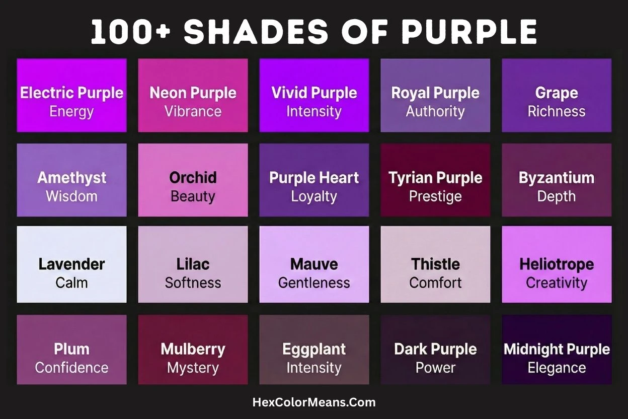
From soft lavender to deep plum, the world of purple is vast and vibrant. This royal color mixes red and blue in endless ways. But how do you choose the right shade?
Explore names, hex codes, and meanings for every hue. We cover pale lilac, rich eggplant, bright magenta, and historic Tyrian purple.
Next, find the perfect purple for your design, branding, or creative project.
Darker & Richer Shades
For a sense of drama and luxury, turn to the deeper end of the purple spectrum. Eggplant is a very dark, deep purple, mirroring the vegetable’s rich skin.
Then there’s the legendary Tyrian Purple, also known as Royal Purple. This is an ancient and luxurious shade once reserved for emperors.
Similarly, Mulberry offers a dark, reddish-purple tone. It echoes the depth of the ripe berry.
Lighter & Pastel Shades
In contrast, lighter purples evoke calm and softness. Lilac is a pale purple with distinctive pinkish tones, often feeling warmer than its cousin lavender.
Periwinkle presents as a pale, soft blue-purple. It has a delicate charm.
For a more muted option, Thistle provides a grayish-purple hue. It is inspired by the soft flower head.
How Shades Are Created
The creation of all these variations stems from simple color mixing. Fundamentally, purple is born from combining red and blue; equal parts make a classic violet.
Using more blue creates a cooler tone, while more red yields a warmer, pinker hue. To achieve lighter, pastel shades like lavender or lilac, white is blended in.
Conversely, adding black or gray results in darker, more muted shades. This creates colors such as deep plum or violet.
Lavender
Lavender (#E6E6FA) is a very pale, cool-toned violet with a high white content, named after the lavender flower. This color evokes calmness, purity, and delicate femininity. Consequently, it is strongly associated with aromatherapy and springtime. It is a staple in feminine design, wedding decor, and wellness products to promote relaxation and serenity.
- HEX #E6E6FA
- RGB 230, 230, 250
- CMYK 8, 8, 0, 2
Violet
Violet (#8F00FF) is a vivid, spectral color at the short-wavelength end of the visible spectrum. It is often confused with purple but is a pure chromatic color with its own wavelength. This shade is linked to spirituality, imagination, and higher consciousness. Furthermore, it was a favorite of artists like Leonardo da Vinci. Thus, Violet is effectively used in meditative spaces, artistic expressions, and futuristic designs.
- HEX #8F00FF
- RGB 143, 0, 255
- CMYK 44, 100, 0, 0
Indigo
Indigo (#4B0082) is a deep, dark blue-purple, historically derived from the plant Indigofera tinctoria. It sits between blue and violet on the spectrum. This color represents intuition, integrity, and deep contemplation. It was once a valuable trade commodity and is one of the seven colors of the rainbow. Hence, Indigo is used in denim, spiritual symbolism, and designs requiring dignified depth.
- HEX #4B0082
- RGB 75, 0, 130
- CMYK 42, 100, 0, 49
Plum
Plum (#DDA0DD) is a pale, grayish violet-red reminiscent of the interior flesh of the plum fruit. This muted shade conveys maturity, luxury, and subdued romance. Moreover, it is often associated with elegant fashion and vintage interiors. Therefore, Plum is a popular choice for sophisticated packaging, cosmetic designs, and autumnal palettes.
- HEX #DDA0DD
- RGB 221, 160, 221
- CMYK 0, 28, 0, 13
Thistle
Thistle (#D8BFD8) is a pale, grayish violet-red reminiscent of the Scottish thistle flower. This subtle, dusty shade conveys softness, modesty, and nostalgic charm. Historically, it is linked to the national emblem of Scotland, symbolizing nobility and resilience. Moreover, its muted tone avoids strong contrast, creating a gentle and soothing effect. Therefore, Thistle is effectively used in vintage floral designs, feminine stationery, and soft background textures to evoke a sense of quiet dignity and historical romance.
- HEX #D8BFD8
- RGB 216, 191, 216
- CMYK 0, 12, 0, 15
Orchid
Orchid (#DA70D6) is a bright, medium purple with strong pink undertones, directly named after the vibrant tropical flower. This color exudes exotic beauty, rare charm, and vibrant femininity. It became notably popular in the Art Nouveau period and later in the psychedelic 1960s for its eye-catching quality. The shade strikes a balance between playful and sophisticated. Consequently, Orchid is a dynamic choice for fashion accents, creative branding, and designs aiming to appear both luxurious and approachable.
- HEX #DA70D6
- RGB 218, 112, 214
- CMYK 0, 49, 2, 15
Fuchsia
Fuchsia (#FF00FF) is a fully saturated, intense purplish-red, named after the fuchsia plant’s hanging flowers. It is identical to web color Magenta and represents the pure essence of electric pink-purple. This color embodies bold confidence, high energy, and unabashed playfulness. Technically, it is an extra-spectral color, meaning it cannot be generated by a single wavelength of light. Thus, Fuchsia is powerfully deployed in youth-oriented advertising, nightlife graphics, and digital art to command immediate attention and convey a modern, rebellious spirit.
- HEX #FF00FF
- RGB 255, 0, 255
- CMYK 0, 100, 0, 0
Magenta
Magenta (#FF00FF) is an identical match to Fuchsia in digital design, a vivid blend of red and blue light at full intensity. Its name originates from the Battle of Magenta in 1859, coinciding with the invention of the first aniline dye. This color is a primary color in the CMYK subtractive model and symbolizes universal harmony and emotional balance. It possesses a unique property of not having a dedicated wavelength, making it a “forbidden color” of the spectrum. Therefore, Magenta is fundamental in color printing, psychedelic art, and designs that require a striking, non-naturalistic pop.
- HEX #FF00FF
- RGB 255, 0, 255
- CMYK 0, 100, 0, 0
Mauve
Mauve (#E0B0FF) is a pale, grayish violet with a subtle lavender-pink tone, famously the first synthetic aniline dye accidentally created by William Henry Perkin in 1856. This discovery sparked a chemical industry revolution. The color quickly became a fashion sensation in the late Victorian era, known as “mauveine.” It represents innovation, nostalgia, and understated elegance. As a result, Mauve is historically significant and is used in period costumes, romantic packaging, and designs that whisper rather than shout.
- HEX #E0B0FF
- RGB 224, 176, 255
- CMYK 12, 31, 0, 0
Amethyst
Amethyst (#9966CC) is a medium, transparent violet inspired by the semi-precious quartz gemstone. Historically, it was believed to prevent drunkenness, with its name deriving from the Greek “amethystos” meaning “not intoxicated.” This color symbolizes sobriety, peace, and spiritual wisdom. Furthermore, it has been prized in ecclesiastical jewelry and royal regalia for centuries. Consequently, Amethyst is used in spiritual and holistic branding, jewelry design, and interiors to create an atmosphere of calm luxury and introspection.
- HEX #9966CC
- RGB 153, 102, 204
- CMYK 25, 50, 0, 20
Lilac
Lilac (#C8A2C8) is a light, soft violet with a distinctly pinkish hue, named after the small, fragrant lilac flower. This color evokes first love, youthful innocence, and the gentle arrival of spring. It is often associated with Easter celebrations and vintage romance. Moreover, its high value and low saturation make it exceptionally soothing. Therefore, Lilac is a perennial favorite for nursery decor, feminine fashion, and pastoral-themed designs that aim to be sweet and nostalgic.
- HEX #C8A2C8
- RGB 200, 162, 200
- CMYK 0, 19, 0, 22
Grape
Grape (#6F2DA8) is a deep, rich violet with strong blue undertones, directly reminiscent of Concord grapes. This saturated shade conveys abundance, decadence, and mysterious depth. It is a color often linked to opulence in nature and creative imagination. Additionally, it carries a certain dramatic, almost theatrical energy. Hence, Grape is effectively used in luxurious food packaging, fantasy genre art, and bold accent walls to suggest richness and intensity.
- HEX #6F2DA8
- RGB 111, 45, 168
- CMYK 34, 73, 0, 34
Eggplant
Eggplant (#614051) is a very dark, muted violet-brown, taking its name from the skin of the aubergine. This color embodies sophistication, earthiness, and understated drama. It is a neutral with character, often serving as a refined alternative to black. Furthermore, it is a staple in autumnal fashion and modern interior design for its warmth and depth. Thus, Eggplant is ideal for elegant evening wear, cozy interior accents, and gourmet branding that requires a tasteful, grounded darkness.
- HEX #614051
- RGB 97, 64, 81
- CMYK 0, 34, 16, 62
Mulberry
Mulberry (#C54B8C) is a deep, reddish-purple inspired by the ripe mulberry fruit. This warm, berry tone suggests passion, sacrifice, and sensual richness. Historically, it was a common dye color in many ancient cultures. The color balances the warmth of red with the complexity of purple. Consequently, Mulberry is powerfully used in dramatic floral arrangements, rich textiles, and confectionery branding to evoke a sense of indulgent, mature sweetness.
- HEX #C54B8C
- RGB 197, 75, 140
- CMYK 0, 62, 29, 23
Wisteria
Wisteria (#C9A0DC) is a light, soft violet with a delicate grayish-pink undertone, named after the cascading blossoms of the wisteria vine. This color evokes romanticism, serenity, and graceful aging. It is strongly associated with spring gardens and classic, pastoral beauty. Moreover, its ethereal quality suggests nostalgia and gentle charm. Therefore, Wisteria is commonly used in wedding themes, feminine bedding collections, and spa environments to create a soft, dreamlike, and calming atmosphere.
- HEX #C9A0DC
- RGB 201, 160, 220
- CMYK 9, 27, 0, 14
Heliotrope
Heliotrope (#DF73FF) is a vibrant, pinkish-purple named after the heliotrope flower, which turns toward the sun. This luminous color represents devotion, eternal love, and celestial attraction. Historically, it was popular in the Victorian language of flowers. Furthermore, its intense hue captures a sense of magical or otherworldly light. Consequently, Heliotrope is effectively used in fantasy art, mystical or spiritual graphics, and vibrant fashion details to imply enchantment and radiant warmth.
- HEX #DF73FF
- RGB 223, 115, 255
- CMYK 13, 55, 0, 0
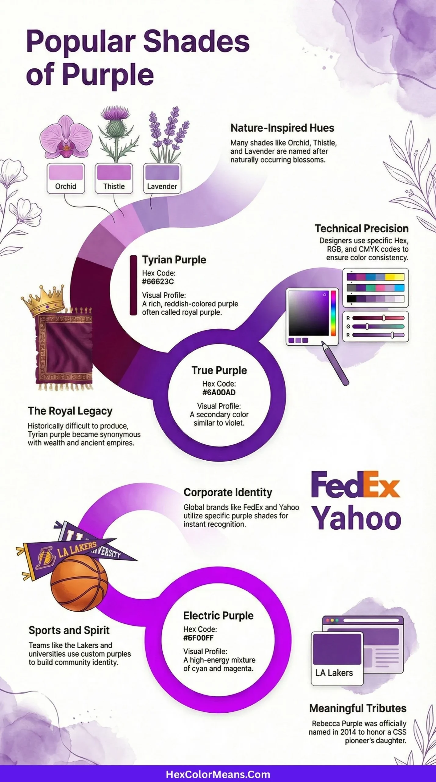
Tyrian Purple
Tyrian Purple (#66023C) is an extremely deep, reddish-purple, historically known as the famed “Royal Purple” of antiquity. It was produced from the mucous secretions of the Murex sea snail, making it prohibitively expensive and a literal status symbol for Roman emperors and Byzantine empresses. This color is synonymous with ultimate power, imperial authority, and immense prestige. Thus, Tyrian Purple is referenced in historical art, heraldry, and designs that require an authentic connotation of ancient, unrivaled luxury and sovereignty.
- HEX #66023C
- RGB 102, 2, 60
- CMYK 0, 98, 41, 60
Royal Purple
Royal Purple (#7851A9) is a rich, medium violet-blue, distinct from the ancient Tyrian Purple. This shade became associated with royalty in Europe due to its continued costliness from various dye sources. It represents majesty, ambition, and dignified creativity. Furthermore, it is a traditional academic color for fields like architecture and law. Hence, Royal Purple is used in corporate branding for premium services, graduation regalia, and team uniforms to communicate authority with a slightly more accessible and modern vibrancy than its ancient counterpart.
- HEX #7851A9
- RGB 120, 81, 169
- CMYK 29, 52, 0, 34
Byzantium
Byzantium (#702963) is a dark, muted purplish-red, evocative of the opulent and mysterious Byzantine Empire. This color balances deep purple with strong magenta undertones, suggesting extravagance, mysticism, and historical grandeur. It is a color of shadowy luxury and ornate depth. Consequently, Byzantium is powerfully employed in period drama set design, luxury cosmetic packaging, and dramatic evening wear to evoke a sense of ancient, secretive wealth and sophisticated power.
- HEX #702963
- RGB 112, 41, 99
- CMYK 0, 63, 12, 56
Iris
Iris (#5A4FCF) is a bright, vibrant blue-purple named after the iris flower, which exhibits a wide spectrum of colors. This shade leans distinctly toward periwinkle blue while maintaining a luminous purple base. It symbolizes faith, wisdom, and cherished friendship. Furthermore, in Greek mythology, Iris was the goddess of the rainbow, linking this color to divine messages and celestial bridges. Consequently, Iris is effectively used in creative branding, spiritual logos, and uplifting designs that aim to feel both hopeful and elegantly vibrant.
- HEX #5A4FCF
- RGB 90, 79, 207
- CMYK 57, 62, 0, 19
Periwinkle
Periwinkle (#CCCCFF) is a very pale, pastel tint of blue-violet, named after the small Mediterranean sea snail and the flowering plant. This ethereal color evokes serenity, nostalgia, and tender memories. It is often associated with sweetness, calmness, and a gentle, dreamy state of mind. Moreover, its high lightness makes it an excellent, non-aggressive background. Therefore, Periwinkle is a staple in nursery decor, spring-themed marketing, and healthcare environments to promote a sense of peaceful tranquility and soft comfort.
- HEX #CCCCFF
- RGB 204, 204, 255
- CMYK 20, 20, 0, 0
Wine
Wine (#722F37) is a deep, muted red-brown with strong purple undertones, directly inspired by the color of red wine. This sophisticated shade conveys richness, maturity, and rustic elegance. It is inherently linked to viticulture, gourmet dining, and autumn harvests. Furthermore, it carries connotations of classical knowledge and aged luxury. Hence, Wine is powerfully used in upscale restaurant branding, luxury product packaging, and traditional interior design to create an atmosphere of warm, refined opulence.
- HEX #722F37
- RGB 114, 47, 55
- CMYK 0, 59, 52, 55
Jam
Jam (#601A35) is a very dark, rich reddish-purple reminiscent of cooked berry preserves. This color suggests indulgence, homemade comfort, and concentrated sweetness. It is a shade that feels both warm and deeply saturated, evoking a sense of abundance and tradition. Consequently, Jam is effectively employed in food industry branding, cozy craft packaging, and autumn fashion palettes to communicate a feeling of hearty, delicious, and nostalgic richness.
- HEX #601A35
- RGB 96, 26, 53
- CMYK 0, 73, 45, 62
Pansy
Pansy (#78184A) is a deep, muted violet-red named after the garden flower with its characteristic “faces.” This color embodies thoughtful remembrance, free-thinking, and loving memories. In the language of flowers, pansies often symbolize idle thought and remembrance. Moreover, its depth conveys a certain poetic melancholy and resilience. Thus, Pansy is used in memorial designs, poetic book covers, and heritage crafts to express sentimentality, depth of feeling, and enduring affection.
- HEX #78184A
- RGB 120, 24, 74
- CMYK 0, 80, 38, 53
Raisin
Raisin (#290916) is an extremely dark, desaturated purplish-brown, mirroring the appearance of a dried grape. This shade is nearly black but carries a warm, subtle undertone of fermented fruit. It represents aged richness, understated luxury, and natural decay. Furthermore, it functions as a complex neutral, adding depth without starkness. Consequently, Raisin is effectively used in high-end leather goods, sophisticated typography, and moody interior design schemes to provide a warm, deep foundation with character.
- HEX #290916
- RGB 41, 9, 22
- CMYK 0, 78, 46, 84
Gloxinia
Gloxinia (#622569) is a medium-dark, muted violet with balanced red and blue notes, named for the tropical flowering plant. This color suggests exotic beauty, a love of nature, and spirited individuality. It is vibrant yet refined, avoiding overt sweetness. Moreover, it carries a botanical elegance and a touch of the uncommon. Therefore, Gloxinia is a distinctive choice for specialty gardening brands, unique fashion accessories, and artistic packaging that aims to stand out with natural sophistication.
- HEX #622569
- RGB 98, 37, 105
- CMYK 7, 65, 0, 59
Boysenberry
Boysenberry (#873260) is a deep, reddish-purple inspired by the hybrid berry, blending the tones of raspberry, blackberry, and loganberry. This juicy shade conveys complex sweetness, innovative creation, and rustic abundance. It is a warm and appetizing color that feels both natural and indulgent. Hence, Boysenberry is powerfully used in artisanal food labels, farm-fresh product branding, and cozy knitwear to evoke a sense of handcrafted delight and fruitful harvest.
- HEX #873260
- RGB 135, 50, 96
- CMYK 0, 63, 29, 47
Aubergine
Aubergine (#3B0910) is a very dark, almost black shade of brownish-purple, taking its name from the British and French word for eggplant. This color embodies deep sophistication, dramatic intensity, and earthy luxury. It is darker and more neutral than its counterpart “Eggplant,” functioning as a rich, warm black. Consequently, Aubergine is ideal for elegant evening gowns, luxury automotive interiors, and gourmet restaurant menus where it communicates opulence and profound depth.
- HEX #3B0910
- RGB 59, 9, 16
- CMYK 0, 85, 73, 77
Heather
Heather (#B7A0C9) is a soft, grayish lavender inspired by the common heather plant found in moorlands. This muted, dusty tone evokes solitude, admiration, and the beauty of wild, open spaces. It is a color associated with Scottish landscapes, resilience, and understated charm. Furthermore, its gray infusion makes it exceptionally versatile and soothing. Thus, Heather is widely used in tweed fabrics, rustic wedding palettes, and serene home decor to create a sense of natural, weathered elegance.
- HEX #B7A0C9
- RGB 183, 160, 201
- CMYK 9, 20, 0, 21
Damson
Damson (#854C65) is a medium-dark, muted purple with strong brownish-gray undertones, named after the small, tart Damson plum. This color conveys heritage, simplicity, and autumnal warmth. Historically associated with traditional preserves and rustic orchards, it evokes a sense of time-honored practices. Moreover, its desaturated nature provides a subdued, earthy elegance. Consequently, Damson is effectively used in heritage branding, folk art design, and cozy interior textiles to suggest authenticity and natural, unassuming richness.
- HEX #854C65
- RGB 133, 76, 101
- CMYK 0, 43, 24, 48
Mystic
Mystic (#D65282) is a bright, rosy magenta-pink with a vibrant, medium saturation. This color suggests enchantment, spiritual mystery, and passionate emotion. It leans more toward hot pink than true purple, carrying an energetic and mesmerizing quality. Furthermore, it is often linked to the unconventional and the ethereal. Therefore, Mystic is a compelling choice for festival wear, metaphysical shop branding, and bold digital art to convey a sense of magical allure and vibrant, otherworldly energy.
- HEX #D65282
- RGB 214, 82, 130
- CMYK 0, 62, 39, 16
Electric Purple
Electric Purple (#BF00FF) is an intensely vivid, neon-like purple with a powerful blue undertone. This synthetic, ultra-saturated hue embodies high voltage, digital innovation, and futuristic psychedelia. It is a color that seems to emit its own light, reminiscent of neon signs and laser shows. Consequently, Electric Purple is dominantly used in club graphics, sci-fi media, and extreme sports branding to communicate cutting-edge energy, artificial brilliance, and a bold, avant-garde attitude.
- HEX #BF00FF
- RGB 191, 0, 255
- CMYK 25, 100, 0, 0
Imperial Purple
Imperial Purple (#5A0035) is an extremely deep, blackened red-purple, evoking the dense, blood-like richness of ancient dyes. This color is synonymous with absolute power, solemnity, and imposing grandeur. It is darker and more severe than Tyrian Purple, suggesting coercive authority and formidable presence. Hence, Imperial Purple is powerfully employed in high-end academic regalia, luxury leather goods, and dramatic theatrical design to impart a sense of uncompromising tradition and majestic weight.
- HEX #5A0035
- RGB 90, 0, 53
- CMYK 0, 100, 41, 65
Ultra Violet
Ultra Violet (#645394) is a medium, muted blue-purple, famously designated as Pantone’s Color of the Year in 2018. This complex shade suggests inventiveness, visionary thinking, and countercultural expression. It is a color that looks toward the future and the cosmic unknown. Moreover, it carries a mystical yet technological resonance. Thus, Ultra Violet is used in avant-garde fashion, tech startup branding, and artistic installations to symbolize creative exploration and mindful complexity.
- HEX #645394
- RGB 100, 83, 148
- CMYK 32, 44, 0, 42
Blackberry
Blackberry (#4D0135) is an exceedingly deep, blackened purple with strong red undertones, mirroring the ripe, almost black fruit. This color embodies mysterious abundance, hidden depths, and protective secrecy. It is the shade of shadowed thickets and foraging at dusk, conveying a sense of wild, untamed richness. Consequently, Blackberry is powerfully used in mystery novel covers, luxury dessert branding, and dark floral designs to evoke a feeling of indulgent, enigmatic natural bounty.
- HEX #4D0135
- RGB 77, 1, 53
- CMYK 0, 99, 31, 70
Concord
Concord (#7C5379) is a grayish, medium violet-brown inspired by the deep hue of Concord grapes. This muted, desaturated shade conveys maturity, tradition, and rustic simplicity. It is a color firmly rooted in American horticultural history and homemade wines. Furthermore, its earthy quality makes it feel both reliable and approachable. Therefore, Concord is effectively used in heritage craft branding, pastoral landscape art, and cozy home furnishings to suggest time-honored quality and unpretentious comfort.
- HEX #7C5379
- RGB 124, 83, 121
- CMYK 0, 33, 2, 51
Dusty Purple
Dusty Purple (#A898B5) is a light to medium, grayed lavender with a significant neutral undertone. This color evokes faded elegance, nostalgic memory, and quiet grace. It appears as if a brighter purple has been softened by time and sun, lending it a vintage, weathered charm. Moreover, it serves as a sophisticated neutral in design. Thus, Dusty Purple is a staple in shabby chic interiors, vintage wedding themes, and muted botanical prints to create a sense of romantic, timeworn beauty.
- HEX #A898B5
- RGB 168, 152, 181
- CMYK 7, 16, 0, 29
Grape Jelly
Grape Jelly (#3F1F4B) is a dark, intensely saturated purple with a blue-black base, reminiscent of the processed, glossy spread. This color suggests playful indulgence, childhood nostalgia, and artificial sweetness. It is darker and more uniform than the natural grape, carrying a fun, manufactured vibrancy. Consequently, Grape Jelly is effectively used in toy packaging, playful app icons, and retro diner decor to invoke a sense of sugary, joyful familiarity and bold, simple delight.
- HEX #3F1F4B
- RGB 63, 31, 75
- CMYK 16, 59, 0, 71
Dark Orchid
Dark Orchid (#9932CC) is a rich, deep violet with a strong, luminous blue bias, named after the exotic flower. This color represents luxurious mystery, dramatic seduction, and creative opulence. It is significantly more saturated and vibrant than many “dark” purples, giving it a jewel-toned intensity. Hence, Dark Orchid is a dominant choice for luxury fashion accents, vibrant nightlife branding, and fantasy game design to convey a sense of exotic richness and captivating depth.
- HEX #9932CC
- RGB 153, 50, 204
- CMYK 25, 75, 0, 20
Medium Orchid
Medium Orchid (#BA55D3) is a vivid, pinkish-purple that is both saturated and luminous, sitting between Dark Orchid and the lighter orchid shades. This color exudes flamboyant charm, tropical allure, and artistic flair. It is a staple in digital design palettes due to its eye-catching yet balanced tone. Furthermore, it carries connotations of 1960s psychedelia and modern eccentricity. Consequently, Medium Orchid is effectively used in event posters, creative software UI elements, and vibrant fashion prints to project a friendly, energetic, and creatively bold personality.
- HEX #BA55D3
- RGB 186, 85, 211
- CMYK 12, 60, 0, 17
Pale Violet
Pale Violet (#DB7093), also known as Pale Violet-Red, is a soft, muted pink-lavender with a significant grayish undertone. This gentle shade evokes tender romance, sentimental memory, and delicate health. Despite its name, it leans more toward a dusty pink on the spectrum. Moreover, it is one of the original web colors from early X11 windows. Therefore, Pale Violet is commonly used in vintage cosmetics packaging, spring-themed greeting cards, and healthcare logos to communicate softness, care, and nostalgic affection.
- HEX #DB7093
- RGB 219, 112, 147
- CMYK 0, 49, 33, 14
Medium Purple
Medium Purple (#9370DB) is a medium-light, cool-toned violet with a distinct periwinkle lean, created as a web color. This shade represents accessibility, soothing creativity, and digital friendliness. It is less intense than pure violet but more colorful than lavender, striking a versatile and approachable balance. Hence, Medium Purple is widely employed in children’s educational apps, wellness website designs, and casual craft supplies to foster an environment that feels both imaginative and calmly inviting.
- HEX #9370DB
- RGB 147, 112, 219
- CMYK 33, 49, 0, 14
Rebecca Purple
Rebecca Purple (#663399), also known as RebeccaPurple, is a deep, muted blue-violet with significant historical weight in web development. This color was officially added to the CSS color list in 2014 in memory of Rebecca Alison Meyer, daughter of web pioneer Eric Meyer. It symbolizes loss, remembrance, and the humanity within technology. Consequently, it is used in web developer communities, memorial sites, and digital advocacy as a poignant tribute and a symbol of the personal stories behind code.
- HEX #663399
- RGB 102, 51, 153
- CMYK 33, 67, 0, 40
African Violet
African Violet (#B284BE) is a soft, grayish medium purple inspired by the popular houseplant’s blossoms. This color conveys domestic tranquility, gentle nurturing, and subtle joy. It is associated with hobbyist gardening and cozy indoor spaces. Furthermore, its muted saturation makes it exceptionally easy to live with. Thus, African Violet is a favorite in home decor, especially in bedrooms and living rooms, and in branding for gardening societies or craft stores to promote a sense of calm, cherished hobbies, and peaceful beauty.
- HEX #B284BE
- RGB 178, 132, 190
- CMYK 6, 31, 0, 25
Deep Violet
Deep Violet (#330066) is an intense, dark blue-violet that approaches black while maintaining a vivid chromatic undertone. This color embodies profound mystery, spiritual depth, and cosmic wonder. It is reminiscent of the night sky just before absolute darkness and carries a sense of infinite potential. Consequently, Deep Violet is powerfully used in astronomy-related designs, spiritual retreat branding, and luxury packaging for high-end electronics to evoke a sense of the sublime, the unknown, and ultimate sophistication.
- HEX #330066
- RGB 51, 0, 102
- CMYK 50, 100, 0, 60
Dark Purple
Dark Purple (#301934) is a very dark, desaturated purple with a strong brownish-gray cast, often perceived as a warm black. This shade represents solemnity, secrecy, and gothic elegance. It is less chromatic and more neutral than Deep Violet, functioning as a shadowy, earthy base. Hence, Dark Purple is effectively used in gothic fashion, mystery genre book covers, and moody theatrical set designs to create an atmosphere of antique mystery and refined gloom.
- HEX #301934
- RGB 48, 25, 52
- CMYK 8, 52, 0, 80
Purple Heart
Purple Heart (#69359C) is a strong, vibrant violet-blue, named after the United States military decoration awarded for being wounded or killed in service. This color symbolizes bravery, sacrifice, and honorable recognition. It carries a weight of respect and solemn courage. Therefore, Purple Heart is used not only in military contexts and veteran support imagery but also in designs that aim to communicate dignity, high achievement, and principled strength with a noble and clear-toned authority.
- HEX #69359C
- RGB 105, 53, 156
- CMYK 33, 66, 0, 39
Purple Taupe
Purple Taupe (#50404D) is a dark, grayish purple-brown, sitting squarely at the intersection of purple and neutral earth tones. This complex shade conveys utilitarian elegance, grounded sophistication, and muted warmth. It is a versatile and serious neutral that works well in both modern and traditional settings. Consequently, Purple Taupe is ideal for architectural finishes, professional office attire, and high-end product design where it provides a background of understated, reliable, and tasteful depth.
- HEX #50404D
- RGB 80, 64, 77
- CMYK 0, 20, 4, 69
Purple Plum
Purple Plum (#9C51B6) is a bright, medium purple with a lively pinkish undertone, directly evoking the skin of a ripe plum. This juicy, saturated color suggests whimsical luxury, creative abundance, and playful energy. It is more vibrant and less muted than the color “Plum.” Furthermore, it has a youthful and electric quality. Thus, Purple Plum is effectively used in contemporary fashion accessories, toy design, and creative software branding to inject a dose of fun, modern vibrancy.
- HEX #9C51B6
- RGB 156, 81, 182
- CMYK 14, 55, 0, 29
Purple Mountain Majesty
Purple Mountain Majesty (#9678B6) is a soft, dusty medium violet with a distinct grayish-lavender tone, named from the lyric in “America the Beautiful.” This color evokes distant horizons, nostalgic patriotism, and serene grandeur. It captures the hazy, faded purple of faraway mountain ranges at dusk. Consequently, it is used in heritage branding, outdoor adventure logos, and scenic photography themes to communicate a sense of expansive, timeless beauty and peaceful, weathered majesty.
- HEX #9678B6
- RGB 150, 120, 182
- CMYK 18, 34, 0, 29
Purple Navy
Purple Navy (#4E5180) is a dark, desaturated blue-purple that leans heavily toward navy blue. This color embodies professional authority, maritime tradition, and intelligent depth. It combines the seriousness of navy with the creative nuance of purple, making it both authoritative and unconventional. Hence, Purple Navy is effectively used in corporate branding for creative industries, academic team uniforms, and sophisticated website headers to project reliability with a distinctive, thoughtful character.
- HEX #4E5180
- RGB 78, 81, 128
- CMYK 39, 37, 0, 50
Purple Haze
Purple Haze (#807396) is a medium-light, grayish violet with a balanced, muted tone, famously referencing the Jimi Hendrix song and psychedelic experience. This color suggests dreamy ambiguity, nostalgic fusion, and softened perception. It appears as a blended, indistinct shade, evoking mist or smoke. Therefore, Purple Haze is commonly used in music festival merchandise, vintage poster design, and bohemian interior decor to create an atmosphere of mellow, retro-inspired mystique.
- HEX #807396
- RGB 128, 115, 150
- CMYK 15, 23, 0, 41
Purple Lotus
Purple Lotus (#6A0DAD) is a deep, vibrant violet with a slight blue bias, inspired by the sacred lotus flower in Buddhism and Hinduism. This color symbolizes spiritual enlightenment, divine wisdom, and mystical rebirth. It represents the crown chakra and the highest state of consciousness. Consequently, Purple Lotus is powerfully employed in wellness and yoga branding, spiritual literature covers, and holistic product packaging to denote purity, spiritual awakening, and transcendent beauty.
- HEX #6A0DAD
- RGB 106, 13, 173
- CMYK 39, 92, 0, 32
Purple Iris
Purple Iris (#571B7E) is a very dark, saturated violet-blue, deeper and more intense than the standard Iris color. This shade conveys regal dignity, profound intuition, and deep-seated faith. It is the color of the iris flower at its most majestic and shadowed. Moreover, it carries a solemn, almost ecclesiastical weight. Thus, Purple Iris is used in academic regalia for divinity schools, luxury cosmetic lines, and dramatic floral arrangements to express solemn beauty and insightful depth.
- HEX #571B7E
- RGB 87, 27, 126
- CMYK 31, 79, 0, 51
Purple Passion
Purple Passion (#A020F0) is a vivid, intense violet that is almost electric in its saturation, nearly identical to the web color “Veronica.” This color embodies uninhibited creativity, dynamic energy, and theatrical flair. It is a borderline neon shade that commands immediate attention and suggests a fearless personality. Consequently, Purple Passion is dominantly used in entertainment industry graphics, nightclub lighting, and avant-garde fashion to project confidence, excitement, and a bold, modern sensibility.
- HEX #A020F0
- RGB 160, 32, 240
- CMYK 33, 87, 0, 6
Purple Rose
Purple Rose (#B09FCA) is a light, grayish lavender with a soft pink undertone, mimicking the rare hue of some cultivated roses. This delicate shade evokes enchantment, unique love, and mystical fascination. It carries the romance of a rose with the mystery of purple, symbolizing love at first sight and wonder. Therefore, Purple Rose is a popular choice for fantasy-themed weddings, specialty floral branding, and perfume packaging to create a sense of magical, uncommon romance.
- HEX #B09FCA
- RGB 176, 159, 202
- CMYK 13, 21, 0, 21
Purple Sage
Purple Sage (#9F8DA7) is a pale, grayish violet-brown, named after the silvery-purple leaves of the desert sagebrush. This muted, dusty color conveys drought-resistant resilience, southwestern warmth, and earthy wisdom. It is a neutral with a subtle cool undertone, evocative of arid landscapes and herbal simplicity. Hence, Purple Sage is effectively used in spa and wellness branding, rustic home decor, and natural cosmetic lines to promote a feeling of grounded tranquility and organic harmony.
- HEX #9F8DA7
- RGB 159, 141, 167
- CMYK 5, 16, 0, 35
Purple Smoke
Purple Smoke (#A27F9E) is a medium, desaturated reddish-purple with a significant gray infusion, resembling wisps of colored smoke. This elusive shade suggests ephemeral beauty, haunting memory, and subtle transformation. It is a color that seems to evade clear definition, creating a soft, melancholic atmosphere. Consequently, Purple Smoke is used in poetic book covers, historical documentary themes, and moody portrait photography to impart a sense of fleeting, soft-focus nostalgia.
- HEX #A27F9E
- RGB 162, 127, 158
- CMYK 0, 22, 2, 36
Purple Velvet
Purple Velvet (#4B1B3F) is a very dark, rich red-purple, evocative of plush, deep-pile velvet fabric. This color embodies opulent luxury, sensual depth, and dramatic comfort. It is the shade of royal drapes and exclusive lounges, suggesting a texture that is as rich as its hue. Thus, Purple Velvet is powerfully employed in high-end fashion (especially eveningwear), luxury hotel interiors, and theater curtain design to communicate sumptuousness, intimate grandeur, and tactile indulgence.
- HEX #4B1B3F
- RGB 75, 27, 63
- CMYK 0, 64, 16, 71
Dark Magenta
Dark Magenta (#8B008B) is a deep, intense purplish-red, defined as a standard web and X11 color. This shade is a darker, more somber version of pure magenta, representing solemn passion, sophisticated intensity, and transformative power. It retains the psychological impact of magenta but with added gravity and depth. Consequently, Dark Magenta is effectively used in corporate identity for creative firms, professional scientific visualization, and alternative fashion to convey serious creativity and impactful, non-traditional energy.
- HEX #8B008B
- RGB 139, 0, 139
- CMYK 0, 100, 0, 45
Rich Purple
Rich Purple (#720058) is a very dark, saturated red-purple that borders on maroon. This color exudes decadent luxury, profound emotion, and baroque opulence. It is deeper and redder than many purples, suggesting aged wine, velvet, and deep shadow. Hence, Rich Purple is powerfully employed in luxury confectionery packaging, dramatic interior accent walls, and formal event invitations to evoke a sense of sumptuous, almost overwhelming, sensory richness.
- HEX #720058
- RGB 114, 0, 88
- CMYK 0, 100, 23, 55
Frosted Lavender
Frosted Lavender (#DDD6E8) is an extremely pale, cool-toned lavender with a high white content, resembling lavender touched by frost or mixed with milk. This ethereal shade evokes pristine calm, wintery silence, and delicate clarity. It is even lighter and cooler than standard lavender, creating an airier, more spacious feeling. Therefore, Frosted Lavender is ideal for minimalist spa design, winter wedding themes, and skincare product packaging to promote an immaculate, serene, and softly refined aesthetic.
- HEX #DDD6E8
- RGB 221, 214, 232
- CMYK 5, 8, 0, 9
Muted Plum
Muted Plum (#7D5A7E) is a medium, grayish violet-red with a dusky, subdued character. This color conveys mature refinement, understated romance, and autumnal decay. It is less saturated and more complex than a pure plum, suggesting something faded and elegantly worn. Consequently, Muted Plum is used in heritage brand logos, sophisticated knitwear, and traditional quilt designs to communicate a sense of time-tested quality, quiet comfort, and nostalgic beauty.
- HEX #7D5A7E
- RGB 125, 90, 126
- CMYK 1, 29, 0, 51
Shadow Purple
Shadow Purple (#4A4063) is a dark, desaturated blue-violet that mimics the color of deep shadows in twilight. This shade embodies mysterious depth, introspective thought, and velvety darkness. It is a color of hidden corners and subdued light, offering a dramatic yet neutral backdrop. Thus, Shadow Purple is effectively used in astrological graphics, mystery game interfaces, and dramatic stage lighting to create an ambiance of concealed knowledge and tranquil mystery.
- HEX #4A4063
- RGB 74, 64, 99
- CMYK 25, 35, 0, 61
Soft Lilac
Soft Lilac (#DCD0FF) is a very pale, whitened violet with a gentle, cool luminance. This shade evokes innocent dreams, gentle reassurance, and clean freshness. It is lighter and softer than standard lilac, almost resembling a pastel haze or morning mist. Consequently, Soft Lilac is extensively used in baby product branding, dreamy illustration backgrounds, and minimalist website design to cultivate an atmosphere of pure, peaceful, and optimistic serenity.
- HEX #DCD0FF
- RGB 220, 208, 255
- CMYK 14, 18, 0, 0
Sugar Plum
Sugar Plum (#914E75) is a medium, muted reddish-purple inspired by the confection referenced in “The Nutcracker.” This color conveys whimsical nostalgia, festive sweetness, and storybook magic. It balances warmth with a dusty quality, feeling both indulgent and vintage. Hence, Sugar Plum is a staple in holiday marketing, children’s book illustrations, and vintage-inspired bakery packaging to evoke a sense of traditional, fairy-tale delight and cozy celebration.
- HEX #914E75
- RGB 145, 78, 117
- CMYK 0, 46, 19, 43
Twilight Purple
Twilight Purple (#5B2C6F) is a deep, muted violet-blue that captures the color of the sky in the final moments of dusk. This shade represents transition, peaceful mystery, and contemplative calm. It is the color between day and night, symbolizing quiet reflection and magical possibility. Therefore, Twilight Purple is effectively used in poetry journals, meditation app interfaces, and landscape photography themes to inspire thoughtfulness and a sense of serene, cosmic transition.
- HEX #5B2C6F
- RGB 91, 44, 111
- CMYK 18, 60, 0, 56
Grape Royale
Grape Royale (#5E2B97) is a rich, deep violet with a majestic blue undertone, more saturated and regal than standard grape. This color embodies luxurious depth, noble creativity, and bold individuality. It suggests a concentrated, almost intoxicating richness. Consequently, Grape Royale is powerfully employed in music festival branding (especially jazz or soul), premium juice or wine labels, and dramatic evening makeup to communicate a sense of intense, flavorful opulence.
- HEX #5E2B97
- RGB 94, 43, 151
- CMYK 38, 72, 0, 41
Berry Purple
Berry Purple (#7A1F3D) is a dark, red-leaning purple that sits on the border between purple and burgundy. This shade conveys dramatic richness, tangy sweetness, and robust vitality. It is the color of blackberries and elderberries at their ripest and darkest. Thus, Berry Purple is used in athletic wear for unique teams, modern gourmet restaurant branding, and bold automotive finishes to project a sense of powerful, energetic, and sophisticated depth.
- HEX #7A1F3D
- RGB 122, 31, 61
- CMYK 0, 75, 50, 52
Orchid Haze
Orchid Haze (#E3A9E5) is a very light, pastel pinkish-purple with a misty, luminous quality. This ethereal shade suggests delicate fantasy, sweet daydreams, and airy romance. It appears as a whisper of orchid color, softened and diffused. Consequently, Orchid Haze is effectively used in bridesmaid dress design, confectionery packaging for macarons, and children’s fantasy book covers to create a sense of weightless, sugary, and enchantingly soft beauty.
- HEX #E3A9E5
- RGB 227, 169, 229
- CMYK 1, 26, 0, 10
Royal Amethyst
Royal Amethyst (#856088) is a medium, grayish violet with a subdued, stately presence, darker and more muted than the gemstone amethyst. This color conveys dignified wisdom, aged wealth, and quiet authority. It feels historic and weathered, like a faded tapestry. Hence, Royal Amethyst is used in museum exhibit design, heritage tourism branding, and academic publishing to evoke a sense of established knowledge, timeless value, and understated grandeur.
- HEX #856088
- RGB 133, 96, 136
- CMYK 2, 29, 0, 47
Smoky Mauve
Smoky Mauve (#9B6B8A) is a medium-dark, desaturated reddish-purple with a significant gray infusion. This complex shade evokes vintage glamour, subdued passion, and sophisticated melancholy. It is reminiscent of faded lipstick or old rose petals, carrying a narrative of past elegance. Therefore, Smoky Mauve is a favorite in period film costume design, retro cosmetic lines, and intimate café interiors to create an atmosphere of nostalgic, whispers-of-the-past romance.
- HEX #9B6B8A
- RGB 155, 107, 138
- CMYK 0, 31, 11, 39
Purple Fog
Purple Fog (#C2B4D6) is a light, cool grayish lavender that visually mimics the softening effect of fog on a purple landscape. This color embodies ambiguity, gentle obscurity, and peaceful isolation. It is a blurred and muted shade that reduces visual tension. Consequently, Purple Fog is ideal for backgrounds in UI/UX design to improve readability, serene wall paint colors, and packaging for relaxation products to promote a calm, unobtrusive, and softly focused state of mind.
- HEX #C2B4D6
- RGB 194, 180, 214
- CMYK 9, 16, 0, 16
Purple Ash
Purple Ash (#8E8396) is a medium, grayish violet-brown that resembles cooled ashes with a hint of purple ember. This neutral shade conveys resilience, transformation, and earthy balance. It is a complex, quiet color that speaks of cycles and natural processes. Thus, Purple Ash is effectively used in modern pottery glazes, artisanal textile design, and eco-friendly product branding to communicate authenticity, groundedness, and a beauty born of elemental change.
- HEX #8E8396
- RGB 142, 131, 150
- CMYK 5, 13, 0, 41
Cosmic Purple
Cosmic Purple (#2E003E) is an intensely dark, near-black violet that suggests the void of deep space illuminated by distant nebulae. This color embodies the infinite unknown, profound mystery, and cosmic wonder. It is the shade of the universe’s deepest shadows, holding the promise of unseen energy and creation. Consequently, Cosmic Purple is powerfully used in astrobiology branding, sci-fi video game environments, and cutting-edge tech product launches to evoke the sublime scale and enigmatic beauty of the cosmos.
- HEX #2E003E
- RGB 46, 0, 62
- CMYK 26, 100, 0, 76
Purple Dusk
Purple Dusk (#5D3A5A) is a medium-dark, muted reddish-purple that captures the moment after sunset when color drains from the landscape. This shade conveys quiet closure, serene endings, and reflective peace. It is a somber yet warm color, balancing melancholy with comfort. Hence, Purple Dusk is effectively used in literary fiction covers, contemplative art, and hospitality spaces like lounges and libraries to foster an atmosphere of calm introspection and gentle transition.
- HEX #5D3A5A
- RGB 93, 58, 90
- CMYK 0, 38, 3, 64
Purple Orchid
Purple Orchid (#7A3E9D) is a vibrant, medium-dark violet with a clear, saturated tone, specifically named for the Cattleya orchid. This color exudes exotic elegance, rare beauty, and confident allure. It is more blue-toned and deeper than the “Orchid” web color, feeling more luxurious and intense. Therefore, Purple Orchid is a compelling choice for luxury fragrance packaging, high-end stationery, and dramatic floral fashion prints to communicate cultivated sophistication and vibrant, natural luxury.
- HEX #7A3E9D
- RGB 122, 62, 157
- CMYK 22, 61, 0, 38
Purple Bloom
Purple Bloom (#B666D2) is a bright, medium magenta-purple with a luminous, cheerful quality. This shade suggests youthful exuberance, blossoming creativity, and joyful expression. It is a friendly and energetic purple, less dramatic than electric tones but more playful than pastels. Consequently, Purple Bloom is widely used in children’s media, creative learning tools, and spring festival branding to inspire happiness, imagination, and a sense of growing, lively potential.
- HEX #B666D2
- RGB 182, 102, 210
- CMYK 13, 51, 0, 18
Purple Crush
Purple Crush (#8E3A59) is a deep, muted red-purple with a dusty, subdued intensity. This color conveys romantic longing, suppressed passion, and vintage drama. It resembles the color of crushed berries or faded Victorian wallpaper, evoking a sense of history and deep emotion. Thus, Purple Crush is effectively used in historical romance novel covers, artisanal wine branding, and boutique hotel decor to create an ambiance of intimate, story-rich sophistication.
- HEX #8E3A59
- RGB 142, 58, 89
- CMYK 0, 59, 37, 44
Grape Soda
Grape Soda (#6F1AB6) is a vivid, medium-dark violet with an artificial, candy-like brilliance, directly reminiscent of the popular soft drink. This color embodies playful artificiality, sugary fun, and nostalgic pop culture. It is a synthetic, high-energy purple that feels both retro and youthful. Consequently, Grape Soda is dominantly used in 90s retro designs, arcade game graphics, and playful beverage packaging to evoke a sense of cheerful, unapologetic artificial sweetness and casual fun.
- HEX #6F1AB6
- RGB 111, 26, 182
- CMYK 39, 86, 0, 29
Dark Lavender
Dark Lavender (#734F96) is a medium, desaturated blue-violet that is the deeper, more serious cousin of common lavender. This shade conveys introverted calm, spiritual depth, and dignified tranquility. It retains lavender’s soothing properties but with added gravity and maturity. Hence, Dark Lavender is effectively used in mental wellness app interfaces, meditation accessory branding, and sophisticated bedroom decor to promote a sense of profound peace and thoughtful serenity.
- HEX #734F96
- RGB 115, 79, 150
- CMYK 23, 47, 0, 41
Pale Lilac
Pale Lilac (#E4CFEF) is an extremely light, whitened violet with a barely-there hint of lavender. This ethereal shade evokes innocence, fragility, and pristine new beginnings. It is even paler than Soft Lilac, approaching a glowing white with a purple whisper. Therefore, Pale Lilac is ideal for christening gowns, delicate porcelain designs, and high-end skincare product packaging to communicate ultimate purity, gentle care, and luminous delicacy.
- HEX #E4CFEF
- RGB 228, 207, 239
- CMYK 5, 13, 0, 6
Purple Storm
Purple Storm (#3E2C41) is a very dark, muted violet-gray that resembles heavy, storm-laden clouds at twilight. This color embodies brooding intensity, dramatic tension, and powerful natural forces. It is a somber and weighty shade, suggesting impending change or release. Consequently, Purple Storm is powerfully used in dramatic landscape photography themes, mystery thriller promotional materials, and industrial design for premium audio equipment to convey depth, power, and atmospheric gravity.
- HEX #3E2C41
- RGB 62, 44, 65
- CMYK 5, 32, 0, 75
Purple Quartz
Purple Quartz (#6C3483) is a rich, medium-dark violet with a solid, stony presence, inspired by amethyst geode interiors. This shade represents grounded spirituality, natural wealth, and protective stability. It combines the mysticism of purple with the enduring solidity of stone. Thus, Purple Quartz is used in crystal healing branding, jewelry store displays, and nature-inspired architecture to symbolize a harmonious balance between earthly foundation and spiritual energy.
- HEX #6C3483
- RGB 108, 52, 131
- CMYK 18, 60, 0, 49
Purple Berry
Purple Berry (#8A307F) is a deep, reddish-purple with a juicy, saturated quality, akin to a mix of blueberries and raspberries. This color conveys lush abundance, flavorful depth, and vibrant natural energy. It is a warm and appetizing shade that feels both organic and indulgent. Consequently, Purple Berry is effectively used in smoothie and juice branding, organic cosmetic lines, and athletic wear for women to project vitality, natural richness, and a bold, healthy lifestyle.
- HEX #8A307F
- RGB 138, 48, 127
- CMYK 0, 65, 8, 46
Mystic Purple
Mystic Purple (#6A1B9A) is a deep, vibrant violet with a strong blue bias, often associated with spiritual practices and the third eye. This color embodies esoteric knowledge, psychic intuition, and transformative magic. It is a highly charged and spiritual shade, believed to enhance meditation and psychic ability. Hence, Mystic Purple is dominantly used in metaphysical shop signage, tarot card design, and fantasy game magic systems to denote arcane power, deep insight, and otherworldly connection.
- HEX #6A1B9A
- RGB 106, 27, 154
- CMYK 31, 82, 0, 40
Purple Frost
Purple Frost (#CDB7D9) is a light, cool grayish lavender with a chilled, silvery sheen. This shade evokes winter elegance, crisp mornings, and refined coolness. It is a pale and slightly metallic tone, suggesting frost on lavender fields. Therefore, Purple Frost is a popular choice for winter wedding decor, high-tech appliance finishes, and premium vodka packaging to communicate a sleek, cool, and sophisticated modernity.
- HEX #CDB7D9
- RGB 205, 183, 217
- CMYK 6, 16, 0, 15
Purple Blush
Purple Blush (#E6A9EC) is a light, warm pinkish-purple that mimics a soft flush of color on the skin. This delicate shade suggests shy romance, gentle warmth, and playful femininity. It is a sweet and luminous color, combining the tenderness of a blush with the fantasy of purple. Consequently, Purple Blush is widely used in cosmetics (especially highlighters and blushes), romantic greeting cards, and nursery designs for girls to evoke soft, joyful affection and whimsical charm.
- HEX #E6A9EC
- RGB 230, 169, 236
- CMYK 3, 28, 0, 7
Purple Aura
Purple Aura (#9A4EAE) is a medium, luminous violet often associated with the spiritual energy field or aura in metaphysical traditions. This color represents higher consciousness, spiritual awakening, and psychic sensitivity. It is believed to surround wise teachers and healers. Thus, Purple Aura is powerfully employed in wellness center branding, meditation cushion design, and New Age music album art to symbolize spiritual protection, enlightenment, and connection to the divine.
- HEX #9A4EAE
- RGB 154, 78, 174
- CMYK 11, 55, 0, 32
Purple Flame
Purple Flame (#9B30FF) is a vivid, electric violet with an intense, almost neon luminosity. This color embodies transformative energy, creative combustion, and otherworldly heat. Unlike red or orange flame, it suggests a magical or chemical fire, burning at an extreme temperature. Consequently, Purple Flame is dominantly used in esports team logos, psychedelic concert visuals, and special effects in fantasy films to convey powerful, unnatural energy and fierce, imaginative passion.
- HEX #9B30FF
- RGB 155, 48, 255
- CMYK 39, 81, 0, 0
Purple Wine
Purple Wine (#4A001F) is an extremely deep, blackened red-purple that captures the densest shade of a full-bodied red wine. This color conveys aged complexity, profound depth, and opulent decadence. It is darker and more purple than standard wine, suggesting a vintage of great power and rarity. Hence, Purple Wine is effectively used in luxury winery branding, fine dining restaurant interiors, and classic car upholstery to evoke a sense of timeless, sophisticated richness.
- HEX #4A001F
- RGB 74, 0, 31
- CMYK 0, 100, 58, 71
Purple Shadow
Purple Shadow (#665D7E) is a medium-dark, desaturated blue-violet that functions as a literal shadow to brighter purples. This shade embodies subtle depth, quiet support, and mysterious undertone. It is a versatile and complex neutral that adds dimension without dominance. Therefore, Purple Shadow is ideal for shadow effects in web design, background textures in printing, and layering in watercolor art to create realism, depth, and sophisticated visual interest.
- HEX #665D7E
- RGB 102, 93, 126
- CMYK 19, 26, 0, 51
Purple Moon
Purple Moon (#7F5DA9) is a soft, medium violet with a dusty, luminous quality, reminiscent of the moon through a thin haze. This color evokes nocturnal mystery, gentle magic, and dreamy inspiration. It is a romantic and calming shade associated with night-time creativity. Consequently, Purple Moon is used in astrology blog designs, bedtime storybook illustrations, and boutique candle packaging to create an atmosphere of serene, celestial wonder and soft fantasy.
- HEX #7F5DA9
- RGB 127, 93, 169
- CMYK 25, 45, 0, 34
Purple Mist
Purple Mist (#AE9BCB) is a light, grayish lavender with a hazy, diffuse appearance. This shade suggests elusive beauty, softened reality, and tranquil ambiguity. It is a blurred and atmospheric color that reduces visual sharpness and promotes calm. Thus, Purple Mist is effectively used in backgrounds for relaxation videos, diffuse lighting filters in photography, and serene landscape painting to induce a sense of peaceful vagueness and ethereal calm.
- HEX #AE9BCB
- RGB 174, 155, 203
- CMYK 14, 24, 0, 20
Purple Jewel
Purple Jewel (#4F284B) is a very dark, saturated reddish-purple with a glossy, profound depth, akin to a deep-cut gemstone. This color embodies luxurious opacity, regal mystery, and concentrated value. It is a shade that absorbs light, suggesting immense wealth and hidden fire. Consequently, Purple Jewel is powerfully used in high-end jewelry boxes, luxury watch dials, and formal award statuettes to communicate an aura of priceless, timeless, and deeply embedded opulence.
- HEX #4F284B
- RGB 79, 40, 75
- CMYK 0, 49, 5, 69
Purple Silk
Purple Silk (#C19ACF) is a light, cool violet with a soft, lustrous sheen implied by its name. This shade evokes sensual elegance, smooth luxury, and delicate refinement. It is a polished and gentle color, reminiscent of fine fabric. Hence, Purple Silk is effectively used in lingerie branding, luxury bedding packaging, and cosmetic lines for mature skin to convey a sense of tactile softness, understated glamour, and graceful comfort.
- HEX #C19ACF
- RGB 193, 154, 207
- CMYK 7, 26, 0, 19
Purple Twilight
Purple Twilight (#512E5F) is a dark, muted violet-blue that captures the deep, serene moment when night fully settles. This color represents peaceful conclusion, deep rest, and quiet mystery. It is darker and more saturated than “Twilight Purple,” emphasizing nocturnal stillness. Therefore, Purple Twilight is ideal for bedroom accent walls, astronomy software themes, and packaging for sleep aids to foster an environment of profound calm and contemplative darkness.
- HEX #512E5F
- RGB 81, 46, 95
- CMYK 15, 52, 0, 63
Purple Opal
Purple Opal (#A569BD) is a medium, milky lavender with an iridescent quality, inspired by the play-of-color in opal gemstones. This shade conveys magical iridescence, dreamy changeability, and ethereal beauty. It suggests a shimmering, internal light and a sense of gentle mystery. Consequently, Purple Opal is used in fantasy book covers, ethereal makeup highlights, and wedding invitations to create a sense of soft, magical luminescence and enchanting delicacy.
- HEX #A569BD
- RGB 165, 105, 189
- CMYK 13, 44, 0, 26
Purple Mirage
Purple Mirage (#7D659C) is a medium, dusty blue-violet that appears elusive and difficult to pin down, like a desert mirage. This color embodies illusion, longing, and elusive beauty. It is a shifting and ambiguous shade, constantly balanced between blue and purple. Thus, Purple Mirage is effectively used in travel branding for exotic destinations, perfume names suggesting mystery, and surrealist art to evoke a sense of beguiling distance and intangible desire.
- HEX #7D659C
- RGB 125, 101, 156
- CMYK 20, 35, 0, 39
Purple Amour
Purple Amour (#9C6ADE) is a bright, medium violet with a lively, romantic pink undertone. The name, meaning “love” in French, directly signifies passionate affection, enchanting romance, and whimsical love. This color is playfully intense, suggesting a modern, vibrant take on classic romance. Consequently, Purple Amour is a popular choice for contemporary Valentine’s Day marketing, dating app interfaces, and bold floral arrangements to communicate a sense of energetic, joyful, and stylish adoration.
- HEX #9C6ADE
- RGB 156, 106, 222
- CMYK 30, 52, 0, 13
Purple Dandelion
Purple Dandelion (#A83279) is a unique, muted reddish-purple that imagines the common dandelion in a fantastical hue. This color conveys wishes, resilience, and magical transformation. It combines the whimsy of a wish-granting weed with the depth of purple, symbolizing hope in unexpected places. Therefore, Purple Dandelion is used in children’s book art about magic, branding for nonprofit causes, and creative garden center themes to evoke a sense of hopeful magic and enduring, cheerful strength.
- HEX #A83279
- RGB 168, 50, 121
- CMYK 0, 70, 28, 34
Purple Granite
Purple Granite (#593C5C) is a dark, grayish violet-brown that mimics the appearance of certain granitic rocks with subtle purple mineral flecks. This shade embodies enduring strength, natural sophistication, and cool stability. It is a grounded and solid color, offering a unique alternative to gray or brown neutrals. Hence, Purple Granite is effectively used in modern kitchen countertops, architectural facades, and premium tech accessory design to communicate rugged elegance, timeless durability, and sleek, natural integrity.
- HEX #593C5C
- RGB 89, 60, 92
- CMYK 3, 35, 0, 64
Purple Ink
Purple Ink (#3A1C3E) is an extremely dark, blackened purple with a subtle red undertone, reminiscent of ancient iron-gall ink or rich printing dye. This color represents permanence, knowledge, and profound expression. It is the shade of written secrets and official decrees, carrying a weight of authority and history. Consequently, Purple Ink is powerfully used in luxury pen branding, university press logos, and tattoo studio signage to symbolize deep commitment, recorded wisdom, and indelible mark-making.
- HEX #3A1C3E
- RGB 58, 28, 62
- CMYK 6, 55, 0, 76
Purple Galaxy
Purple Galaxy (#2C003E) is the final, deepest shade—an intense, blackened violet that represents the void of space pierced by distant stellar nurseries. This color embodies the ultimate mystery, infinite creativity, and cosmic origin. It is the darkest chromatic anchor of the purple spectrum, suggesting both nothingness and infinite potential. Thus, Purple Galaxy is used in planetarium dome projections, cutting-edge physics branding, and luxury packaging for exclusive products to evoke the awe-inspiring scale, beauty, and unknown frontier of the universe.
- HEX #2C003E
- RGB 44, 0, 62
- CMYK 29, 100, 0, 76