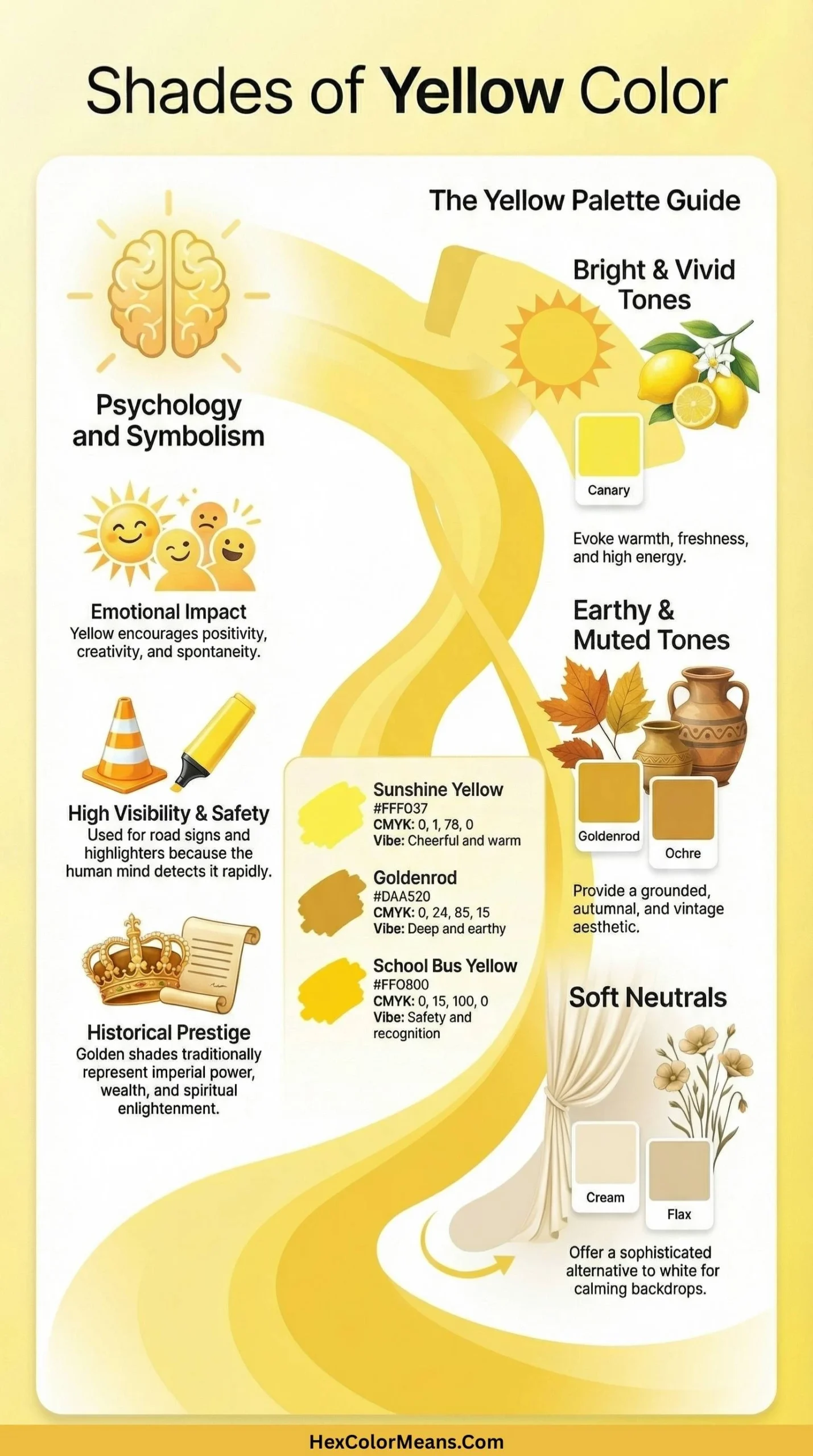
Shades of yellow cover a wide emotional and visual spectrum. They stretch from soft, delicate tones to bold, high-energy hues and rich, earthy shades.
Yellow is one of the most versatile and expressive colors. It symbolizes happiness, optimism, creativity, and mental energy.
Some yellows feel light and airy, evoking calm and warmth. Others appear vivid and saturated, grabbing attention instantly.
Deeper or earthy yellows feel grounded. Meanwhile, metallic and green-leaning shades convey luxury, freshness, or modernity.
Popular Yellow Varieties
Light & Airy
These soft, pastel-like yellows are often created by mixing yellow with white. They feel gentle, soothing, and approachable, making them perfect for minimalist designs, wellness brands, and calming interiors.
Examples include Cream, Lemon Chiffon, and Jasmine.
Vivid & Saturated
These are the most energetic and eye-catching yellows. They are bold and lively and symbolize clarity, confidence, and excitement.
Designers often use them for promotional materials, sports visuals, and digital call-to-action elements. Examples include Canary Yellow, Electric Yellow, and Lemon Yellow.
Deep & Earthy
Darker yellows created by adding black or brown tones feel grounded, natural, and mature. They evoke warmth, heritage, and stability.
This makes them ideal for interiors, fashion, and traditional branding. Examples include Mustard Yellow, Goldenrod, and Ochre.
Warm & Metallic
These yellows lean toward orange or reflect precious metals, giving a rich, luxurious, and glowing effect. They convey value, success, and celebration.
They are suitable for premium packaging, festive designs, and elegant visuals. Examples include Gold, Amber, and Saffron.
Green-Yellows
Sitting between yellow and green, these acidic shades feel fresh, modern, and energetic. They are often used in tech, sports, and futuristic design projects.
They are chosen where a vibrant, eye-catching look is needed. Examples include Chartreuse and Citrine.
From airy pastels to metallic glows, yellow’s spectrum offers endless possibilities for designers, artists, and creators. It is a color that truly balances emotion, energy, and visual impact.
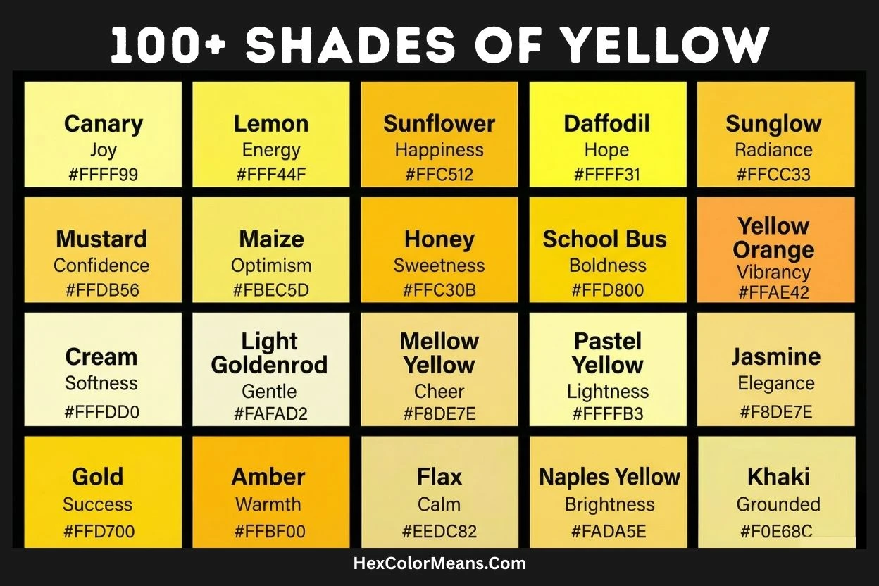
Lemon Yellow
Lemon Yellow (#FFF700) is a highly saturated, green-tinged yellow that perfectly captures the intense chromaticity of citrus fruit rinds. Its historical significance is rooted in the 19th-century development of synthetic pigments, specifically barium chromate, which provided artists with a stable and brilliantly pure yellow that was previously unattainable. This specific chemical composition created a cool, sharp brightness that stood apart from warmer, earthier yellows of the time. Symbolically, it evokes acidity, mental clarity, and cautionary visibility, carrying a modern, almost electric energy. As a result, its primary uses extend beyond art into high-visibility safety gear, alert systems, and packaging for cleaning agents where it commands immediate attention and connotes a sterile, effective freshness.
- HEX #FFF700
- RGB 255, 247, 0
- CMYK 0, 3, 100, 0
Canary Yellow
Canary Yellow (#FFEF00) is a bright, slightly orange-diminished yellow named for the domesticated songbird, whose selective breeding in the 17th century produced its distinctive plumage. This color sits at a crucial perceptual midpoint, appearing neither greenish nor reddish, which grants it a unique visual purity and cheer. Historically, its adoption in fashion and decor coincided with the Victorian era’s fascination with aviculture, symbolizing domesticated joy, lightheartedness, and vivacious energy. Consequently, it became a psychological tool in design, frequently deployed in children’s products, recreational equipment, and mid-century modern interiors to stimulate optimism and project an approachable, spirited personality without aggression.
- HEX #FFEF00
- RGB 255, 239, 0
- CMYK 0, 6, 100, 0
Golden Yellow
Golden Yellow (#FFDF00) is a deep, warm yellow imbued with the visual suggestion of metallic sheen and material wealth. Its history is intrinsically tied to the ancient and global human obsession with gold, serving as a pictorial and decorative substitute for the precious metal in everything from Renaissance paintings to gilded architectural details. This shade possesses a lower lightness value than primary yellow, adding a sense of density, antiquity, and opulence. It carries meanings of divine light, supreme achievement, and enduring value. Therefore, its modern applications are carefully chosen for prestige branding, ceremonial accents, and luxury packaging where it imparts an immediate, culturally ingrained sense of reward and elevated status.
- HEX #FFDF00
- RGB 255, 223, 0
- CMYK 0, 13, 100, 0
Daffodil
Daffodil (#FFFF31) is a luminous, light-valued yellow with a subtle greenish undertone, directly mirroring the natural pigment found in Narcissus flowers. This specific hue is botanically designed for maximized visibility to early spring pollinators, a function that translates into its human perception as a beacon of renewal. Unlike a pure spectral yellow, Daffodil has a softened, slightly chalky quality that evokes gentle warmth and nascent life. It symbolizes hope, resilience after hardship, and the promise of prosperity (as one of the first flowers to bloom). Its use is particularly potent in therapeutic design contexts, spring festivals, and as an accent color in healthcare settings aimed at gently uplifting spirits and signaling positive new cycles.
- HEX #FFFF31
- RGB 255, 255, 49
- CMYK 0, 0, 81, 0
Sunflower
Sunflower (#FFDA03) is a strong, reddish-orange infused yellow that replicates the exact chromatic output of the Helianthus annuus petal. This color is a product of specific flavonoids that absorb blue and ultraviolet light, creating a warm, directional glow that appears to follow the sun. Historically, it was a symbol of constancy and spiritual devotion in pre-Columbian cultures, later adopted as an icon of the Impressionist art movement for its vibrant, natural luminosity. It psychologically induces feelings of nourishment, loyalty, and steadfast positivity. Thus, its most effective uses are in rustic or organic branding, warm and inviting interior design schemes, and artistic projects that seek to channel a sense of wholesome, earth-bound vitality and unwavering cheer.
- HEX #FFDA03
- RGB 255, 218, 3
- CMYK 0, 15, 99, 0
School Bus Yellow
School Bus Yellow (#FFD800) is a highly specific, orange-leaning yellow formally known as National School Bus Glossy Yellow. Its history is one of deliberate safety engineering, having been standardized in 1939 in North America after scientific studies proved it to be the most conspicuous color to the human peripheral vision, especially in dawn and dusk low-light conditions. This shade’s unique wavelength strikes a optimal balance between luminance and chromaticity, making it faster to recognize than pure red. It represents standardized safety, communal responsibility, and daily routine. Consequently, its use is legally and culturally codified almost exclusively for student transportation vehicles, though it is occasionally borrowed in design to deliberately evoke nostalgia, reliability, and public trust.
- HEX #FFD800
- RGB 255, 216, 0
- CMYK 0, 15, 100, 0
Light Yellow
Light Yellow (#FFFFE0) is an extremely pale, desaturated tint of yellow, positioned at the very edge of the visible color spectrum before it becomes pure white. This shade is created by adding a significant amount of white (in pigment) or near-maximum light (on screen), resulting in a delicate, luminous quality that lacks chromatic intensity. Historically, it evokes the limitations of early dyes and paints, where achieving a strong, clean yellow was difficult, leading to common use of its paler variants. It connotes gentleness, subtle illumination, and cautious optimism. Therefore, it is predominantly used as a background or neutral base color in web and interior design, particularly in nurseries or minimalist aesthetics, where it provides a warm, barely-there glow without visual aggression or strain.
- HEX #FFFFE0
- RGB 255, 255, 224
- CMYK 0, 0, 12, 0
Cream
Cream (#FFFDD0) is a warm, slightly beige-tinged off-white that takes its name from the fatty component of milk. Its color directly results from the natural presence of beta-carotene and riboflavin in dairy fat. Historically, before reliable white pigments, it represented a luxurious, natural off-white associated with wealth and purity, as true white fabrics and materials were difficult to maintain. This shade signifies richness, understated elegance, and organic comfort. Thus, it is a cornerstone color in interior design, high-end stationery, and wedding décor, where it provides a warmer, softer, and more inviting alternative to stark white, promoting a sense of calm, traditional luxury.
- HEX #FFFDD0
- RGB 255, 253, 208
- CMYK 0, 1, 18, 0
Jasmine
Jasmine (#F8DE7E) is a soft, medium-light yellow with a distinct golden-brown undertone, inspired by the pale yellow blossoms of the jasmine vine. Unlike sharper citrus yellows, this hue carries a muted, romantic warmth reminiscent of candlelight or aged parchment. Its historical use is tied to its association with the prized, fragrant flower, symbolizing sensuality, exotic beauty, and quiet grace across Asian and Middle Eastern cultures. This color evokes moonlight, delicate fragrance, and vintage aesthetic. Consequently, it is effectively used in luxury cosmetic packaging, wedding invitations, and interior design themes aiming for a soft, romantic, or nostalgically elegant ambiance without the boldness of a primary yellow.
- HEX #F8DE7E
- RGB 248, 222, 126
- CMYK 0, 10, 49, 3
Maize
Maize (#FBEC5D) is a bright, cheerful yellow with a distinct buttery undertone, directly named after the kernels of the corn plant. Its color originates from natural plant pigments like lutein and zeaxanthin, which are carotenoids also vital for human eye health. Historically, as a staple crop of the Americas, this color became associated with sustenance, agricultural abundance, and the harvest season. It sits perceptually between a pure yellow and a light gold, giving it a nourishing, wholesome appearance. This shade symbolizes prosperity, warmth, and simple comfort. Therefore, it is frequently employed in food industry branding, agricultural imagery, and autumnal designs to evoke feelings of natural goodness, satisfying yield, and earthy generosity.
- HEX #FBEC5D
- RGB 251, 236, 93
- CMYK 0, 6, 63, 2
Mellow Yellow
Mellow Yellow (#F8DE7E) is a soft, warm, and slightly desaturated yellow, sharing its hex code with Jasmine and evoking a relaxed, vintage sensibility. The name was popularized by the 1967 Donovan song, cementing its association with 1960s counterculture, laid-back moods, and a gentle psychedelic aesthetic. Chromatically, it is a yellow significantly tempered with white and a touch of red, reducing its intensity and creating a sun-bleached, retro feel. It signifies calm happiness, nostalgia, and non-confrontational optimism. As a result, it is a favored choice for vintage-inspired designs, relaxed lifestyle branding, and interior accents aimed at creating a cozy, unhurried, and warmly inviting atmosphere.
- HEX #F8DE7E
- RGB 248, 222, 126
- CMYK 0, 10, 49, 3
Gold
Gold (#FFD700) is the quintessential metallic yellow, representing the archetypal color of the precious metal itself. Its web color is a simulation of the specular highlight of polished gold, balancing high saturation with a moderate value to suggest brilliance. Historically, its use in art was paramount, from Egyptian tomb paintings to Byzantine mosaics, where it symbolized the divine, the eternal, and ultimate power. This specific hue is warmer and darker than primary yellow, carrying a sense of weight, antiquity, and incorruptibility. It universally communicates supreme success, luxury, and high value. Consequently, it is indispensable in award design, luxury product marketing, and ceremonial graphics where it instantly conveys prestige, achievement, and timeless quality.
- HEX #FFD700
- RGB 255, 215, 0
- CMYK 0, 16, 100, 0
Goldenrod
Goldenrod (#DAA520) is a deep, earthy yellow named after the wildflower of the same name, known for its late summer bloom. This color is distinct for its significant brown and orange undertones, placing it firmly in the “warm brown” family while retaining a strong yellow identity. Historically, the plant was used to create a fugitive yellow dye, giving the color name an artistic heritage. It evokes the changing light of autumn, maturity, and the prairie. Symbolically, it represents encouragement, good fortune, and thriving in adversity. Thus, it is effectively used in rustic design, autumn palettes, and heritage branding to suggest a sturdy, natural, and warmly established presence, often as a more sophisticated alternative to brighter yellows.
- HEX #DAA520
- RGB 218, 165, 32
- CMYK 0, 24, 85, 15
Light Goldenrod
Light Goldenrod (#EEDD82) is a pale, greenish-gold tint of the standard Goldenrod color. As a web color, it was designed to provide a softer, less saturated alternative within the same hue family. This shade reduces the brown intensity of its parent color, replacing it with a hazy, chalky quality that suggests antiquity softened by time. It carries connotations of parchment, aged silk, and diffused sunlight. Historically, it mimics the effect of natural dyes and pigments fading on textiles or manuscripts. This color implies gentle wisdom, antiquity, and subdued warmth. Therefore, it is commonly selected for vintage website backgrounds, subtle decorative accents, and designs requiring a historical or scholarly feel without stark contrast or vibrancy.
- HEX #EEDD82
- RGB 238, 221, 130
- CMYK 0, 7, 45, 7
Light Goldenrod Yellow
Light Goldenrod Yellow (#FAFAD2) is an extremely pale, green-tinged yellow, almost existing as a tinted white. This web color is part of the X11 palette, designed as the lightest possible iteration of the goldenrod family, pushing the hue towards the periphery of perception. Its extremely high value and low saturation give it a barely-there, ethereal quality, reminiscent of morning light on sun-bleached grass. Historically, such pale tints were difficult to achieve with natural dyes, making them associated with delicacy and refinement. It evokes feelings of softness, quiet dawn, and subtle illumination. Consequently, it is primarily utilized as an ultra-subtle background color in web and UI design, particularly for themes seeking a warm, light, and non-intrusive canvas that avoids the starkness of pure white.
- HEX #FAFAD2
- RGB 250, 250, 210
- CMYK 0, 0, 16, 2
Khaki
Khaki (#F0E68C) is a light, desaturated yellow with strong brown and green undertones, deriving its name from the Persian word for “dust.” Its modern significance was forged in 19th-century military history, when British Indian Army units began dyeing their white uniforms with tea, curry powder, and mud for camouflage, creating the first practical military uniform color. This specific hue represents a practical, earthy neutral that effectively disguises dirt and blends with arid landscapes. It symbolizes utility, endurance, and casual sophistication. As a result, it transitioned from battlefield to mainstream fashion, becoming a staple in casual trousers, safari-style apparel, and neutral design palettes where it conveys a sense of relaxed, functional, and timeless style.
- HEX #F0E68C
- RGB 240, 230, 140
- CMYK 0, 4, 42, 6
Pale Goldenrod
Pale Goldenrod (#EEE8AA) is a soft, light yellow with a subtle greenish cast, sitting between Light Goldenrod and Light Goldenrod Yellow in saturation. This web color offers a more perceptibly yellow alternative to its nearly-white counterparts while maintaining a gentle, muted presence. Its hue suggests the color of churned butter, certain varieties of hay, or antique linen. Historically, it mimics the effect of natural goldenrod dye on wool or cotton when heavily diluted. This shade connotes gentle warmth, rustic comfort, and understated nourishment. Therefore, it finds practical application in website design as a warmer neutral background, in packaging for natural products, and in interior design to create cozy, sun-drenched spaces that feel organic and calming.
- HEX #EEE8AA
- RGB 238, 232, 170
- CMYK 0, 3, 29, 7
Tuscan Sun
Tuscan Sun (#FAD6A5) is a warm, peachy-yellow that evokes the sun-bleached stone and rolling hills of the Italian countryside. This color is not a pure pigment but a complex mixture of yellow, red, and a significant amount of white, resulting in a pastel with a dusty, earthy quality. It is directly inspired by the Renaissance art and architecture of Tuscany, where such warm, muted tones dominate the landscape. This shade embodies old-world warmth, rustic luxury, and leisurely contentment. Consequently, it is a favorite in hospitality design, Mediterranean-themed decor, and lifestyle branding that aims to transport the viewer to a place of relaxed, sun-soaked elegance and artisanal tradition.
- HEX #FAD6A5
- RGB 250, 214, 165
- CMYK 0, 14, 34, 2
Flax
Flax (#EEDC82) is a muted, grayish-yellow directly named after the color of processed flax fibers used to make linen. This hue captures the natural, undyed state of the textile, bearing traces of the plant’s stem and seed. Historically, it represents one of humanity’s oldest cultivated colors, associated with practicality, humble origins, and natural craftsmanship. Its low chroma and earthy tone give it a textural, fibrous appearance. It symbolizes simplicity, sustainability, and organic purity. Thus, it is effectively used in eco-friendly branding, natural fiber product marketing, and designs seeking a neutral with warm, honest, and artisanal character, often paired with other naturals like oatmeal and slate.
- HEX #EEDC82
- RGB 238, 220, 130
- CMYK 0, 8, 45, 7
Buff
Buff (#F0DC82) is a medium-light, desaturated yellow with a distinct grayish-orange undertone, historically named after the color of undyed buffalo leather. This hue emerged from practical necessity, as buff leather was widely used for military uniforms and accessories in the 17th and 18th centuries due to its durability. The color represents a weathered, practical neutral that effectively conceals wear. It carries connotations of tradition, resilience, and understated service. Consequently, Buff evolved from its military roots into a classic color for formal waistcoats, traditional academic regalia, and heritage-style interiors, where it signifies established custom and robust, timeless quality without ostentation.
- HEX #F0DC82
- RGB 240, 220, 130
- CMYK 0, 8, 46, 6
Naples Yellow
Naples Yellow (#FADA5E) is a warm, slightly opaque light yellow with historical significance as one of the oldest synthetic pigments. Originally manufactured from lead antimonate, it was a staple on artists’ palettes from the Renaissance through the 19th century, prized for its unique semi-opaque, creamy consistency ideal for depicting sunlight and flesh tones. Its chemical composition gave it a dense, chalky luminosity unlike other yellows. This pigment symbolizes artistic tradition, Mediterranean light, and classical technique. Although modern, safer substitutes are used, the color remains essential in fine art reproduction, traditionalist painting, and designs aiming to evoke the warm, historical glow of Old Master paintings.
- HEX #FADA5E
- RGB 250, 218, 94
- CMYK 0, 13, 62, 2
Mustard
Mustard (#FFDB58) is a rich, warm, and moderately dark yellow with strong brown and orange notes, directly mimicking the condiment made from mustard seeds. Its depth comes from the natural pigments in turmeric and ground seed, creating a color that is spicy and earthy rather than bright. Historically associated with the popularization of the condiment in 20th-century cuisine, it gained cultural traction in the 1960s and 70s in fashion and decor. This shade signifies pungency, retro style, and autumnal warmth. Therefore, it is powerfully used in vintage-themed design, fall fashion collections, and branding for gourmet or artisanal foods to convey a sense of bold, tangy character and nostalgic flair.
- HEX #FFDB58
- RGB 255, 219, 88
- CMYK 0, 14, 65, 0
Banana Mania
Banana Mania (#FAE7B5) is a pale, creamy pastel yellow with a noticeable beige-pink undertone, created by Crayola in 1998. This color is a fantastical, softened interpretation of a banana’s flesh, leaning into a whimsical and artificial sweetness rather than a naturalistic hue. Its name and tone reflect a late-20th-century trend toward inventing playful, food-inspired color names for children. It evokes childhood nostalgia, playful creativity, and lighthearted fun. As a result, it is predominantly used in children’s products, playful packaging, and interior designs for nurseries or playrooms where the goal is to stimulate a sense of sweet, gentle, and cheerful imagination.
- HEX #FAE7B5
- RGB 250, 231, 181
- CMYK 0, 8, 28, 2
Banana Yellow
Banana Yellow (#FFE135) is a vivid, saturated yellow that accurately represents the peel of a ripe, common Cavendish banana. This shade possesses a clean, cheerful intensity with a very slight greenish hint, capturing the fruit at peak ripeness. It became culturally cemented as a symbol of tropical abundance and accessible exoticism in the 20th century with the global banana trade. The color communicates accessibility, healthy energy, and tropical fun. Consequently, it is a ubiquitous choice for food packaging, children’s entertainment, and summer marketing campaigns, where it immediately signals a product that is flavorful, friendly, and full of sunny vitality.
- HEX #FFE135
- RGB 255, 225, 53
- CMYK 0, 12, 79, 0
Jasmine White
Jasmine White (#F6EABE) is an extremely pale, delicate yellow with a subtle beige undertone, inspired by the lightest petals of certain jasmine varieties. This color exists on the threshold between white and yellow, capturing the ethereal quality of fragrant blossoms in low light. Historically, such pale, complex off-whites were difficult to achieve and were associated with luxury, purity, and refined taste. It evokes sensations of soft fragrance, morning dew, and serene elegance. Consequently, Jasmine White is a sophisticated choice for wedding stationery, high-end cosmetic packaging, and spa interior design, where it creates an ambiance of pristine calm, subtle warmth, and understated luxury.
- HEX #F6EABE
- RGB 246, 234, 190
- CMYK 0, 5, 23, 4
Corn
Corn (#FBEC5D) shares its hex code with Maize, representing the bright, buttery yellow of sweet corn kernels. This color specifically emphasizes the vibrant, edible delight of the vegetable at its peak, distinct from the more generalized plant. Its intense saturation comes from natural carotenoid pigments like zeaxanthin. Culturally, it is tied to agricultural festivals, summer harvests, and Americana. The shade symbolizes sweetness, abundance, and cheerful nourishment. Therefore, it is effectively used in promotional materials for farmers’ markets, family-friendly food brands, and festive summer decor to communicate wholesome, joyful, and straightforward enjoyment.
- HEX #FBEC5D
- RGB 251, 236, 93
- CMYK 0, 6, 63, 2
Cornsilk
Cornsilk (#FFF8DC) is a pale, warm off-white named for the fine, silky threads found inside an ear of corn. This web color is one of the lightest in the yellow family, with a minimal but perceptible yellow-red undertone that distinguishes it from pure white. It mimics the natural, fibrous material that is often overlooked, giving it an organic, textured connotation. It signifies subtlety, natural protection, and soft warmth. As a result, Cornsilk is predominantly used as a gentle background color in web design and digital interfaces, providing a warmer, less glaring alternative to pure white that is easy on the eyes and suggests a natural, soft foundation.
- HEX #FFF8DC
- RGB 255, 248, 220
- CMYK 0, 3, 14, 0
Yellow Orange
Yellow Orange (#FFAE42) is a vibrant, tertiary color positioned exactly midway between yellow and orange on the color wheel. This high-energy hue is defined by its balanced, fiery glow, possessing the brightness of yellow and the warmth of orange. Historically, it was less common as a distinct pigment but achieved through mixing, associated with flames, autumn leaves, and ripe citrus. It embodies enthusiasm, creativity, and adventurous fun. Consequently, it is a powerful tool in sports team branding, children’s activity centers, and promotional graphics where the goal is to project dynamic, playful, and extroverted energy that attracts immediate attention.
- HEX #FFAE42
- RGB 255, 174, 66
- CMYK 0, 32, 74, 0
Sunglow
Sunglow (#FFCC33) is a brilliant, radiant yellow with a strong orange influence, meant to capture the intense glare of the sun at its zenith. This color maximizes saturation and lightness to create a luminous, almost fluorescent effect. Its name and modern use are tied to mid-20th century pop art and space-age design, where it represented atomic energy and optimistic futurism. It symbolizes blazing energy, positivity, and electrifying brilliance. Thus, Sunglow is frequently used in festival graphics, tech startup logos aiming for disruption, and safety signage requiring ultimate visibility and a connotation of powerful, unstoppable force.
- HEX #FFCC33
- RGB 255, 204, 51
- CMYK 0, 20, 80, 0
Cyber Yellow
Cyber Yellow (#FFD300) is a sharp, intensely saturated yellow with a slight greenish edge, evocative of early digital monitor glows. This color emerged specifically from late 1990s and early 2000s digital aesthetics, representing the synthetic, high-contrast palette of early computer graphics and rave culture. Its hex value is carefully chosen to be highly luminous on screen, cutting through darker backgrounds. It symbolizes digital innovation, synthetic energy, and futuristic speed. Consequently, Cyber Yellow is a cornerstone in cyberpunk-themed design, tech gadget marketing, and contemporary fitness branding where it conveys a sense of cutting-edge performance, digital connectivity, and artificial intelligence.
- HEX #FFD300
- RGB 255, 211, 0
- CMYK 0, 17, 100, 0
Saffron
Saffron (#F4C430) is a deep, radiant golden-orange, named after the precious spice derived from the crocus flower stigma. Historically, it is one of the world’s most expensive dyes and flavorings, with use dating back to ancient Minoan, Persian, and Indian cultures for royal garments, religious rituals, and cuisine. Its rich hue comes from the carotenoid pigments crocin and crocetin. This color embodies luxury, sacredness, and exotic richness. Therefore, it holds profound significance in South Asian and Buddhist art, ceremonial attire, and premium food packaging, where it instantly communicates opulence, spiritual devotion, and unparalleled quality.
- HEX #F4C430
- RGB 244, 196, 48
- CMYK 0, 20, 80, 4
Harvest Gold
Harvest Gold (#E6A817) is a muted, brownish-gold that rose to prominence as a quintessential appliance and decor color in the 1970s. This shade is not a pure natural gold but a deliberately earthy, oxidized interpretation, reflecting the era’s shift toward earthy, autumnal tones. It symbolizes a nostalgic ideal of domestic comfort, rustic abundance, and retro style. After falling from favor, it has been revived in retro-themed designs, vintage product lines, and branding that seeks to evoke warmth, nostalgia, and a cozy, analogue-era aesthetic. It represents a very specific moment in design history.
- HEX #E6A817
- RGB 230, 168, 23
- CMYK 0, 27, 90, 10
Bumblebee
Bumblebee (#FCE205) is a bright, slightly greenish yellow that directly mimics the vivid warning stripes of the bumblebee insect. This color is part of a natural aposematic coloration strategy, designed by evolution for maximum visibility against flora. Its high luminance and saturation make it instantly eye-catching and associated with nature’s alert systems. It signifies busy energy, natural warning, and cheerful industriousness. As a result, it is effectively used in children’s learning materials, sporting goods, and eco-friendly product branding to convey a sense of lively, natural activity, friendly alertness, and environmental consciousness.
- HEX #FCE205
- RGB 252, 226, 5
- CMYK 0, 10, 98, 1
Safety Yellow
Safety Yellow (#EED202) is a deep, orange-leaning yellow standardized for high-visibility safety applications. Unlike School Bus Yellow, it is slightly darker and less orange, optimized for contrast against industrial backgrounds like machinery, construction sites, and warning tape. Its standardization is governed by organizations like OSHA and ANSI to ensure consistent recognition of hazards. This color unequivocally means caution, potential danger, and mandatory attention. Therefore, its use is strictly functional in hard hats, hazard signs, safety vests, and industrial equipment where the primary goal is to prevent accidents through immediate visual identification of risk.
- HEX #EED202
- RGB 238, 210, 2
- CMYK 0, 12, 99, 7
School Bus
School Bus (#FFD800) is identical in hex value to School Bus Yellow, representing the standardized color for North American student transportation. Its codification in 1939 was a landmark in applied color psychology and public safety, establishing a uniform visual cue recognized across communities. This specific hue was scientifically selected because it is perceptible earlier in dawn and dusk light than red, and the lateral human eye is most sensitive to its wavelength. It transcends mere color to become a cultural icon of routine, communal care, and childhood. Consequently, its use outside of actual school buses is almost always a deliberate reference to these themes in advertising, media, and nostalgic design.
- HEX #FFD800
- RGB 255, 216, 0
- CMYK 0, 15, 100, 0
Lemon Curry
Lemon Curry (#CCA01D) is a deep, muted yellow with strong brown and olive undertones, inspired by the complex spice blend. This color moves firmly into the earthy, sophisticated territory of mustard but is darker and less red, evoking dried turmeric and fenugreek. It emerged as a fashionable color name in the late 20th century, reflecting global culinary influences on design palettes. It symbolizes exotic warmth, spicy depth, and grounded zest. Therefore, it is effectively used in gourmet food branding, bohemian interior design, and autumn fashion to convey a sense of rich, worldly, and inviting complexity.
- HEX #CCA01D
- RGB 204, 160, 29
- CMYK 0, 22, 86, 20
Citrine
Citrine (#E4D00A) is a vibrant, greenish-yellow named after the semi-precious quartz gemstone. Its color comes from trace amounts of iron within the crystal structure. Historically, it was often confused with topaz and valued as a stone of light, manifestation, and personal power. This specific hue is less orange than many golden yellows, giving it a fresh, luminous quality. It represents clarity, vitality, and success. Consequently, Citrine is popular in jewelry design, spiritual and wellness branding, and accent decor meant to attract positive energy, illuminate, and suggest a clean, modern prosperity.
- HEX #E4D00A
- RGB 228, 208, 10
- CMYK 0, 9, 96, 11
Laser Lemon
Laser Lemon (#FEFE22) is an intensely bright, green-tinted yellow from the Crayola crayon line, introduced in 1990. This color is designed to mimic the artificial, electric glow of laser lights or highlighter pens, pushing saturation to an almost fluorescent extreme. It represents a late 20th-century fascination with synthetic, neon brightness. The shade symbolizes hyper energy, artificiality, and focused attention. As such, it is used in graphic novels, extreme sports logos, and digital art to create jarring, high-impact visuals that feel modern, energetic, and deliberately unnatural.
- HEX #FEFE22
- RGB 254, 254, 34
- CMYK 0, 0, 87, 0
Aureolin
Aureolin (#FDEE00) is a cool, vivid yellow historically known as Cobalt Yellow, a pigment first created in the mid-19th century using potassium cobaltinitrite. It was prized by Impressionist and Post-Impressionist painters like Van Gogh for its transparency and clean, greenish tint, which was perfect for depicting sunlight and natural highlights. Unlike warmer antique yellows, Aureolin offered a modern, chemical purity. It symbolizes artistic innovation, luminous atmosphere, and scientific progress in color. Thus, it remains a color of significance in fine art contexts and design projects seeking to reference a specific historical moment of artistic and chemical advancement.
- HEX #FDEE00
- RGB 253, 238, 0
- CMYK 0, 6, 100, 1
Naples Yellow Deep
Naples Yellow Deep (#EEDC56) is a rich, opaque yellow that represents a darker, more saturated variant of the historical pigment. While traditional Naples Yellow was valued for its pale, creamy opacity, this deeper iteration captures the pigment’s potential for warmth and body when used at full strength or mixed with minimal white. It retains the chalky, mineral quality characteristic of the original lead antimonate formula. This hue embodies classical depth, Renaissance richness, and textured light. Consequently, it is used in historical art reproduction, traditional interior frescoes, and design schemes that aim to evoke a sense of Old World solidity, warmth, and crafted grandeur.
- HEX #EEDC56
- RGB 238, 220, 86
- CMYK 0, 8, 64, 7
Yellow Sunshine
Yellow Sunshine (#FFF700) shares its hex code with Lemon Yellow, representing the concept of pure, unobstructed sunlight. This color name is less about historical pigment and more about emotional and perceptual association with the brightest possible daylight. It is the chromatic embodiment of optimum visibility, cheer, and solar energy. In design, it functions as a pure psychological stimulant, lacking the subtle green or orange nuances of other yellows. Therefore, its application is most effective in marketing aiming for uncomplicated happiness, children’s media, and safety applications where the message must be utterly simple, positive, and attention-grabbing.
- HEX #FFF700
- RGB 255, 247, 0
- CMYK 0, 3, 100, 0
Golden Brown
Golden Brown (#996515) is a deep, dark yellow with dominant brown saturation, situating it on the border between brown and yellow. This color is reminiscent of tanned leather, certain wood stains, and toasted grain. Historically, it is an earth pigment color, derived from oxides and widely available, making it a common color in primitive art and utilitarian objects. It signifies reliability, natural earthiness, and seasoned maturity. As a result, Golden Brown is a foundational neutral in rustic design, leathercraft branding, and autumnal palettes, providing a warm, grounded, and timeless base that suggests durability and organic origin.
- HEX #996515
- RGB 153, 101, 21
- CMYK 0, 34, 86, 40
Dandelion
Dandelion (#FED85D) is a cheerful, medium-bright yellow named after the common lawn flower. This shade specifically captures the bright, fluffy head of the plant in full bloom, not the stem or leaves. It is a color of transient beauty and resilience, associated with childhood games and wishes. Symbolically, it represents oracle, healing, and the ability to thrive in adversity. Consequently, Dandelion is frequently used in packaging for natural health products, spring-themed graphics, and designs targeting a sense of playful, whimsical nostalgia. It feels more spontaneous and less formal than other floral yellows.
- HEX #FED85D
- RGB 254, 216, 93
- CMYK 0, 15, 63, 0
Pineapple
Pineapple (#563C0D) is a very dark, desaturated yellow-brown that represents the rough, textured exterior skin of the tropical fruit, not its bright interior. This color is essentially a deep, muddy ochre, heavily dominated by brown and black tones. It evokes tropical soil, rugged natural forms, and aged basketry. Historically, such dark earthy yellows were common in natural dyes and prehistoric cave paintings. It symbolizes earthiness, hidden sweetness, and exotic ruggedness. Therefore, it is used as a deep, warm neutral in organic and tropical branding, rustic furniture stains, and packaging that aims to convey authentic, unrefined, and natural texture.
- HEX #563C0D
- RGB 86, 60, 13
- CMYK 0, 30, 85, 66
Flavescent
Flavescent (#F7E98E) is a pale, greenish-yellow whose name derives from the Latin flavescere, meaning “to become yellow.” This term describes the process of turning yellow, such as leaves in autumn or ripening fruit. The color itself is a soft, luminous pastel with a distinct cool undertone. Historically, it appears in botanical illustrations and scientific texts to describe transitional states in nature. It evokes gradual change, delicate light, and pale botanical specimens. Consequently, Flavescent is used in designs related to botany, eco-friendly products, and themes of growth or transition, where it suggests a natural, gentle, and intellectual process of becoming.
- HEX #F7E98E
- RGB 247, 233, 142
- CMYK 0, 6, 43, 3
Pear
Pear (#D1E231) is a distinctly greenish-yellow that mirrors the hue of a ripe Anjou or Bartlett pear. This shade sits firmly on the border between yellow and green, capturing the unique chlorophyll and carotenoid balance in the fruit’s skin. It is associated with fresh, crisp flavor, understated sweetness, and organic growth. The color conveys a refreshing, healthy, and slightly rustic vitality. Therefore, Pear is effectively utilized in health food branding, sustainable product design, and kitchenware aesthetics to communicate natural freshness, wholesome nutrition, and a calm, earthy zest.
- HEX #D1E231
- RGB 209, 226, 49
- CMYK 7, 0, 78, 11
Mayonnaise
Mayonnaise (#FFF399) is a pale, creamy yellow with a subtle pinkish-beige undertone, directly inspired by the emulsified condiment. This color is a complex off-white, reflecting the mixture of egg yolk, oil, and lemon juice or vinegar. It evokes richness, indulgence, and comforting familiarity. Unlike brighter yellows, it carries a soft, almost edible quality associated with home cooking and creamy textures. Consequently, Mayonnaise is used in vintage kitchen decor, gourmet food packaging, and design schemes aiming for a cozy, retro, and subtly indulgent comfort. It avoids starkness while providing warm illumination.
- HEX #FFF399
- RGB 255, 243, 153
- CMYK 0, 5, 40, 0
Light Buttercup
Light Buttercup (#F6EABE) shares its hex code with Jasmine White, representing a pale, warm tint of the brighter buttercup flower yellow. This color is a highly desaturated interpretation, focusing on the gentle, sunlit glow of the flower rather than its intense pigment. It suggests softness, delicate warmth, and innocent charm. Historically, such pale tints were difficult to capture in dye, making them feel delicate and precious. It is ideal for nursery designs, wedding stationery, and product packaging that seeks to convey tenderness, gentle happiness, and a sense of airy, romantic light.
- HEX #F6EABE
- RGB 246, 234, 190
- CMYK 0, 5, 23, 4
Royal Yellow
Royal Yellow (#FADA5E) shares its hex code with Naples Yellow, indicating a warm, saturated light yellow associated with regality. In various Asian cultures, particularly in imperial China and Southeast Asia, this specific shade of yellow was historically reserved for the emperor and royal family, symbolifying supreme power and centrality. Its “royal” status comes from cultural codification, not physical rarity. It represents sovereignty, sacred power, and auspiciousness. Therefore, it is used in designs referencing Asian heritage, ceremonial contexts, and luxury branding that wishes to tap into connotations of exclusive, traditional authority and golden prosperity.
- HEX #FADA5E
- RGB 250, 218, 94
- CMYK 0, 13, 62, 2
Yellow Sea
Yellow Sea (#FFE302) is a bright, slightly orange-tinged yellow named after the large body of water between China and Korea, which takes its name from the yellowish silt carried into it by rivers like the Huang He. This color captures the turbid, sandy luminosity of that water under sunlight, rather than a clear blue. It represents a natural phenomenon of sedimentation and scale. Symbolically, it evokes vastness, fertile outflow, and dynamic energy. Consequently, it is used in regional branding for East Asian coastal areas, environmental campaigns, and designs that seek to convey a sense of powerful, natural, and slightly earthy aquatic energy.
- HEX #FFE302
- RGB 255, 227, 2
- CMYK 0, 11, 99, 0
Buttercup
Buttercup (#F8C539) is a warm, rich yellow with prominent orange undertones, directly matching the petals of the common Ranunculus flower. This hue is brighter and more saturated than many floral yellows, capturing the flower’s reflective quality that creates a characteristic glossy shine. Historically, the buttercup’s intense color has been associated with childhood games and folklore (holding it under a chin to test for liking butter). It symbolizes radiant charm, joyfulness, and simple delight. Therefore, it is a popular choice for cheerful branding, spring fashion, and garden-themed design, where it projects a friendly, vibrant, and uncomplicatedly happy persona.
- HEX #F8C539
- RGB 248, 197, 57
- CMYK 0, 21, 77, 3
Safflower
Safflower (#ED9121) is a deep orange-yellow named after the thistle-like plant whose flowers have been used for centuries to produce both a dye (Carthamin) and a cooking oil. Historically, it was a less expensive alternative to true saffron for creating red and yellow dyes in textiles. This specific hue represents the orange-red pigment obtained from the petals. It signifies ancient craftsmanship, economical richness, and spicy warmth. As a result, Safflower is used in ethnographic textile design, heritage craft branding, and autumnal palettes to convey a sense of historical utility, earthy spice, and handcrafted color.
- HEX #ED9121
- RGB 237, 145, 33
- CMYK 0, 39, 86, 7
Sunray
Sunray (#E3AB57) is a medium, reddish-yellow that mimics the warm, diffused light of the sun as it appears later in the afternoon. This color is less about blinding brilliance and more about atmospheric warmth and golden-hour glow. It contains a significant amount of red and brown, giving it a mellow, approachable radiance. It evokes feelings of nostalgia, comfort, and serene energy. Consequently, Sunray is effectively employed in hospitality design, lifestyle photography filters, and packaging for comforting products like coffee or baked goods, where the goal is to evoke a sense of welcoming, relaxed warmth and golden contentment.
- HEX #E3AB57
- RGB 227, 171, 87
- CMYK 0, 25, 62, 11
Topaz
Topaz (#FFC87C) is a light, peachy-orange yellow named after the semi-precious gemstone, which occurs in a wide range of colors but is most popularly known in this “imperial” or sherry hue. This color is a very pale, warm tint of orange, leaning more towards pastel than gemstone saturation. It is associated with friendship, clarity, and gentle strength in crystal lore. Its softness suggests warmth without intensity, and luxury without ostentation. Thus, it is frequently used in soft feminine branding, elegant stationery, and interior accents aiming to create a soothing, uplifting, and subtly luxurious atmosphere.
- HEX #FFC87C
- RGB 255, 200, 124
- CMYK 0, 22, 51, 0
Amber
Amber (#FFBF00) is a vibrant, warm orange-yellow named after the fossilized tree resin prized since antiquity for jewelry and ornamentation. This color captures the translucent, glowing quality of the material, often containing trapped ancient life. Historically, it was a valuable trade good on the Ancient Amber Road. It exists precisely at the intersection of yellow and orange, embodying preserved energy and captured sunlight. Symbolically, it represents endurance, static electricity (from the Greek electron), and warning signals (as in traffic lights). Consequently, Amber is used in jewelry design, retro aesthetics, and safety indicators to convey a sense of organic warmth, nostalgic glow, or cautionary attention.
- HEX #FFBF00
- RGB 255, 191, 0
- CMYK 0, 25, 100, 0
Bronze Yellow
Bronze Yellow (#737000) is a very dark, desaturated olive-yellow that reflects the patina or alloyed color of bronze metal. This is not the bright, new bronze, but the weathered, stately greenish-gold tone that develops over time. It is a color of antiquity, oxidation, and dignified age. Historically, it mimics the surface of ancient statues and artifacts exposed to the elements. It signifies permanence, heritage, and subdued prestige. Therefore, it is used in museum graphics, historical branding, and luxury products that wish to emphasize tradition, timeless craftsmanship, and a legacy that has matured with grace.
- HEX #737000
- RGB 115, 112, 0
- CMYK 0, 3, 100, 55
Gold Fusion
Gold Fusion (#85754E) is a muted, grayish brown-yellow that represents a modern, sophisticated interpretation of gold, stripped of its metallic sheen. This color is essentially a desaturated tan with a subtle green-gold undertone. It emerged from contemporary design trends seeking neutral, earthy metallics that are more understated than traditional gold. It evokes organic elegance, natural texture, and muted luxury. Consequently, Gold Fusion is a popular neutral in modern interior design, eco-luxury branding, and fashion where it provides a warm, natural, and quietly opacious base that feels both contemporary and grounded.
- HEX #85754E
- RGB 133, 117, 78
- CMYK 0, 12, 41, 48
Desert Sand
Desert Sand (#EDC9AF) is a light, pinkish-beige that sits on the border of yellow, named after the pale, sun-bleached sands of arid regions. This color is a complex neutral with significant red and white, only vaguely warmed by a yellow undertone. It directly evokes extreme heat, aridity, and vast, empty landscapes. Historically, it’s the color of natural earth pigments used in desert cultures. It symbolizes barren beauty, resilience, and minimalist calm. As a result, it is a key color in Southwestern and safari design themes, minimalist interiors, and cosmetic lines aiming for a natural, warm, and serene neutral.
- HEX #EDC9AF
- RGB 237, 201, 175
- CMYK 0, 15, 26, 7
Harvest Moon
Harvest Moon (#F7E7CE) is an extremely pale, warm off-white with a barely perceptible yellow-pink cast, inspired by the large, luminous autumn moon. This color captures the diffused, creamy glow of moonlight through a slight haze, not the moon’s bright white core. It is a color of romanticized nature, myth, and peaceful abundance. It evokes tranquility, gentle cycles, and soft illumination. Consequently, Harvest Moon is primarily used as a paint color for interiors and a background in seasonal autumn designs, where it creates a calming, warm, and subtly magical ambiance that feels both comforting and ethereal.
- HEX #F7E7CE
- RGB 247, 231, 206
- CMYK 0, 6, 17, 3
Straw
Straw (#E4D96F) is a light, grayish-yellow that precisely matches the color of dried, sun-bleached cereal stalks after harvest. This hue is desaturated and slightly cool, reflecting the loss of green chlorophyll and the effect of prolonged sun exposure. Historically, it is the color of thatched roofs, woven baskets, and pastoral simplicity. It evokes rustic life, natural frugality, and late-summer fields. Symbolically, it represents humility, natural resourcefulness, and organic texture. Therefore, Straw is effectively used in eco-friendly packaging, rustic wedding decor, and heritage brand design to convey a sense of honest, handcrafted, and naturally weathered authenticity.
- HEX #E4D96F
- RGB 228, 217, 111
- CMYK 0, 5, 51, 11
Desert Yellow
Desert Yellow (#EEBC1D) is a strong, saturated golden-yellow that evokes the intense, direct sunlight and golden sands of arid landscapes, not the pale sand itself. This hue has a powerful, unmodulated warmth with a slight orange push, lacking the greenish tones of cooler yellows. It represents heat, exposure, and stark beauty. Historically, it is reminiscent of ochre pigments used in rock art by desert-dwelling cultures. It symbolizes resilience, brilliance in harsh conditions, and vast openness. Consequently, it is used in adventure travel branding, regional tourism, and designs that need to project bold, unwavering energy and a sense of expansive, sun-drenched space.
- HEX #EEBC1D
- RGB 238, 188, 29
- CMYK 0, 21, 88, 7
Bumblebee Bold
Bumblebee Bold (#FFD400) is a vibrant, slightly orange-leaning yellow that amplifies the warning stripe color of the insect for maximum graphic impact. This shade is brighter and cleaner than the natural Bumblebee color, optimized for commercial use and digital reproduction. It strips away subtlety for pure, energetic visibility. It signifies confident energy, playful warning, and dynamic action. As a result, it is a favorite in sports team graphics, children’s entertainment branding, and promotional materials where the goal is to capture attention instantly and communicate fun, fearless, and high-spirited activity.
- HEX #FFD400
- RGB 255, 212, 0
- CMYK 0, 17, 100, 0
Yellow Orange Color
Yellow Orange Color (#FFA812) is a direct, high-saturation orange-yellow, explicitly named for its position on the color wheel. This hue leans more toward orange than yellow, possessing a fiery, tangy intensity. It is less a naturalistic color and more a pure conceptual mixture, representing the essence of citrus and flame. It embodies exuberance, creativity, and vibrant warmth. Consequently, it is widely used in fruit juice branding, party supplies, and athletic wear to evoke a sense of zesty flavor, high energy, and sociable, extroverted fun that is more approachable than pure red.
- HEX #FFA812
- RGB 255, 168, 18
- CMYK 0, 34, 93, 0
Vegas Gold
Vegas Gold (#C5B358) is a muted, greenish-gold that reflects the glitzy yet somewhat tarnished glamour of Las Vegas casinos and signage. Unlike pure gold, this color is deliberately desaturated and dusty, suggesting neon-lit nights, aged gilt, and a sense of performative luxury. It emerged from mid-20th century American entertainment aesthetics. It symbolizes theatrical opulence, chance, and a slightly faded showmanship. Therefore, it is used in sports team uniforms (like the Pittsburgh Steelers), entertainment industry design, and retro-themed projects to convey a sense of traditional, team-oriented, or vintage glamour with a gritty edge.
- HEX #C5B358
- RGB 197, 179, 88
- CMYK 0, 9, 55, 23
Macaroni and Cheese
Macaroni and Cheese (#FFBD88) is a warm, peachy-orange pastel that humorously replicates the color of the popular processed cheese sauce. This Crayola crayon color, introduced in 1993, reflects a late-20th-century trend of naming colors after processed foods for child appeal. It is a low-saturation, high-value tint of orange, evoking comfort food’s artificial yet familiar hue. It symbolizes childhood nostalgia, playful indulgence, and unpretentious comfort. Consequently, it is used almost exclusively in children’s products, playful graphics, and whimsical design schemes aimed at evoking a sense of lighthearted, cozy, and slightly silly fun.
- HEX #FFBD88
- RGB 255, 189, 136
- CMYK 0, 26, 47, 0
Broom
Broom (#E8A317) is a vivid, reddish-orange yellow named after the flowering plant Cytisus scoparius, not the cleaning tool. The plant produces bright yellow flowers that lean distinctly toward orange, giving this color its fiery warmth. Historically, the plant’s branches were used for making actual brooms. This hue embodies wild, untamed brightness and herbal vitality. It signifies energetic growth, rustic utility, and fiery cheer. Therefore, Broom is effectively used in gardening branding, floral design accents, and autumnal themes to inject a splash of natural, robust, and warmly spirited color.
- HEX #E8A317
- RGB 232, 163, 23
- CMYK 0, 30, 90, 9
Dark Goldenrod
Dark Goldenrod (#B8860B) is a deep, brownish-yellow that is the standardized darker shade of the goldenrod flower. As a web color, it provides a more shadowed, substantial alternative to the medium Goldenrod. This hue carries significant red and black undertones, giving it a rich, autumnal weight. It suggests maturity, harvest bounty, and antique gold. Historically, it mimics the color of certain dense, golden woods and aged gilding. Consequently, it is a favored color for text-heavy website borders, traditional academic robes, and rustic leather goods where it conveys a sense of established dignity, warmth, and depth.
- HEX #B8860B
- RGB 184, 134, 11
- CMYK 0, 27, 94, 28
Orange Yellow
Orange Yellow (#F8D568) is a soft, light yellow with a pronounced orange infusion, placing it clearly in the warm spectrum. This shade is less intense than a true yellow-orange, acting as a mellow, approachable bridge between the two hues. It evokes creamy citrus flavors, soft morning light, and gentle warmth. It symbolizes friendly energy, approachable vibrancy, and comforting brightness. As a result, Orange Yellow is commonly found in kitchenware design, health food packaging, and soft furnishings where the goal is to create an inviting, cheerful, and nurturing atmosphere without visual strain.
- HEX #F8D568
- RGB 248, 213, 104
- CMYK 0, 14, 58, 3
Neon Yellow
Neon Yellow (#EFFD5F) is a bright, greenish-yellow that simulates the glow of a neon light or highlighter ink. This color achieves its electric appearance through high luminosity and a distinct green bias, creating an artificial, radioactive-seeming vibrancy. It is a product of 20th-century synthetic chemistry and nightlife culture. It represents ultra-modernity, nightlife energy, and urgent attention. Therefore, Neon Yellow is a staple in club graphics, futuristic tech interfaces, and extreme sports apparel where it is used to shock, energize, and signal a cutting-edge, high-visibility aesthetic.
- HEX #EFFD5F
- RGB 239, 253, 95
- CMYK 6, 0, 62, 1
Buff Yellow
Buff Yellow (#F0DC82) shares its hex code with Buff, representing the specific yellowish hue of undressed buffalo leather. This color name emphasizes the yellow component over the grayish undertone, linking it more directly to natural animal hide and traditional tanning processes. Historically, it was a color of practical military and expeditionary gear before camouflage. It evokes durability, adventure, and handcrafted utility. Symbolically, it stands for preparedness and ruggedness. Consequently, it is used in heritage workwear branding, outdoor equipment, and historical reenactment gear to signify authentic, time-tested, and functional craftsmanship.
- HEX #F0DC82
- RGB 240, 220, 130
- CMYK 0, 8, 46, 6
School Bus Yellow Dark
School Bus Yellow Dark (#E8C547) is a muted, browned version of the standard safety yellow, suggesting a faded, weathered, or shaded school bus. This color captures the patina of use and age on the iconic vehicle, moving from a pure safety signal to a nostalgic artifact. It evokes memory, mid-century Americana, and sun-bleached paint. This shade symbolizes retro charm, childhood memory, and vintage reliability. Therefore, it is used in nostalgic advertising, retro product design, and artistic filters to deliberately reference the past and evoke a sense of warm, familiar recollection rather than immediate caution.
- HEX #E8C547
- RGB 232, 197, 71
- CMYK 0, 15, 69, 9
Taxi Cab Yellow
Taxi Cab Yellow (#F4C430) shares its hex code with Saffron, representing the specific shade historically mandated for taxi cabs in major cities like New York. This standardization, notably via the Chicago Yellow Cab Company influence, was for maximum street-level visibility and brand recognition. The color is a saturated, golden hue that stands out in urban landscapes. It signifies commercial service, urban mobility, and available hire. Consequently, its use outside transportation almost always serves as a visual shorthand for city life, quick service, or financial exchange, often in travel, delivery, or finance sector branding.
- HEX #F4C430
- RGB 244, 196, 48
- CMYK 0, 20, 80, 4
Lemon Lime
Lemon Lime (#E3FF00) is a vivid, electric chartreuse that sits exactly between lemon yellow and lime green. This highly synthetic, fluorescent-adjacent color is named after the citrus soda flavor, emphasizing artificial, high-energy sweetness. It is a color of extreme vibrancy rarely found in nature at this saturation. It symbolizes hyper activity, synthetic fun, and audacious contrast. As a result, Lemon Lime is dominant in energy drink logos, digital art, and futuristic fashion accents where the goal is to project a jarring, youth-oriented, and aggressively modern energy.
- HEX #E3FF00
- RGB 227, 255, 0
- CMYK 11, 0, 100, 0
Yellow Pantone
Yellow Pantone (#FEDF00) is the standardized bright, slightly greenish yellow defined by the Pantone Matching System (PMS) as “Pantone Yellow.” As a proprietary, standardized color, it is critical for consistent brand reproduction across global print and manufacturing. Its specific hue is designed for optimal visual impact and ink formulation. It represents corporate identity, design precision, and commercial vibrancy. Therefore, this color is foundational in global brand guides (like IKEA), product design, and any scenario requiring absolute color consistency to maintain professional branding and instant recognition.
- HEX #FEDF00
- RGB 254, 223, 0
- CMYK 0, 12, 100, 0
Yellow RYB
Yellow RYB (#FEFE33) is the primary yellow in the traditional Red-Yellow-Blue (RYB) color model used by artists for centuries. This hue is slightly lighter and greener than the web’s RGB primary yellow, reflecting its origins in pigment mixing theory rather than light. Historically, it is the cornerstone of subtractive color mixing for painters, from the Old Masters onward. It represents artistic foundation, creative potential, and pure hue. Consequently, Yellow RYB is a critical reference in art education, traditional painting, and design discussions about fundamental color theory, symbolizing the starting point for creating all other hues physically.
- HEX #FEFE33
- RGB 254, 254, 51
- CMYK 0, 0, 80, 0
Golden Poppy
Golden Poppy (#FCC200) is a rich, vibrant orange-yellow officially designated as the state flower of California. This color captures the intense, silky bloom of the Eschscholzia californica. It is a hue of wild, untamed beauty and specific geographical identity, evoking rolling hills covered in spring wildflowers. Symbolically, it represents vibrant life, resilience in arid climates, and natural spectacle. Therefore, Golden Poppy is prominently used in California state branding, outdoor recreation marketing, and designs aiming to convey a sense of sunny, free-spirited, and optimistic natural abundance.
- HEX #FCC200
- RGB 252, 194, 0
- CMYK 0, 23, 100, 1
Flame Yellow
Flame Yellow (#F7E017) is a bright, slightly greenish-yellow that mimics the hottest, most energetic part of a fire, not its orange core. This color represents combustion at its peak temperature, where the flame appears almost white with a yellow halo. It is a color of extreme energy, transformation, and warning. It signifies purification, intense creativity, and dangerous beauty. Consequently, Flame Yellow is used in motorsports graphics, energy sector branding, and safety warnings to communicate powerful, volatile force, high performance, and the need for respect and caution.
- HEX #F7E017
- RGB 247, 224, 23
- CMYK 0, 9, 91, 3
Sunshade
Sunshade (#FFFD37) is a brilliant, green-tinted yellow that evokes the glare of the sun as seen through a translucent canopy or parasol. This hue is extremely luminous and slightly cooler than a primary yellow, suggesting filtered but intense light. It creates a feeling of dappled brightness, outdoor leisure, and tropical protection. It symbolizes respite, joyful outdoor moments, and vibrant shelter. As a result, Sunshade is effectively employed in resort wear, summer festival branding, and patio furniture design to project an image of cheerful, active relaxation in brilliant sunshine.
- HEX #FFFD37
- RGB 255, 253, 55
- CMYK 0, 1, 78, 0
Vegas Gold Dark
Vegas Gold Dark (#C2A76F) is a deeper, more muted and grayish version of Vegas Gold, emphasizing the aged, weathered aspect of casino glamour. This color has stronger brown and olive undertones, reducing its metallic suggestion in favor of a vintage, dusty quality. It evokes old velvet ropes, tarnished fixtures, and decades of history. It symbolizes faded fortune, enduring showmanship, and retro sophistication. Therefore, it is used in more subdued heritage branding, upscale bar interiors, and design projects that seek to reference classic Vegas or old Hollywood elegance with a sense of patina and story.
- HEX #C2A76F
- RGB 194, 167, 111
- CMYK 0, 14, 43, 24
Light Canary
Light Canary (#FFFF9F) is a pale, greenish-yellow tint that represents a highly diluted version of the vibrant canary bird color. This shade exists as a pastel with extremely high value and low saturation, sitting near the edge of the visible spectrum. It evokes the soft, downy feathers of a young bird or the gentle suggestion of sunlight through sheer fabric. Historically, such pale tints were considered delicate and refined. It symbolizes softness, delicate cheer, and subtle illumination. Consequently, Light Canary is used as a background color in nursery designs, feminine stationery, and spring-themed graphics where it provides a warm, uplifting glow without any visual intensity.
- HEX #FFFF9F
- RGB 255, 255, 159
- CMYK 0, 0, 38, 0
Cream Yellow
Cream Yellow (#FFFDD0) shares its hex code with Cream, emphasizing its position as a warm, yellowish off-white derived from dairy. This shade is distinguished from pure white by its perceptible yellow and minute red undertones, giving it a rich, natural appearance. It directly references whipped cream or clotted cream, evoking notions of indulgence, natural richness, and comforting luxury. It is a color of traditional elegance and soft warmth. Therefore, it is a classic choice for wedding dresses, high-quality paper stock, and interior trim where it offers a warmer, softer, and more inviting alternative to stark white.
- HEX #FFFDD0
- RGB 255, 253, 208
- CMYK 0, 1, 18, 0
Butter
Butter (#FFFF99) is a pale, clean pastel yellow that aims to replicate the color of fresh, churned butter as a uniform, smooth substance. This shade is more saturated and distinctly yellower than cream, with less beige influence. It embodies simple, wholesome richness and everyday nourishment. Historically, the consistent color of butter became a cultural standard only with modern dairy production. It symbolizes domestic warmth, reliable goodness, and golden simplicity. As a result, it is widely used in kitchen product design, children’s food packaging, and country-style decor to communicate homely, comforting, and natural quality.
- HEX #FFFF99
- RGB 255, 255, 153
- CMYK 0, 0, 40, 0
Yellow Cake
Yellow Cake (#F1E788) is a warm, muted yellow with a grayish-beige undertone, named after the classic vanilla cake. This color reflects the crumb of a baked sponge cake, not a bright frosting. It is a complex, desaturated hue that suggests ingredients like eggs, flour, and butter combined and baked. It evokes home baking, celebration, and comforting sweetness. Symbolically, it represents warmth, tradition, and simple joy. Consequently, Yellow Cake is effectively used in bakery branding, rustic kitchen aesthetics, and craft-related designs to create a sense of handmade, nostalgic, and inviting comfort.
- HEX #F1E788
- RGB 241, 231, 136
- CMYK 0, 4, 44, 5
Bumble Bee Stripes
Bumble Bee Stripes (#FCE205) shares its hex code with Bumblebee, directly referencing the iconic warning pattern of the insect. This color name emphasizes the graphic, striping application of the hue rather than the insect itself. It is a color designed by nature for maximum contrast and memorability. It signifies natural branding, bold pattern, and instinctive recognition. Therefore, its use in design is often literal or heavily stylized, appearing in sports uniforms, product designs for children, and safety-themed graphics where the goal is to mimic nature’s effective high-visibility warning system in a playful or impactful way.
- HEX #FCE205
- RGB 252, 226, 5
- CMYK 0, 10, 98, 1
Daffodil Bush
Daffodil Bush (#FFC40C) is a warm, orange-leaning yellow that captures the intense color of the daffodil flower’s central trumpet, which is often deeper than its petals. This shade is more saturated and reddish than the petal color, providing a focal point of warmth within the bloom. It symbolizes vitality, the heart of spring, and concentrated joy. Historically, it’s the part of the flower that attracts pollinators most intensely. Consequently, Daffodil Bush is used in floral design accents, spring marketing campaigns, and graphics where a more intense, focused, and warm yellow is needed to suggest energetic attraction and vibrant life.
- HEX #FFC40C
- RGB 255, 196, 12
- CMYK 0, 23, 95, 0
Neon Goldenrod
Neon Goldenrod (#E6E600) is a bright, greenish-yellow that applies a synthetic, electric vibrancy to the traditional earthy goldenrod hue. This color takes the essence of the wildflower and supercharges it for digital or neon display, stripping away brown tones for pure luminance. It represents a fusion of natural inspiration and artificial energy. It signifies retro-futurism, digital nature, and eye-catching modernity. Therefore, it finds its place in 80s-themed design, video game aesthetics, and contemporary art where it creates a striking, unnatural yet organic-feeling point of light.
- HEX #E6E600
- RGB 230, 230, 0
- CMYK 0, 0, 100, 10
Pale Yellow
Pale Yellow (#FFFF99) shares its hex code with Butter, representing a broad category of very light, desaturated yellows. This specific hue is a high-value, moderate-chroma yellow that serves as a generic light yellow in color nomenclature. It is the conceptual opposite of deep gold, evoking fading sunlight, delicate fabrics, and softness. It is a color of subtlety and understatement. As a result, Pale Yellow is a utilitarian color in web design palettes, as a highlight color, or in situations where a nondescript, gentle warmth is required without the specific connotations of cream, butter, or jasmine.
- HEX #FFFF99
- RGB 255, 255, 153
- CMYK 0, 0, 40, 0
Yellow Carnation
Yellow Carnation (#FFF600) is a vivid, slightly greenish yellow associated with the dyed or cultivated yellow variant of the carnation flower. In floriography, the yellow carnation historically symbolized disdain or disappointment, a contrast to the pink carnation’s love. This color is a pure, clean, synthetic-seeming yellow often seen in floral arrangements. It conveys mixed messages of bright beauty and subtle rejection. Consequently, its use in design can be intentionally nuanced, appearing in modern floral patterns, fashion accents, or projects where a bright, slightly cool yellow is needed, sometimes with an edge of irony.
- HEX #FFF600
- RGB 255, 246, 0
- CMYK 0, 4, 100, 0
Royal Amber
Royal Amber (#F5C85C) is a medium, warm golden-yellow that combines the richness of amber with the prestige of royalty. This hue is softer and lighter than pure amber, with a creamy, approachable quality. It suggests gilded luxury, honeyed wealth, and warm authority. The name implies a regal version of a natural substance, elevating it. It is used in upscale hospitality branding, cosmetic packaging, and product design that aims to feel both luxurious and naturally derived, offering a sense of accessible opulence and golden-hour glow.
- HEX #F5C85C
- RGB 245, 200, 92
- CMYK 0, 18, 62, 4
Sun Kissed
Sun Kissed (#FFD95A) is a warm, peachy-yellow that evokes the healthy, golden glow of skin lightly tanned by the sun. This color is a soft, radiant blend of yellow, orange, and pink, suggesting warmth, leisure, and vitality. It embodies the ideal of a healthy outdoor lifestyle and natural radiance. Symbolically, it represents warmth, vitality, and a carefree spirit. Consequently, Sun Kissed is extensively used in cosmetics (especially bronzers and highlighters), summer fashion lines, and travel branding to promote an image of effortless beauty, relaxed adventure, and sunny well-being.
- HEX #FFD95A
- RGB 255, 217, 90
- CMYK 0, 15, 65, 0
Lemon Zest
Lemon Zest (#FDFF00) is an intensely bright, greenish-yellow that aims to capture the vivid, oily spray released from grating a lemon’s peel. This hue is even slightly greener and more electric than the fruit’s flesh, representing concentrated citrus essence. It symbolizes pungent aroma, sharp flavor, and invigorating energy. This color is about the activating, intense moment of citrus. Therefore, Lemon Zest is powerfully used in cleaning product branding (for degreasers), energy drink design, and graphic elements that need to communicate a burst of intense, cutting, and refreshing action.
- HEX #FDFF00
- RGB 253, 255, 0
- CMYK 1, 0, 100, 0
Yellow-Green Light
Yellow-Green Light (#CCFF00) is a bright, electric chartreuse that sits at the extreme border of yellow and green, heavily leaning into green territory. This web color is a highly saturated secondary hue from the RGB model, created by mixing full green with significant red light. It is a color of unnatural vibrancy, often associated with bio-luminescence and synthetic materials. It signifies futurism, radical growth, and toxic beauty. As a result, it is a staple in sci-fi aesthetics, cybersecurity visuals, and extreme sports gear where it conveys a sense of advanced, almost alien energy and high-visibility edge.
- HEX #CCFF00
- RGB 204, 255, 0
- CMYK 20, 0, 100, 0
Lime Yellow
Lime Yellow (#D0FF14) is a vibrant, slightly greenish yellow named for the lime fruit, though it is brighter than most actual limes. This shade is less green than Yellow-Green Light, holding more of a yellow identity while still being decidedly cool. It evokes tangy acidity, zesty freshness, and modern crispness. It symbolizes sharpness, clean energy, and a contemporary twist. Consequently, Lime Yellow is popular in beverage packaging (especially sodas and seltzers), tech startup accents, and summer apparel where it communicates a crisp, zingy, and youthfully energetic personality.
- HEX #D0FF14
- RGB 208, 255, 20
- CMYK 18, 0, 92, 0
Paris Daisy
Paris Daisy (#FFEAC8) is a very pale, peachy off-white inspired by the creamy-white petals of the daisy with a warm, sunny center. This color is a complex pastel with subtle pink and yellow undertones, suggesting elegance and natural light. It evokes romantic gardens, French countrysides, and soft, refined beauty. The name implies a chic, European sensibility. It is used in luxury cosmetic packaging, bridal design, and high-end interior decor to create an atmosphere of serene, sun-drenched, and effortlessly elegant warmth.
- HEX #FFEAC8
- RGB 255, 234, 200
- CMYK 0, 8, 22, 0
Yellow Ice
Yellow Ice (#FFFFCC) is an extremely pale, greenish-yellow tint that sits at the absolute limit of color perception, almost indistinguishable from white. This web color name poetically suggests sunlight reflecting off pale, ancient ice or a barely-tinted frost. It is created by adding a minuscule amount of green and red to white in the RGB model. This shade evokes frigid light, sterility, and ethereal coldness. It symbolizes minimalist purity, stark illumination, and muted warmth. Consequently, Yellow Ice is used almost exclusively as a background or highlight color in ultra-minimalist web and UI design, where it provides a subtly warmer alternative to pure white (#FFFFF) without introducing noticeable color.
- HEX #FFFFCC
- RGB 255, 255, 204
- CMYK 0, 0, 20, 0
Harvest Field
Harvest Field (#EFD334) is a strong, golden-yellow that mimics the color of ripe wheat or barley fields ready for harvest under a bright sun. This hue has a slightly muted, earthy saturation compared to a pure yellow, reflecting the density and organic matter of the crop. It symbolizes abundance at its peak, reward for labor, and natural wealth. Historically, it is the color of agricultural prosperity. Therefore, Harvest Field is effectively used in farmers’ market branding, organic product labels, and rural tourism design to communicate a sense of bountiful, authentic, and sun-ripened value straight from the land.
- HEX #EFD334
- RGB 239, 211, 52
- CMYK 0, 12, 78, 6
Candlelight
Candlelight (#FEE3AC) is a warm, peachy off-white that captures the soft, flickering glow of a candle flame’s outer halo. This color is a pale tint of orange-yellow, rich in red and green light components, creating a complex, living warmth. It evokes intimacy, tradition, and quiet illumination. Unlike electric light, it symbolizes human-scale warmth, romance, and contemplative peace. As a result, Candlelight is a premier choice for spa and wellness interiors, romantic restaurant decor, and packaging for bath products or artisan goods where the goal is to evoke soothing, natural, and gentle radiance.
- HEX #FEE3AC
- RGB 254, 227, 172
- CMYK 0, 11, 32, 0
Mesquite
Mesquite (#D6C17A) is a grayish, brownish-yellow named after the smoky, sweet-savory wood used for grilling. This color reflects the grayish-tan hue of mesquite wood’s bark and heartwood. It is a desaturated, complex neutral with strong earth tones, evoking arid landscapes and rustic cooking. It symbolizes smoky flavor, Southwestern terrain, and artisanal process. Consequently, Mesquite is used in barbecue and foodservice branding, Southwestern-style interior design, and packaging for gourmet foods to convey a sense of authentic, smoky, rugged character and handcrafted warmth.
- HEX #D6C17A
- RGB 214, 193, 122
- CMYK 0, 10, 43, 16
Yellow Buff
Yellow Buff (#F0E68C) shares its hex code with Khaki, emphasizing its yellowish character over its earthy green-brown notes. This name highlights the color’s origin as a light, yellowish-brown leather. It suggests a sun-bleached, dry, and sandy quality. Historically, it was a practical color for safari gear and military uniforms in desert regions. It signifies endurance, dry heat, and utilitarian neutrality. Therefore, it serves as a versatile warm neutral in fashion, particularly for summer suits and casual wear, and in design palettes needing a yellowish base that is more subdued than tan or beige.
- HEX #F0E68C
- RGB 240, 230, 140
- CMYK 0, 4, 42, 6
Golden Fizz
Golden Fizz (#F6EABE) shares its hex code with Jasmine White and Light Buttercup, representing a pale, effervescent yellow. This playful name, likely inspired by a cocktail, suggests a sparkling, creamy, and uplifting quality. The color is a warm, very light pastel with a creamy texture, evoking the foam of a fizzy drink or the lightness of a meringue. It symbolizes celebratory joy, effervescent energy, and sweet lightness. Consequently, Golden Fizz is used in party supply design, confectionery packaging, and branding for leisure or hospitality where the goal is to project a sense of bubbly, cheerful, and indulgent fun.
- HEX #F6EABE
- RGB 246, 234, 190
- CMYK 0, 5, 23, 4
Sahara Gold
Sahara Gold (#CDBE70) is a muted, grayish-gold that evokes the dusty, sun-baked sands and ancient rock formations of the Sahara desert. This hue is a desaturated yellow with strong olive and brown undertones, reflecting the harsh, beautiful erosion of a vast landscape. It suggests ancient trade routes, timeless grandeur, and mineral wealth. Symbolically, it represents endurance, hidden treasure, and arid beauty. Therefore, it is effectively used in jewelry design (for alloyed gold), luxury travel branding, and design schemes aiming for an earthy, sophisticated, and globally inspired metallic accent.
- HEX #CDBE70
- RGB 205, 190, 112
- CMYK 0, 7, 45, 20
Canary Light
Canary Light (#FFF9A6) is a pale, clean, greenish-yellow tint of the standard Canary Yellow. This shade significantly increases lightness and reduces saturation, creating a soft, airy version of the original vibrant hue. It evokes the delicate underfeathers of a bird or soft morning light. It is a color of gentle cheer and subtle optimism, lacking the intensity of its parent color. As a result, Canary Light is chosen for nursery walls, spring-themed event decor, and background elements where a hint of warm, uplifting color is desired without any visual strain or bold statement.
- HEX #FFF9A6
- RGB 255, 249, 166
- CMYK 0, 2, 35, 0
Safari Yellow
Safari Yellow (#E9D66B) is a warm, muted yellow with olive undertones, directly inspired by the dusty, sun-bleached grasses and khaki gear of African safaris. This color is less green than traditional khaki, retaining a clearer yellow identity while still feeling rugged and practical. It symbolizes adventure, expeditionary spirit, and a connection to untamed nature. Consequently, it is a staple in adventure travel branding, outdoor apparel, and heritage-style product design where it communicates a sense of classic exploration, durability, and earthy, sun-drenched authenticity.
- HEX #E9D66B
- RGB 233, 214, 107
- CMYK 0, 8, 54, 9
Bumble Yellow
Bumble Yellow (#FDE910) is a bright, slightly green-tinged yellow that captures the lively, buzzing energy of its namesake insect. This hue is vibrant and clean, sitting between a primary yellow and a neon, designed for maximum cheerful impact. It is a modern, playful color name evoking movement, pollination, and natural dynamism. It signifies busy productivity, sunny disposition, and friendly alertness. Therefore, it is effectively used in educational children’s media, eco-conscious product labels, and graphic design elements meant to feel actively positive, engaging, and full of natural energy.
- HEX #FDE910
- RGB 253, 233, 16
- CMYK 0, 8, 94, 1
Marigold
Marigold (#FFC72C) is a rich, vibrant orange-yellow named after the popular garden flower of the genus Tagetes. This specific hue captures the intense, warm pigment of the flower’s petals, which have been used historically for dye and ceremonial garlands in cultures like India and Mexico. The color is associated with the sun, positive energy, and celebration of the dead (as in Dia de los Muertos). It symbolizes passion, creativity, and sacred remembrance. Consequently, Marigold is widely used in festival decorations, spiritual and wellness branding, and autumnal designs to evoke a sense of vibrant tradition, fiery warmth, and communal joy.
- HEX #FFC72C
- RGB 255, 199, 44
- CMYK 0, 22, 83, 0
Golden Dew
Golden Dew (#F3E5AB) is a pale, warm yellow with a subtle greenish hint, suggesting the first morning light catching droplets of dew on grass. This color is a soft, luminous pastel with a delicate, transient quality. It evokes fresh beginnings, delicate nature, and serene mornings. The name combines preciousness (“golden”) with ephemerality (“dew”). It symbolizes gentle renewal, precious moments, and soft radiance. Therefore, Golden Dew is effectively used in skincare and cosmetic packaging, linen and bedding design, and branding for tranquil spaces like spas, aiming to convey purity, gentle luxury, and a fresh start.
- HEX #F3E5AB
- RGB 243, 229, 171
- CMYK 0, 6, 30, 5
Radiant Yellow
Radiant Yellow (#FFE700) is a pure, high-chroma yellow that emphasizes emission of light and glowing brightness. This shade is slightly darker and more orange than the web’s #FFFF00, giving it a denser, more substantial glow. It is the color of idealized, perfect sunlight—constant and unchanging. It symbolizes unwavering optimism, intellectual energy, and clear visibility. As a result, Radiant Yellow is a powerful tool in attention-grabbing advertising, highlight functions in user interfaces, and safety applications where the message must be one of unambiguous positivity, clarity, and high-energy focus.
- HEX #FFE700
- RGB 255, 231, 0
- CMYK 0, 9, 100, 0
Bright Yellow
Bright Yellow (#FFEA00) is a vivid, slightly greenish yellow that serves as a generic descriptor for intense, light yellows. This hue is carefully balanced to appear maximally bright without leaning strongly into orange or green, making it a versatile standard for “bright yellow.” It is the color of simple, uncomplicated cheer and mental stimulation. It symbolizes happiness, innovation, and youthful energy. Consequently, it is one of the most commonly used yellows in children’s toys, Post-it notes, and traffic signage highlights, where its function is to attract the eye, uplift the mood, and signify new ideas or caution with a friendly tone.
- HEX #FFEA00
- RGB 255, 234, 0
- CMYK 0, 8, 100, 0